With the shift to working from home becoming permanent for many, it’s important to upgrade more than just your desk chair. A good keyboard is not only more pleasant to work on, but can help you avoid pain or even change the way you work entirely. Here are a few that stray from the beaten path but are still well worth your fingertips.
I worked with fellow picky keyboard guy Frederic Lardinois on this, and we have ordered them from least to most wild. I leave off with the Moonlander, which is indeed quite wild, but Frederic has added some truly unhinged options for people with extra fingers and brain lobes. Ortholinear? Concave? Seriously?
Topre Realforce
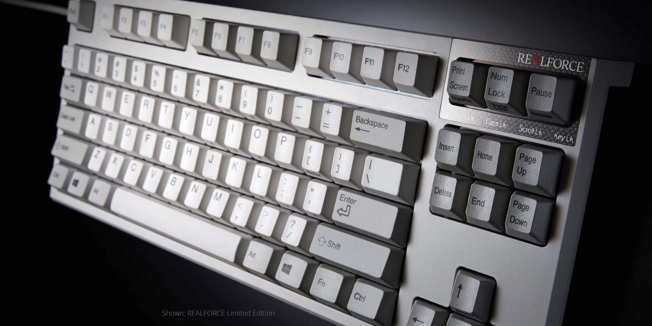
Sometimes the old ways are best, and Topre is unapologetically a throwback to a simpler time when everything was beige and macro was just short for macaroni. The Realforce keyboards, made and distributed by Fujitsu, are a cult hit due to an extremely comfortable and old-school feel. The keypresses feel meaty but not resistant to your fingers, and are quiet and well spaced.
It has a very pleasant and soft low-register sound to it, one that makes me feel productive, and there’s a certain solidity to the press that feels lightly resistant the whole time, rather than changing throughout. To be clear, these are the silent keycap option.
I chose to test out their more traditional full layout keyboard, which has media keys and other layer-type functions. They also offer a “Happy Hacking” HHKB alternative that retains the feel but on a super-compact layout that moves the left ctrl key to where caps lock is. When you think about it, it makes a lot of sense! There’s also a more gamer-y looking one with a printed macro layer. But something made me go for the old beige one.
This is one look and feel that has never really gone out of style, because it was never truly in style. Topre boards have been doing their thing all through the mechanical keyboard renaissance and have been a reliable — if expensive — option. But now that everything is expensive because of inflation, why not give it a shot?
Keychron Q2

This is a relatively high-touch option for anyone who wants to customize up front and get a unique look and feel. Keychron has a bunch of styles and options out there, some more affordable than others, and the Q series is the least affordable of all. But it’s meant to be the foundation of future builds as well, as you can swap out all its keys and caps for a variety of sets available on the site.
The Q2‘s secret is that its keys are all mounted on a sort of floating plate with a double gasket design that dampens sound and gives a forgiving feel to bottoming out the press. It’s not bouncy or unstable at all, more like putting a yoga mat down for your fingertips. I don’t know if I’m selling it here, but it’s very comfortable. I could use a little more depth, but I may just be more used to a higher actuation force.
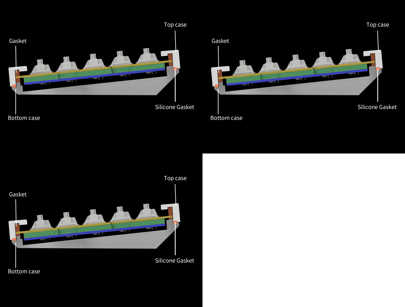
Keychron animation showing how the double gasket trick works.
The same approach is now available in pretty much every layout you can imagine, plus some more. I like the compact Q2 layout but ultimately it feels just slightly cramped and not suited for my work style. I think the Q3 is the sweet spot for me, but Frederic said it took a bit of tweaking to get right.
What ultimately kept me from using this longer than I did, however, is the inability to change its angle. The whole thing is solid, which makes it very stable, but there are also no extendable feet to lift up the back should you, like me, prefer a bit more rise or have a thick wrist rest (bring your own, by the way — the one they sent was wobbly). I ended up sticking a ruler under there, which seems incongruous with a keyboard that costs nearly $300.
1800: Keychron Q5
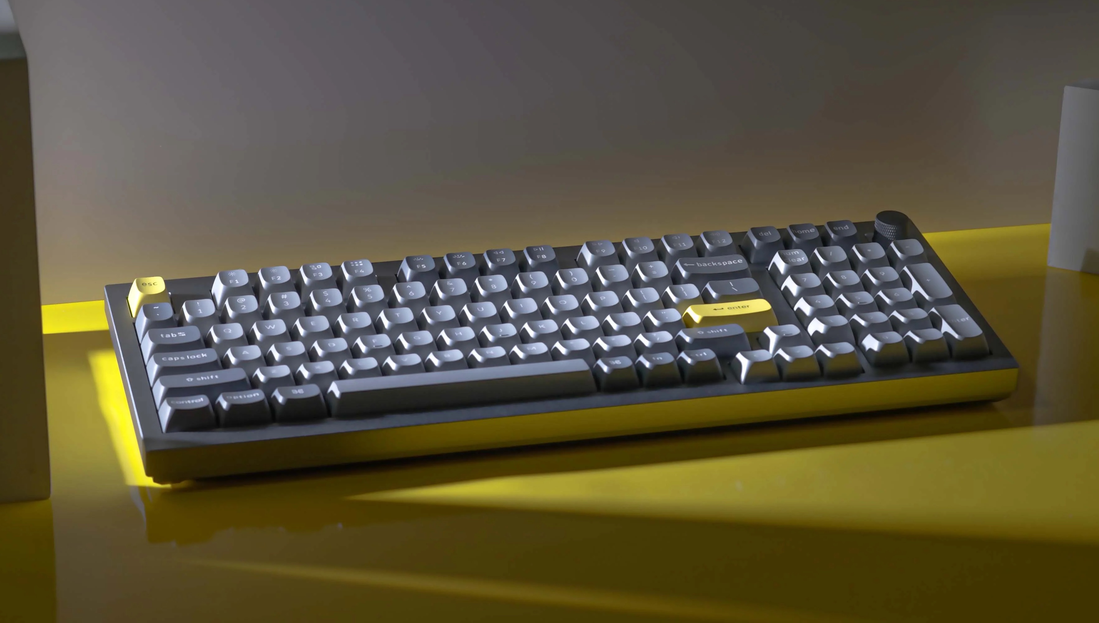
Image Credits: Keychron
Keychron is trying to hit every possible keyboard form factor with its Q-series of custom keyboards. There are now 65%, 70%, 75%, 80% and 100% options — all with a gasket mount with aluminum cases and plates, as well as per-key RGB lighting. But the most interesting one in the series so far is the new Q5 with its 1800 layout. That’s basically a full standard keyboard with a numpad, but it removes the open space between the alpha keys and numpad and squishes the arrow keys below the enter key. Despite spending most of my time on 65% keyboards, I do like a good numpad when I see it and the 1800 layout is a nice alternative to the larger full-size option.
The Q5 is also a bit of a return to form for Keychron. The 75% Q1, the company’s GMMK Pro clone, had some issues (though none that a few mods couldn’t rectify), while the 65% Q2 was great out of the box. The Q3, which I reviewed here, also needed some work to make it sound and feel great and while I didn’t test the Q4, the Q5 is once again great of the box, with no annoying case ping and a good typing feel. Fully assembled, the Q5 costs about $195 plus shipping for the version with a knob in the top right corner and $10 less without the knob. Color options are blue, black and grey (I’m partial to the blue) and the pre-installed switches are either Gateron Pro Red, Blue or Brown. Since it’s a hotswap board, you can always change those or opt for a cheaper barebone kit without switches or keycaps. The keycaps are of the standard Keychrone variety and perfectly solid, though Keychron now also sells $40 sets of its own Cherry profile double-shot PBT keycaps. Given that price, I was surprised by the quality of those.
If you can’t live without a numpad, the Q5 is the way to go at that price. Devin will not like the fact that you can’t adjust the typing angle on these [Ed. note: I do not like it], but I personally haven’t found that to be an issue. The main criticism I have of the Q5 — and really most of the Q-series boards — is that I wish that out of the box, there was a bit more bounce in the typing feel. I’m not sure they fully realize the potential of the gasket mount since in my experience, the gaskets end up being squished pretty tightly between the top frame and case.
Kinesis Freestyle Pro
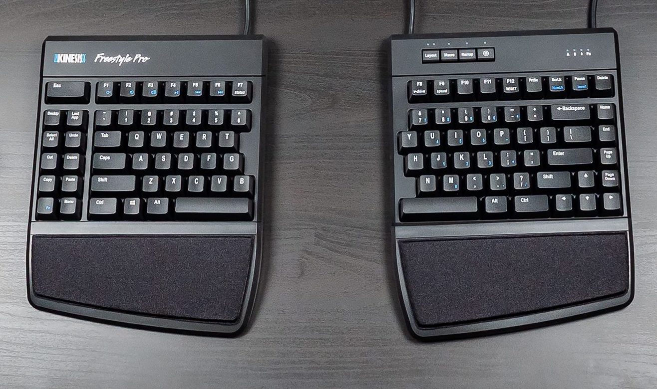
This is the one I’m typing on right now (though that’s because it was the last to arrive). A split keyboard that doesn’t give up the feel of mechanical, the Freestyle Pro joins the Realforce in the realm of the utilitarian. The simple truth is this keyboard is a bit bulky and nor particularly intuitively laid out. But I’ve found it the most comfortable to type on due to the tight integration of its wristpads and tenting mechanism.
The keys themselves probably could use a lube — they are nowhere near the combination of frictionless and tactile that you find on the others in this list. But the combination of a cushy, angled wrist rest and the ability to tilt and realign the keyboard halves make for a fundamentally comfortable experience. Once I snapped everything together it felt like it was meant to be.
However, the layout of the keyboard is gridlike and odd, a somewhat clunky (to me) combination of 75% with an expanded set of pre-printed macro keys. Meanwhile Esc is a quarter mile away to the top left, delete is likewise way in the top right, the F5-F9 cluster is split up, and I can feel the type on the keycaps. If Kinesis does a revamp with a better compact symmetric layout, or instead of a numkey attachment have arrows+functions, I’d be in love. For now I’ll settle for “reduced wrist pain.”
It must be said however that the Kinesis family does allow for serious revamping of its layout, adding layers and other goodies. It may not be svelte exactly, but it’s practical.
Matias Ergo Pro
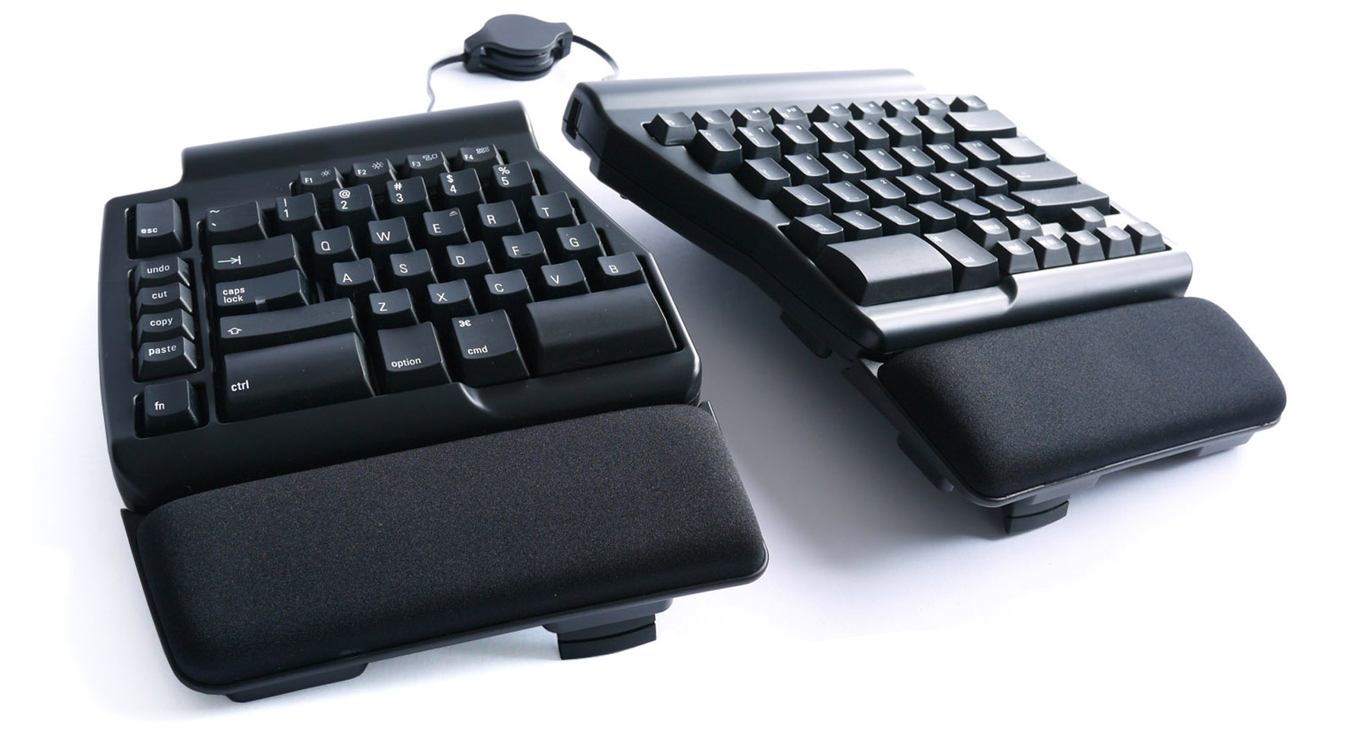
Another split tenting mechanical keyboard, the Matias Ergo Pro is similar to the Kinesis in some ways but has a considerably more compact layout, taking up less desk space and looking a little less like a pair of black dinner plates. The wrist rests are firmer and smaller but still comfortable.
The Matias uses more tactile switches, a little louder but not clicky, and with a longer travel than most of the other boards I tested. Its layout is better than the Kinesis, in my opinion, splitting the F-keys better, clustering the navigation buttons (pgup, pgdn, home, end, and arrows) in a compact area to the southeast, and keeping only essential macros (cut, undo etc) in a single column left of tab.
I’m not a fan of the recessed Esc key, and there’s a random extra key where the b would be on the right half that’s strangely set to “n” rather than “function,” which would make the far-flung media keys and print screen way easier to hit. The bottom row is also strangely fat to accommodate the nav cluster, but it makes the space keys feel luxurious. There’s also a scoop out of the case by the space bar, a thoughtful touch I appreciated since I tend to press on the very edge and can whack the case on other boards.
Where it falls short is in the tenting options. The little fold-out feet offer only one tenting angle, and it’s somewhat shallow since the keyboard is tall to begin with. Despite the keyboard sitting rather awkwardly on the rubber corners of the feet, it is stable, though (and very squeaky when slid out of the way). You can also set a negative tilt, which leaves the rest elevated and declines the back of the board — possibly more comfortable for some.
Drop + OLKB Planck/Preonic
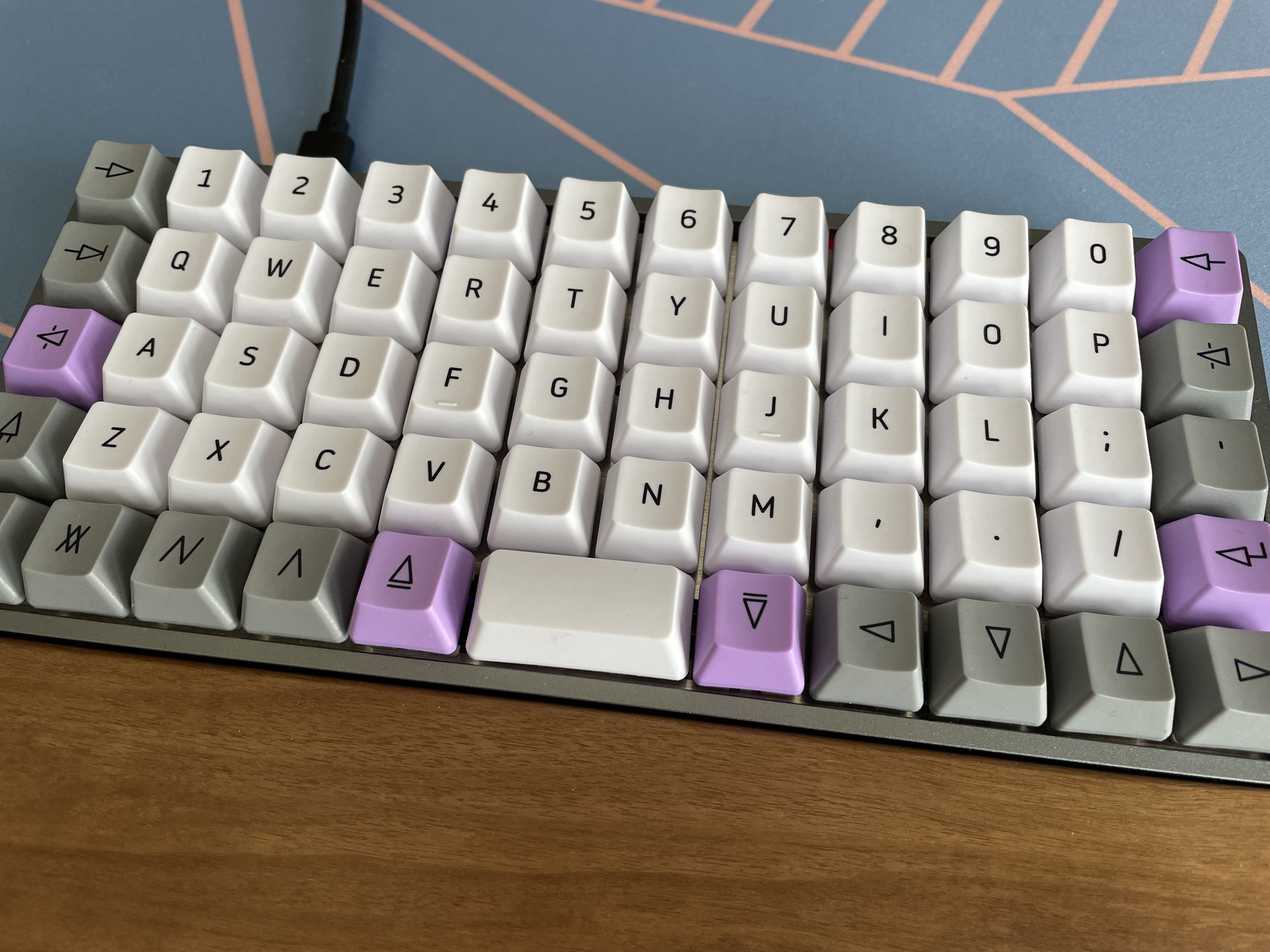
Image Credits: Frederic Lardinois/TechCrunch
Ortholinear keyboards, where the keys aren’t staggered but arranged in a neat rectangle may seem like an oddity that’s hard to type on at first and an ergonomic nightmare at best. Without a doubt, no other keyboard in my collection elicits quite the same reactions as the Drop + OLKB Preonic and its smaller, number row-less cousin, the Planck.
At over $200 for the base kit plus switches and keycaps, it’s not a cheap toy to experiment with either, but there’s a reason these keyboards have such a rabid fan base. It’s not because they sound great or give you an especially luxurious typing feel — it’s a basic tray-mount keyboard with an aluminum case, after all (the see-through polycarbonate version sounds a bit better in my opinion and lets the handful of LED’s shine through. It’ll also take you a good while to get used to the new layout. With only 59 keys on the Preonic and 47 on the Planck, you’ll need to learn dozens of key combinations spread over two layers. And if you couldn’t touch-type before, you’ll learn to do so on these keyboards — but that won’t necessarily help you when you move back.
The real advantage here for somebody who types a lot is that this is an astonishingly ergonomic layout, despite being completely flat. Since it’s so small, you never have to move your wrist as you type. Finding the right keys may take some work at first (it really messes with your brain at first), but after a week or two, it becomes second nature. And that’s why you would get one of these. Not because it hits all the latest mechanical keyboard buzzwords — because it’s the exact opposite of that — but because you want to try a completely different way of using a keyboard, either for the sake of it or for health reasons.
Moonlander

Are you thinking about taking the plunge into true keyboard productivity? The Moonlander may be the best way to simultaneously do more than ever without reaching for a mouse, and also prevent anyone from using your computer when you step away.
The Moonlander is an excellent to introduce yourself to a new way of using a keyboard, one that focuses on redefining the layout around your particular needs. This is because the keyboard is not just incredibly customizable, hardware and software both, but the community and tools are geared around the learning experience. I love that each piece is adjusted with a hex wrench, so not only can you get the precise angle that you want, but you can loosen it all the way, fold it up and stick it in its padded carrying case — this is by far the most portable of the keyboards here.
The trickiest part for me wasn’t the numerous blank keys and thumb cluster to be replaced at will — I got the hang of those from muscle memory in a heartbeat. It’s the columnar layout, which I struggled to sync with the whole time. The keys are aligned vertically and offset horizontally, the opposite of a “normal” keyboard, and although this is arguably the superior layout, it was maddening for my brain. Yet when I managed to sync my consciousness to the Moonlander’s, if only for a few seconds, it was so smooth and right that I aspired to make it natural. Of course since I had to test a bunch of other keyboards that wasn’t really an option, but I felt the spark.
The keys on the Moonlander can be customized, of course, and I went for a lightweight linear set. They press like a dream.
Angry Miao’s Am Hatsu
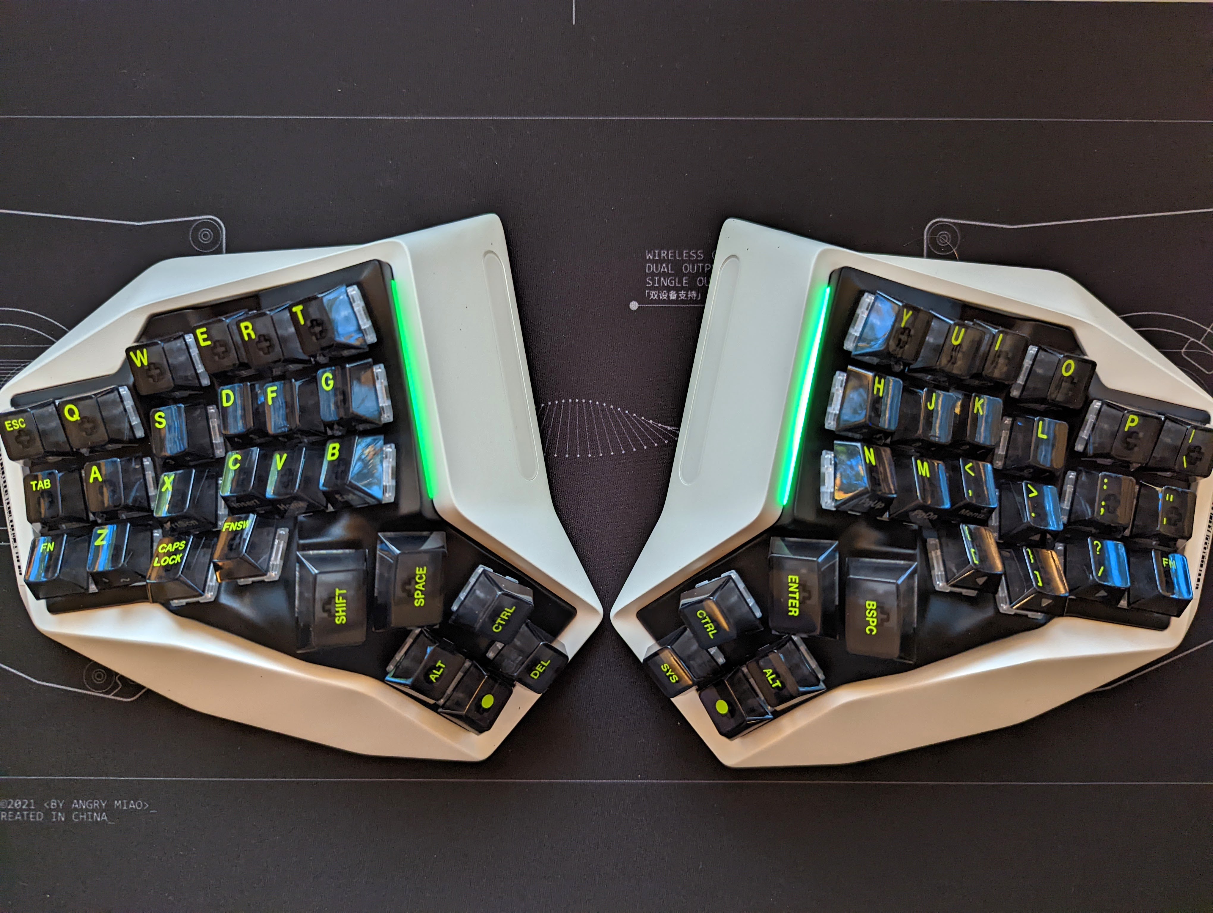
Image Credits: TechCrunch
Angry Miao has made a name for itself with very high-end keyboards that are a bit out there. There’s the Cyberboard, with a giant LED matrix screen on the back, but the Am Hatsu takes the cake. It’s an aluminum wireless split-ergo ortholinear keyboard — one of the few of these on the market — that retailed for $1,600. To my knowledge, there are no immediate plans for additional production runs but you can occasionally find a used one. If learning to type on a standard ortholinear keyboard took some time, getting to grips with the futuristic-looking Am Hatsu took even longer. Since it features a kind of concave dip for your hand to fall into, with no way to adjust it, your finger movements end up having to be slightly different — just enough to hit the wrong key every now and then.
Like some other split ergo keyboards, the enter, control, alt and delete keys sit in a thumb cluster on the bottom left and right or two sides. Your brain will rebel against this idea until you hammer it into submission, which will happen, given that you will need the delete key a lot to fix your typos early on.
Unlike most modern mechanical keyboards, the Am Hatsu doesn’t let you change your switches, so if you want something else but the linears that come with it, you are out of luck. Thankfully, the switches Angry Miao uses are great, so that’s not too much of a problem. Unlike virtually every other modern mechanical keyboard, you also can’t use VIA QMK to adjust the layout to your preferences.
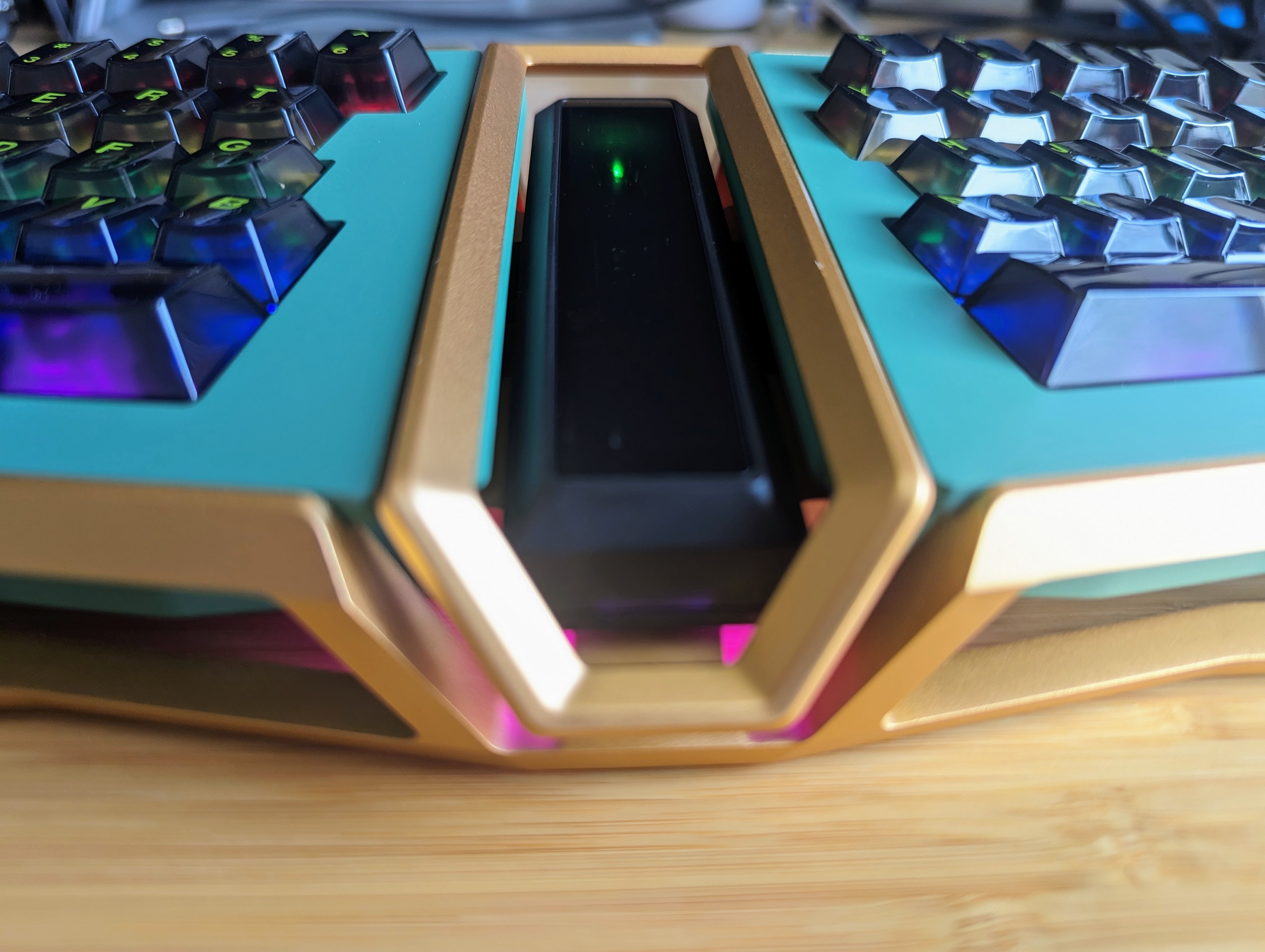
One weird design choice: the USB-C charging port is on the bottom of each side. That’s not a problem if you buy the Cybermat, with the company designed to wirelessly charge the Am Hatsu — and hey, if you pay that much for a keyboard, why not spend a few hundred dollars more for a wireless charging mat?






 English (US) ·