Do you have a second to talk about negative space? It will be quick, I promise. It’s effectively that blank area between objects in a work of art. As the name implies, it’s defined by an absence, but implemented effectively, the negative space may, itself, become an object.
You probably know where I’m going with this, right? As other companies pushed to make the front-facing camera cutout as small as possible, Apple has continued to utilize the notch since the iPhone X. It was made smaller in a recent iteration, but it’s remained a constant, owing — in part — to the module the company uses for things like FaceID. This year, Apple finally dropped the notch — for two of the four iPhone 14s announced today, at least.
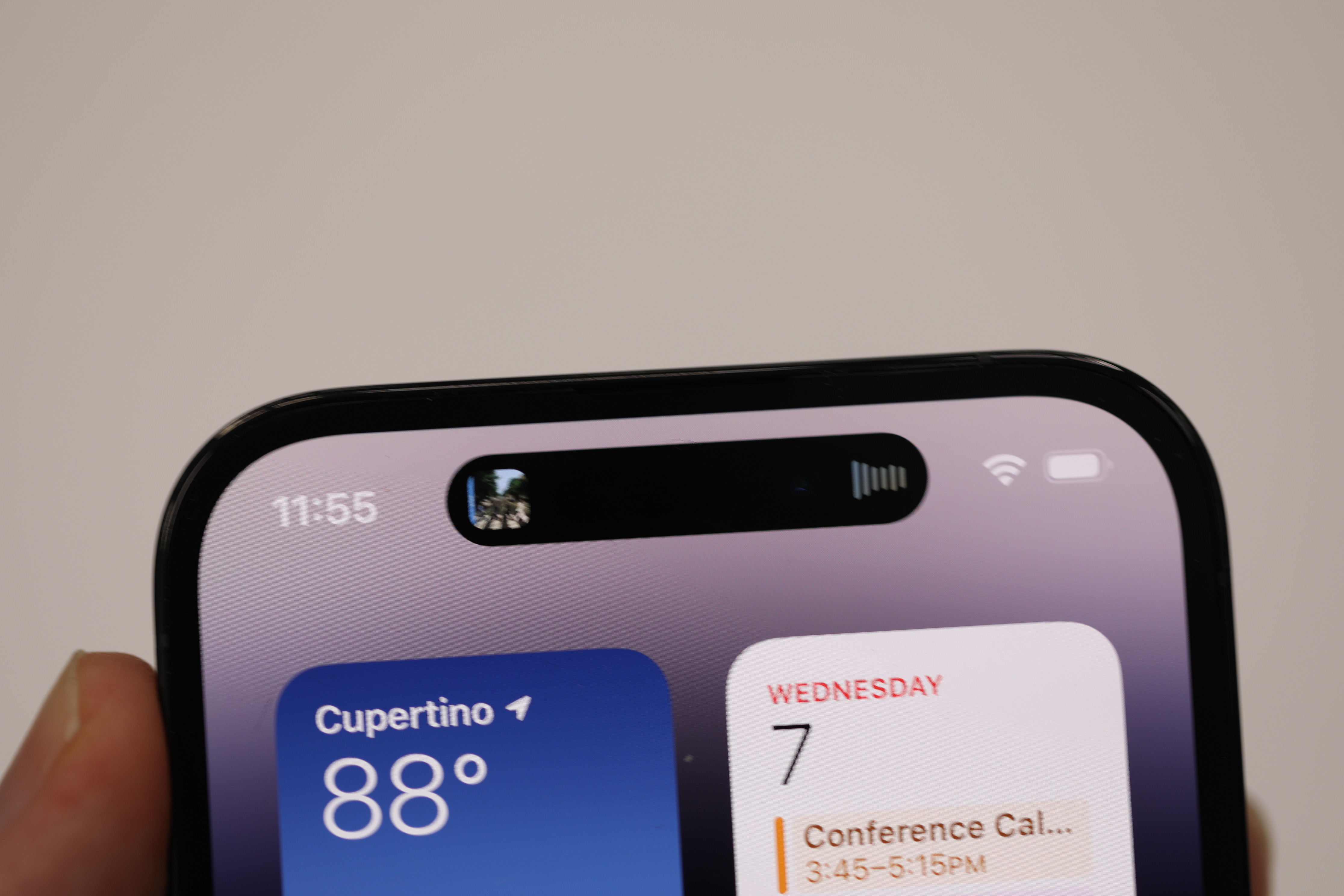
Image Credits: Brian Heater
On the two Pro models, it’s been swapped out for an oblong object that many took to calling a “pill,” even before it was officially announced. The pill is not contiguous with the bezel, unlike the notch. It just kind of floats out there…well, like an island. A Dynamic Island, if you will. Reader, I’m here to tell you that when the company announced that name, there was audible laughter throughout Steve Jobs Theater.
The company has taken to getting a bit goofy in its presentations (though Craig Federighi wasn’t on screen hamming it up), but Apple was dead serious about a name that sounds like a three-person comedy troupe. What I will say, is people only chucked the first time. By the fourth or so mention, a guy behind me said “woo” when it was uttered.
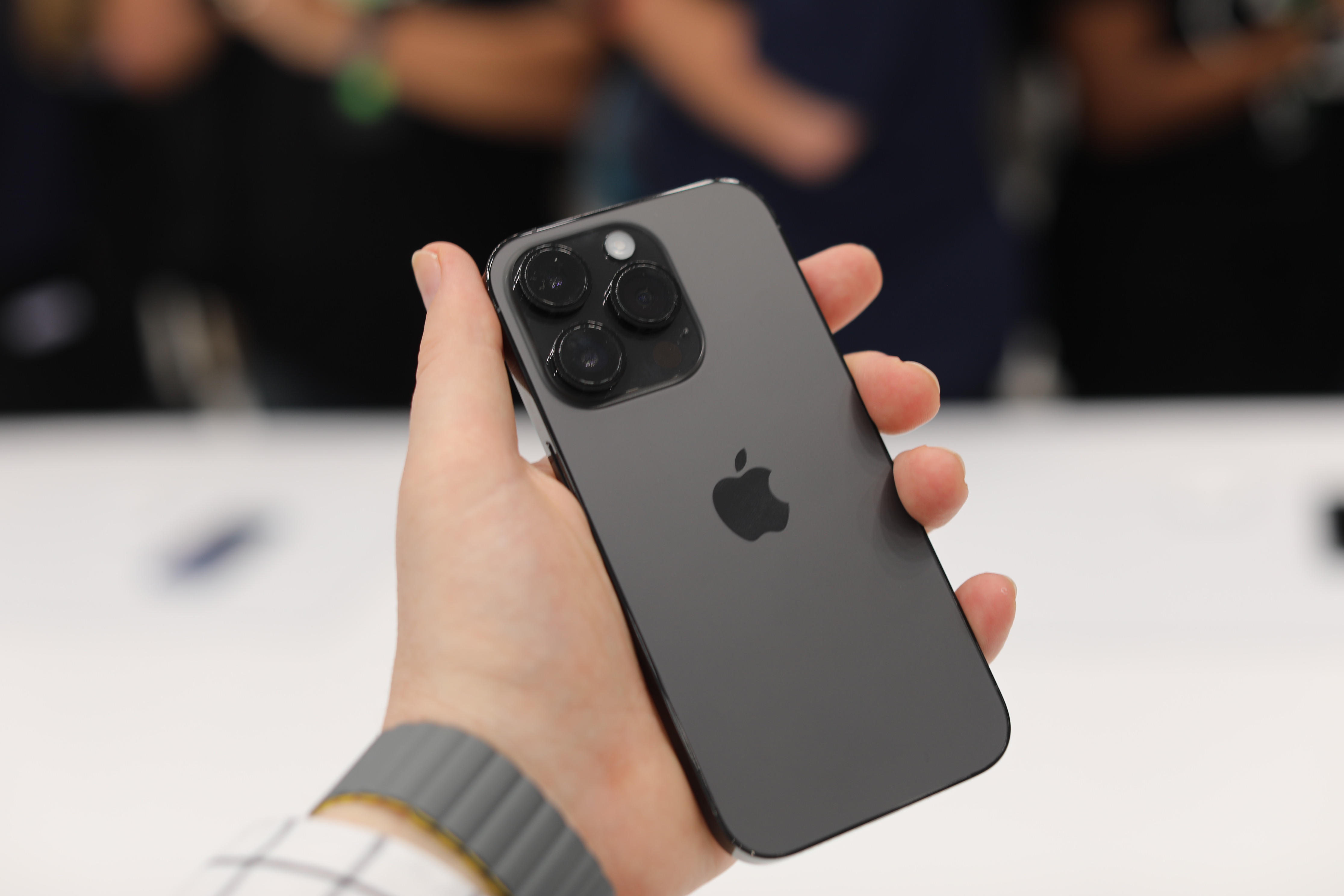
Image Credits: Brian Heater
So, what makes this island “woo worthy”? Apple isn’t just introducing the new cutout. It’s leaning in. The slot expands with additional negative space on its sides, serving as a kind of picture-in-picture, surfacing contextual information for the app you’re using. Think of it almost as a mini Apple Watch — a kind of secondary display baked into the first. Or maybe a Touch Bar that’s significantly smaller.
In the demo Apple gave me, firing up Apple Music and then flipping out of the app will flank the front-facing camera with a pair of images: the cover art for the album you’re listening to and an icon indicating playback. You can’t interact with the images, but tapping into it will resurface the app. It’s basically a way to keep useful information front and center, even when you’re not directly using the app.
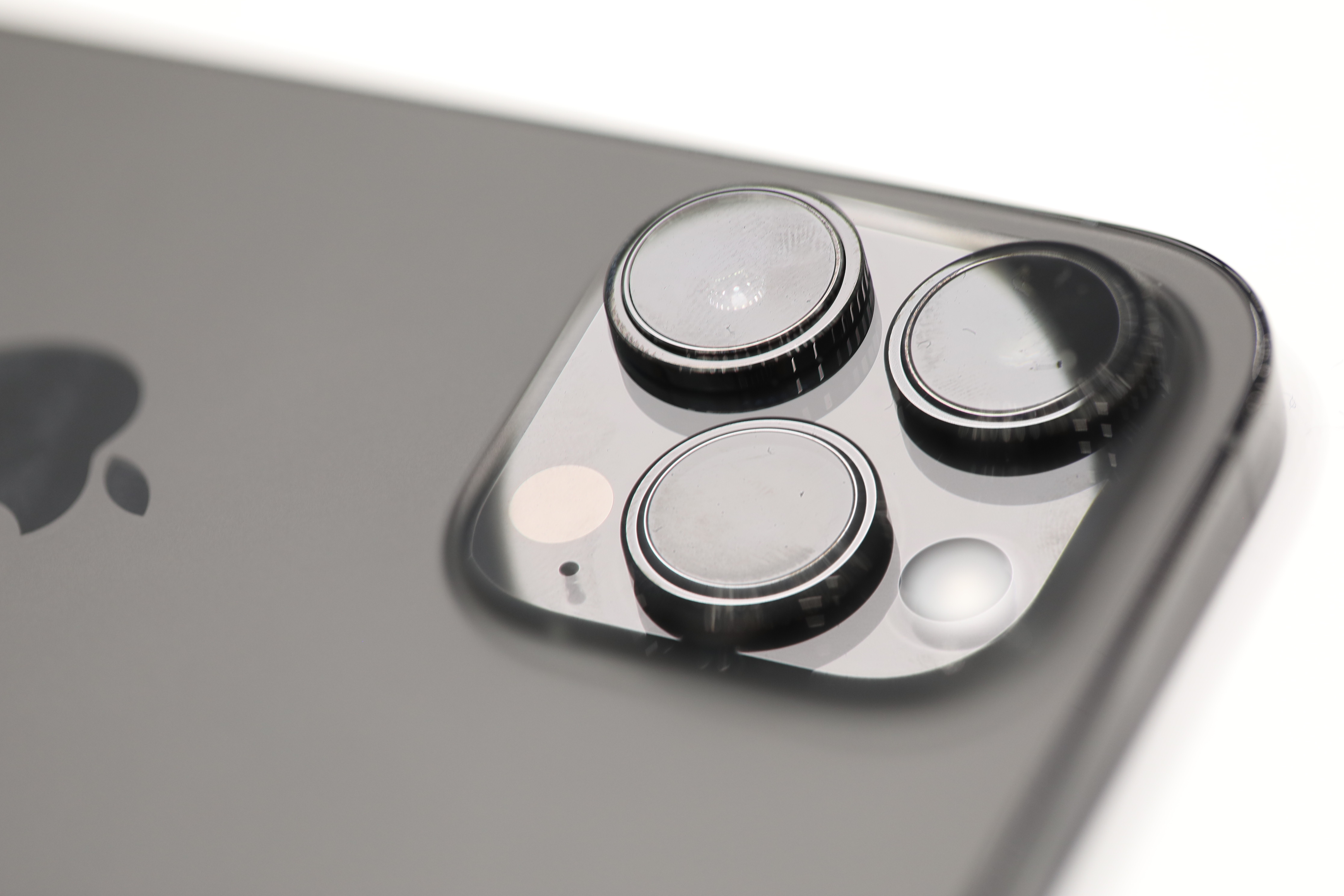
Image Credits: Brian Heater
Revolutionary? Not really. Useful? Kinda. Clever? Definitely. No one is going to run out and buy a 14 Pro for the feature, but it’s a very resourceful way of accommodating a feature Apple’s isn’t quite able to abandon just yet. Speaking of, the Lightning port is still very much present here. Given all of the legislation (both passed and proposed) around universalizing the USB-C standard, I’d anticipate that we’ve just seen the final iPhones to sport that old chestnut.
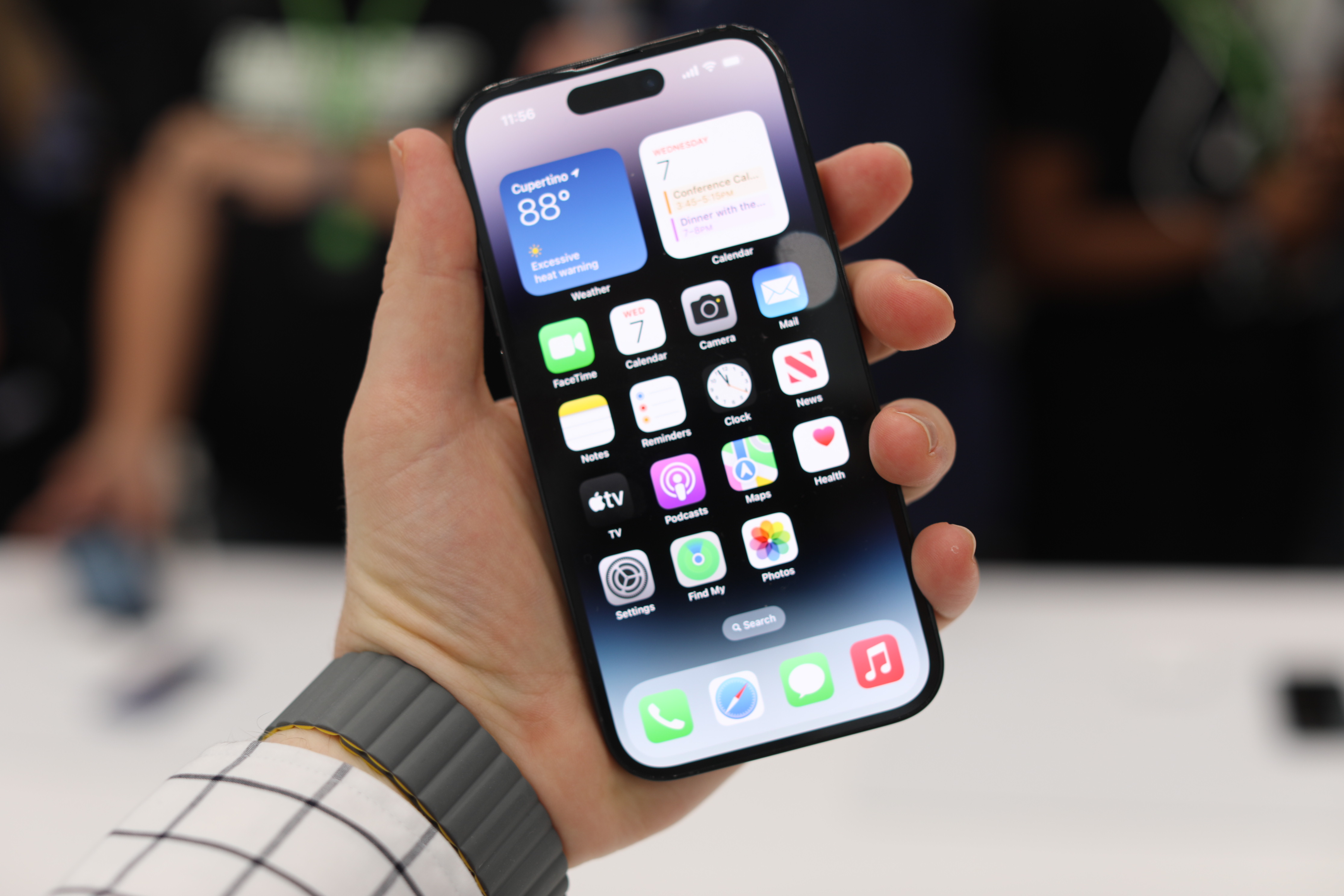
Image Credits: Brian Heater
But the camera cutout suddenly isn’t just surviving, it’s thriving. Apple’s leapt into the void with full feet. To quote Nietzsche, “if you stare into the abyss, the abyss stares back at you.” Not only that, but if you stare into this one, it will even snap a selfie.
Apple leans into the void with the iPhone 14 Pro by Brian Heater originally published on TechCrunch










 English (US) ·