The M2 Air is as close as Apple has ever come to the perfect MacBook. It’s a kind of platonic ideal for the category, and the culmination of key updates to the product line, including the arrival (and upgrade) of Apple silicon and the company’s acceptance that some things (bad keyboards, Touch Bar) simply weren’t working, no matter how hard it tried.
Taken as a whole, I don’t think I’ve ever liked an Apple laptop more than I like the 2022 MacBook Air, and I don’t anticipate that changing soon — at least not until the 2023 Air arrives, perhaps. Even with this month’s arrival of two new Pro models, last year’s Air remains the best mainstream laptop Apple has ever made.
There’s a rub, of course. There always is. Regardless of all the innovations it’s built on top of, no mass-produced computer will please everyone. In fact, as a line, the Air has always been defined as much by the things it leaves out. It’s true that the Air is currently at its point of least compromise, but making a product thin and light has always meant some manner of compromise.
That’s where the new Pros come in. Apple’s lineup has ebbed and flowed quite a bit over the years. With the disappearance of the standard MacBook, the Air has shifted from travel-minded ultraportable to what is effectively the company’s default laptop. The M1 model has stuck around as the “budget” entry, but the Air was — and continues to be — the best choice for a majority of users.
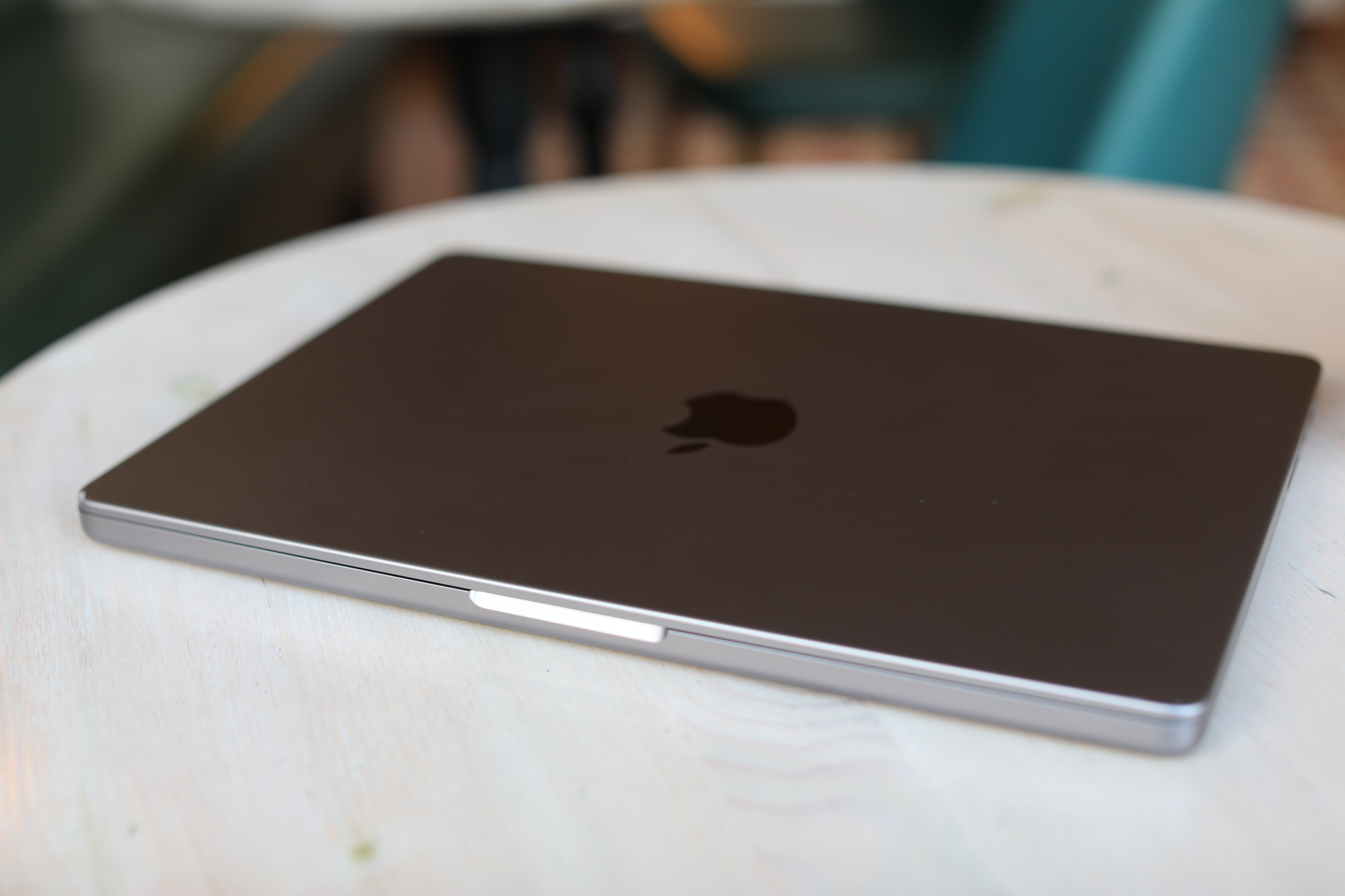
Image Credits: Brian Heater
After years of relying on Intel, Apple cracked things wide open in 2020 with the arrival of in-house silicon. But there’s also a sense in which the company painted itself into a bit of a corner, moving forward. For most users, the power gains offer diminishing returns, if you’re not, say, editing multiple 8K videos or rendering 3D. That isn’t to say such power won’t be required in the future, of course, given the trajectory of computing requirements. It’s just that the $800 gulf between the starting price for the M2 Air and M2 Pro MacBook Pro (kind of a mouthful) ultimately doesn’t make a ton of sense for your average user.
This is, perhaps, a very long-winded way of saying the “Pro” in MacBook Pro is a less nebulous concept than ever before. It’s always been wholly clear that the Mac Pro, for instance, is designed for professionals than regular old consumers. The MacBook line has tended to be a bit more porous. If you’re more content consumer than creator, there isn’t exactly a load of reasons to make the leap. If, on the other hand, you’re a creator looking for a lot of power on the go, you’ll want to listen up.
Apple has comfortably settled into a nice, consistent design language with the MacBook line, with the strange exception of the 13-inch Pro. The entry-level Pro system remains a strange time capsule of earlier days, with Touch Bar hanging on like some vestigial organ and reminder of a nice enough idea that ultimately failed to justify its own existence. The far handier F keys once again reside up top on the newer models, where they belong. The TouchID (the best thing about the Touch Bar) is perched on the top left. The keyboard remains on the soft side, as is consistent across Apple products, but it works well, and the days of key-sticking frustration are finally behind us.

Image Credits: Brian Heater
One of the primary aesthetic distinctions between the Air and the Pro are the skinny speaker grilles that flank the keyboard. The speakers get about as loud as you’d want a set of laptop speakers to get, and the open design allows for a richer sound than you get on the Air’s single back-firing panel. It’s good for a quick video or some music listening, but I imagine if you’re, say, editing audio, you’re going to want a pair of headphones regardless.
Another key difference is ports. As a general rule, the more ports the better. Certainly that’s the case here. In fact, one of the Air’s most glaring issues is a lack of places to plug things in, limited to the proprietary MagSafe 3, two ThunderBolt 4/USB-C ports and a headphone jack. That’s it. In most situations for most people, that’s mostly sufficient. Carrying the Air around at CES the other week, it was mostly fine — until it wasn’t.
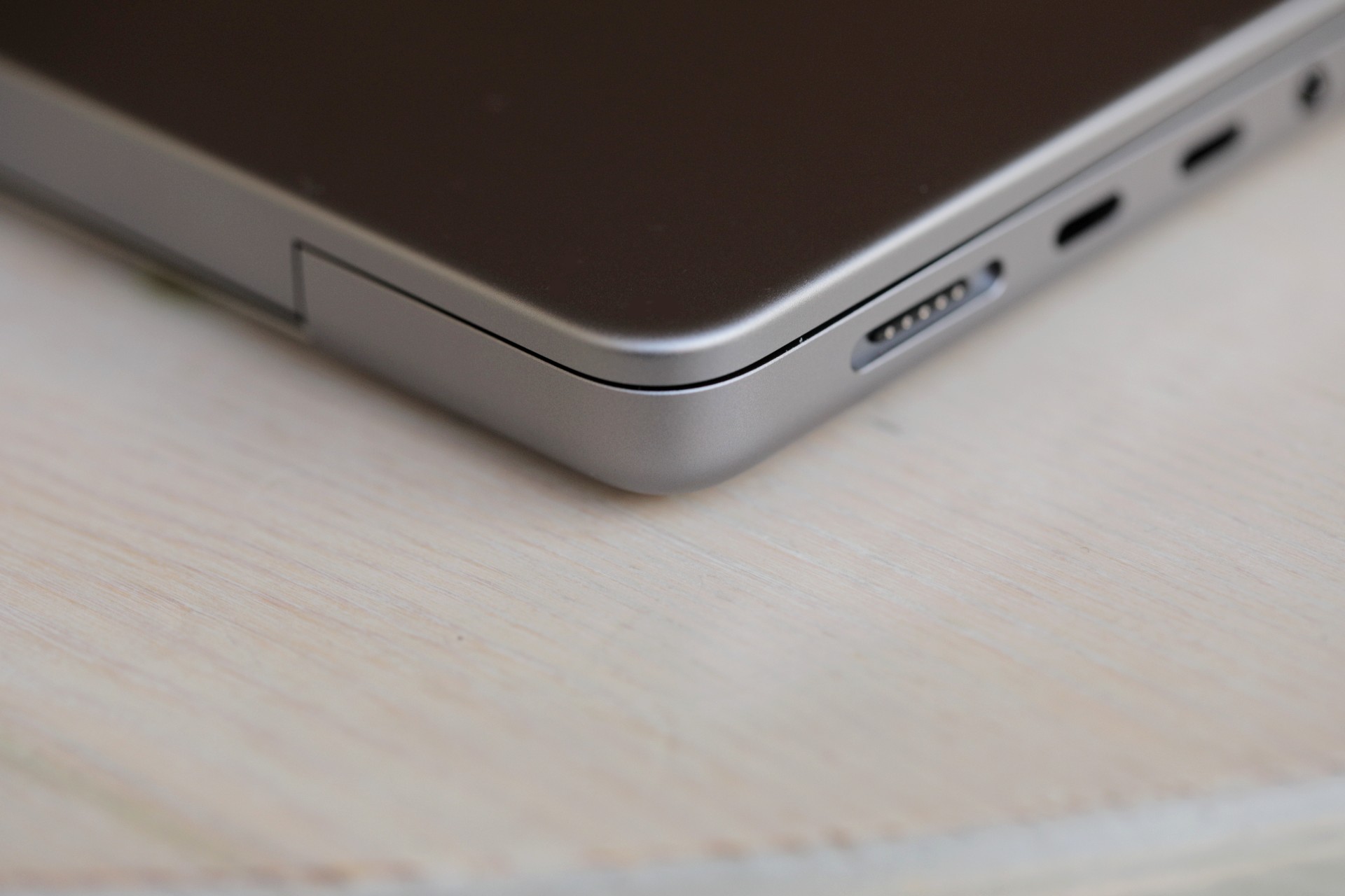
Image Credits: Brian Heater
I suddenly found myself attempting to navigate the labyrinthian Forums shops at Caesar’s at 8:00 p.m. on a Tuesday. My external SD reader had completely given up the ghost sometime between my last in-person event and CES. A relatively unique set of circumstances, certainly, but it drove home how much I’d missed having a built-in card slot after jumping from the Pro to the Air. If you’re a professional photographer (I’m certainly not claiming to be one, mind), I don’t need to tell you how essential a tool it is.
Like the Air, the Pro sports a pair of USB-C ports on the left side, just below the MagSafe connector. One of my highly specific issues with the Air is the decision to place the two USB-C ports on top of each other. Putting one on either side makes more logical sense in instances where the plugged-in object blocks the second port. Here, thankfully, the third sits on the other side. I’m among those who welcomed the return of MagSafe. It was one of the more beloved features of MacBooks past, and an odd thing to drop along the way.
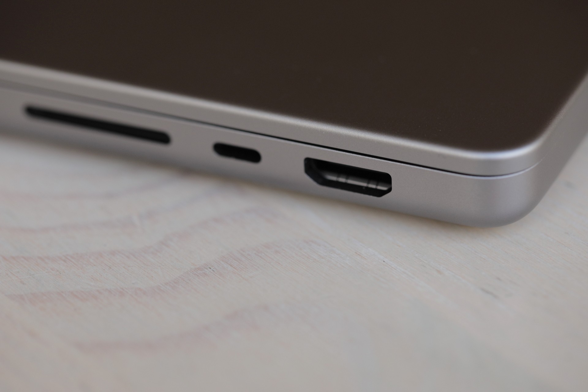
Image Credits: Brian Heater
It’s worth noting that, in spite of being custom built for the purpose, it actually charges a bit slower than USB-C. But the magnetic detachment is a little extra peace of mind for the clumsier among us (I do claim to be one of these, however), and it frees up the other ports for other, noncharging tasks. The final port is an HDMI output that supports 8K displays — a first for the MacBook line and an extremely appealing feature for the creator class.
What strikes you first on unboxing the new Pro, however, is the weight. The thing is heavy. The default weight of the 14-inch model is 3.5 pounds. The Air is 2.7 pounds. The 12.9 iPad Pro is 1.5 pounds (sans-keyboard case, mind). If you anticipate that the device will spend 50% of its time in your backpack, this is certainly something worth factoring in here. At 12.31 x 8.71 x 0.61 inches, the footprint is also larger than the Air (11.97 x 8.46 x 11.97) in every dimension.
Not that any of this is surprising, of course. That’s kind of the whole deal. The Pro delivers a lot more horsepower and bells and whistles. Being a bit more stationary just sort of comes with the territory. This is also due, in part, to the Air’s smaller display, which is 13.6 inches to the Pro’s 14.2. A larger surface area is a foregone conclusion. In addition to being larger, the screen is simply a thing to behold. The Air’s 2560 x 1664 Liquid Retina display gets a big bump to a 3024 x 1964 Liquid Retina XDR. It’s really gorgeous and bright at up to 1,600 nits for HDR content or 500 (the Air’s overall peak) for SDR. The refresh rate maxes out at a smooth 120 Hz — double that of the Air. Is any of this necessary for watching Netflix? Not really. Is it nice to have? Obviously. And it’s certainly a great mobile screen for those whose job descriptions involve creating visual content. macOS is still a long ways from becoming a gaming powerhouse by any stretch, but it’s come a long way over the past decade, and first-party silicon is a big piece of that. (Steam doesn’t hurt, either).
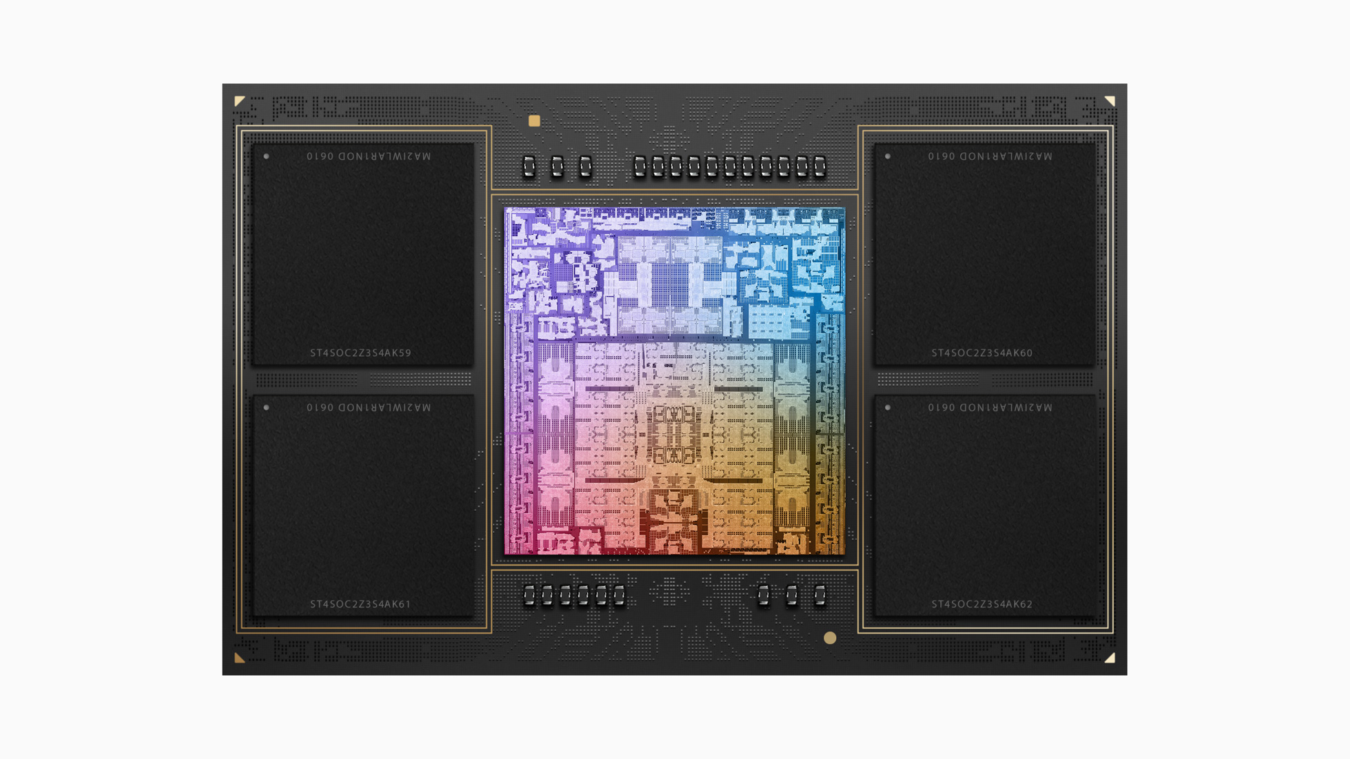
Image Credits: Apple; M2 Max
The baseline ($1,999) Pro sports an M2 Pro chip with a 10-Core CPU, 16-Core GPU, 16GB of RAM and 512GB of storage. The review unit Apple sent isn’t quite top of the line, but it’s pretty close. It’s got the M2 Max with a 12-Core CPU and 38-Core GPU, 64GB or RAM and 2TB of storage. As configured, it’ll run you $4,100. If you really want to go all in, you can bump the RAM up to 96GB and storage to 8TB. Suddenly, you’re tipping the scales at $6,300. That’s more than 3x the cost of the base unit — a $4,300 increase. In other words, you can really trick this baby out, but it’s gonna cost you. And then some.
Performance is certainly reflected in the Benchmarks. The Max chip hit 1952 on the single-core and 15249 on the multicore GeekBench 5 tests (average of three tests). That’s a truly impressive gain over 1,922 and 8,974 we got with the M2 Air. The M1 Ultra still blows them all away with a 20,000+ multicore score, but that’s to be expected with desktop architecture. It frankly boggles the mind to consider the future of the Mac desktop (Mac Pro, perhaps?).
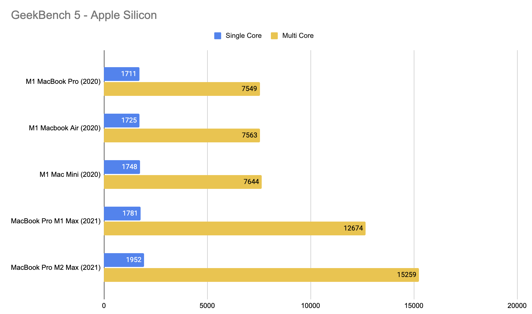
Image Credits: TechCrunch
In the meantime, it’s extremely impressive to see the gains made for notebook processors over the past two years. Unlike the Air, the Pro’s got a fan and a pair of vents on either side of the engraved MacBook Pro logo on the bottom of the system. A quartet of rubber feet elevate the system a bit, to give the outgoing warm and incoming cool air somewhere to go. Truth is, you’re not likely to trigger with most day-to-day activities, but when the time comes to truly push the system to its limit, you’ll be very glad Apple didn’t go fanless across the line.
At 84888, the GeekBench Metal score handily beats the M1 Max (~64000-66000), courtesy of those 38 cores. Again, the M1 Ultra still beats the M2 Max’s GPU scores (>90000). The staggered rollout of silicon iterations may get a bit muddied for consumers, but the quick rule of thumb here is that the M2 Max trounces existing Mac laptop chips and even comes within spitting distance of the M1 Ultra. The native macOS port of Resident Evil Village, for instance, played smoothly (remind me to get a Bluetooth control), though the bottom of the Mac got quite warm to the touch. I was able to get it downright hot playing some Steam titles. Was I just looking for an excuse to replay Disco Elysium? Who can say, really?
Performance was great, probably keep it on a desk when you game (oh, and maybe pick up a decent Bluetooth controller while you’re at it). While extremely efficient, Apple silicon isn’t beyond the need for cooling with resource-intensive tasks. With daily tasks, it stays cool. However, you don’t have to push the system to the limit to noticed a marked difference in processing power. Things I do on the regular, like opening apps and editing podcast audio are perceptively zippier, coming off using the latest Air as a daily driver.
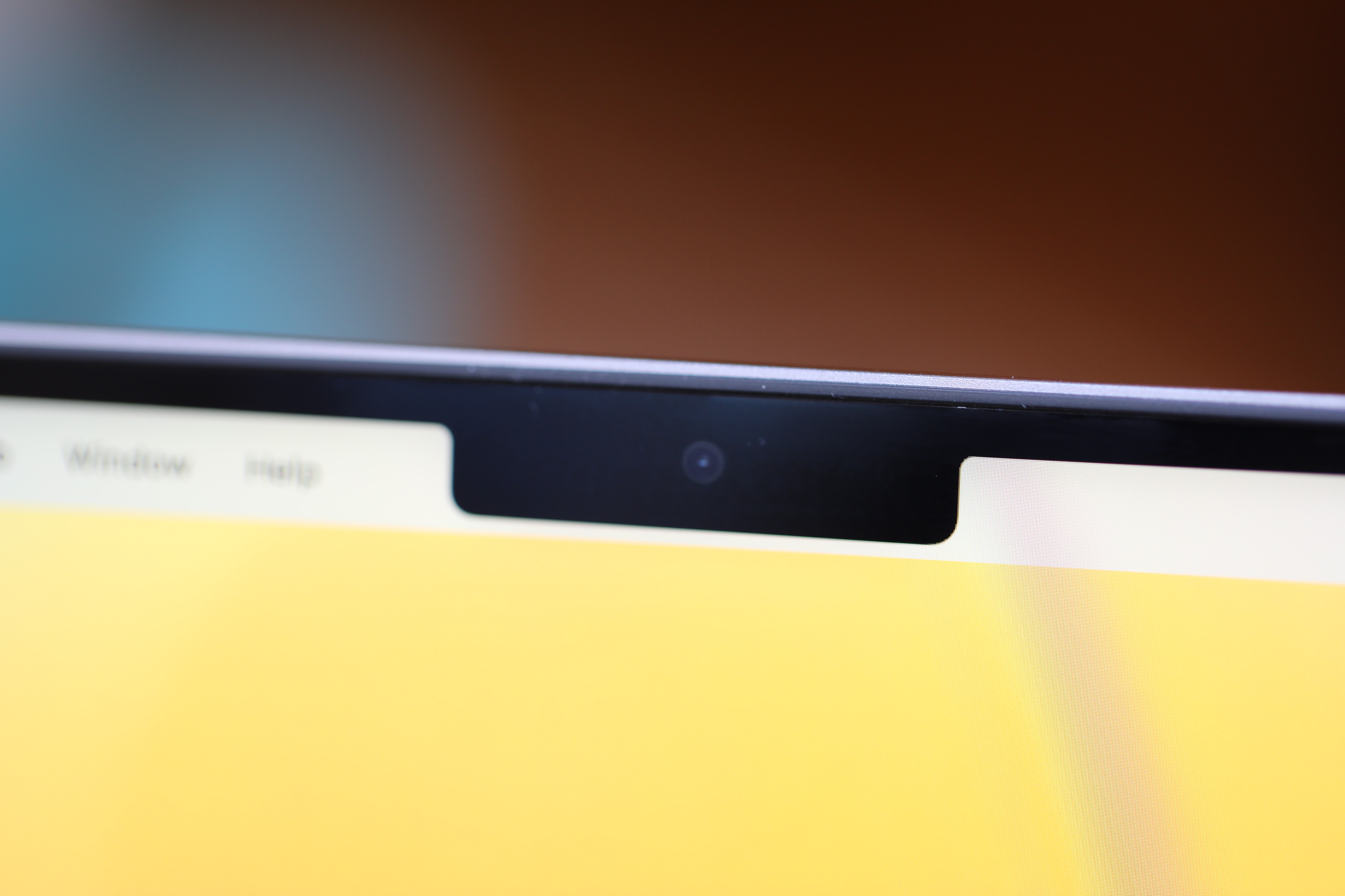
Image Credits: Brian Heater
The new chips bring other updates beyond process power. There are some slight tweaks to the ISP (image signal processor) — specifically with regards to picture contrast. The webcam, still positioned in that display notch you either like or loathe, is more or less the same 1080p hardware you’ll find in the Air. The bump to 1080p was a long, long awaited upgrade, particularly in this golden age of the virtual meeting.

Top: MacBook Pro native camera; Bottom: iPhone 14 Pro via Continuity Camera Image Credits: Brian Heater
Some of the camera hardware (see the Studio Display) got off to a rough start. As we know, there’s currently only so much one can do with the processor versus good, old-fashioned camera hardware, but it’s certainly to a point where I’d feel wholly comfortable using it for a work meeting. Of course, if I’ve got an iPhone handy (as I usually do), I’m going to instead opt for Ventura’s Continuity Camera feature. Above, you can see two screenshots taken in Zoom, one with the built-in webcam and the other with a mounted iPhone 14 Pro. The choice is simple.
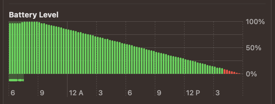
Image Credits: Brian Heater
The battery life, meanwhile, is just straight up awesome. With video playback, I was able to squeeze an impressive 21.5 hours out of the system before the screen shut off. That’s just shy of the stated 22 hours. The Air and 13-inch Pro, meanwhile, are listed as up to 18 and 20 hours, respectively. It’s easy to see Apple hitting a full day in a generation or two. In the meantime, you should be able to make it through that direct flight from New York to Singapore without incident (no, I can’t sleep on flights, either).
Really, it’s the perfect encapsulation of the new Pros. They’re big, bold and brash. They can do all sorts of things that would have seemed impossible on a MacBook only a few generations ago. They’re an exciting signpost for how far Apple’s notebooks have come and provide insight into where things are going, if the company continues its current pace of new chips a couple times a year.
The last few generations of Macs can perform tasks that might have seemed impossible pre-pandemic. While that includes gaming, they still aren’t gaming machines by many definitions. If playing the latest and most resource-intensive titles is central to your computing experience, you know the drill. Apple silicon is built with workflows in mind. That is say, the “Pro” is more creative pro and less professional gamer. For those tasks, these systems sing — and if you want to play games after work, the new chips are increasingly capable with each generation.
As noted above, this particular system is $4,100, as configured. Starting with the $1,999 base, an upgrade from the M2 Pro 10-core CPU/16-core GPU to the 12-core CPU/19-core GPU is a $300 add-on. Bumping that up to the Max with a 30-core GPU is a $500 increase over the base price. The top of the line M2 Max with a 38-core GPU is $700. Things can get real pricey real quick when you’re staring at Apple.com checkout. You try to future-proof and hedge your bets, as you consider whether you plan to hold onto your machine for three, five or 10+ years. It’s an investment, right?
I don’t foresee Apple suddenly make another generational leap in the near future, but I’ll be the first to admit that I’ve been wrong before. Predicting where tech will be in a decade can be a fool’s errand, even if it happens to one that’s central to this job. However, much as I noted above that the Air continues to be the best MacBook for most, I feel fairly confident that the M2 Pro will be plenty for most creative professions. If you need the added firepower of the M2 Max, you probably already know who you are. And hey, I can’t say I minded using it as my daily driver for a bit. Those load times might feel insignificant, but they add up.
Image Credits: Brian Heater
It’s a reaffirmation of the “Pro” in MacBook Pro: chunky, heavy, blazingly fast, full of ports and packed with the best the company has to offer. And they’re decidedly not for everyone — not even most. I’m still going to recommend the Air for nine out of 10 people (if not more) who ask me which MacBook to buy in the coming year. If you’re that 10th person, you almost certainly already know.
Apple MacBook Pro 14-inch M2 Max review by Brian Heater originally published on TechCrunch






 English (US) ·