Though the iPad was a huge hit from the beginning based on its user-friendly interface and single-application focus, it had begun feeling a bit stale for those who hunger for more depth. Long one of the world’s lightest and most powerful medium format computers, the lag between what kind of work it was capable of and what kind of work it actually welcomed had been growing.
Over the past couple of years Apple’s major iPad updates have been focused on dragging the device out of a long gestational period and into a universe that offered more linguistic similarity with the Mac. The preview we got of iPadOS 16 this past week is no exception. A handful of features like Stage Manager, Desktop Class Apps and enhancements to Continuity are all aimed at continuing iPadOS 15’s work in this regard.
I had a chance to talk briefly with Apple SVP of Software Engineering Craig Federighi last week about the new iPadOS features aimed at enhancing multitasking and multi app work. We chatted about the timing, execution and reactions to these announcements.
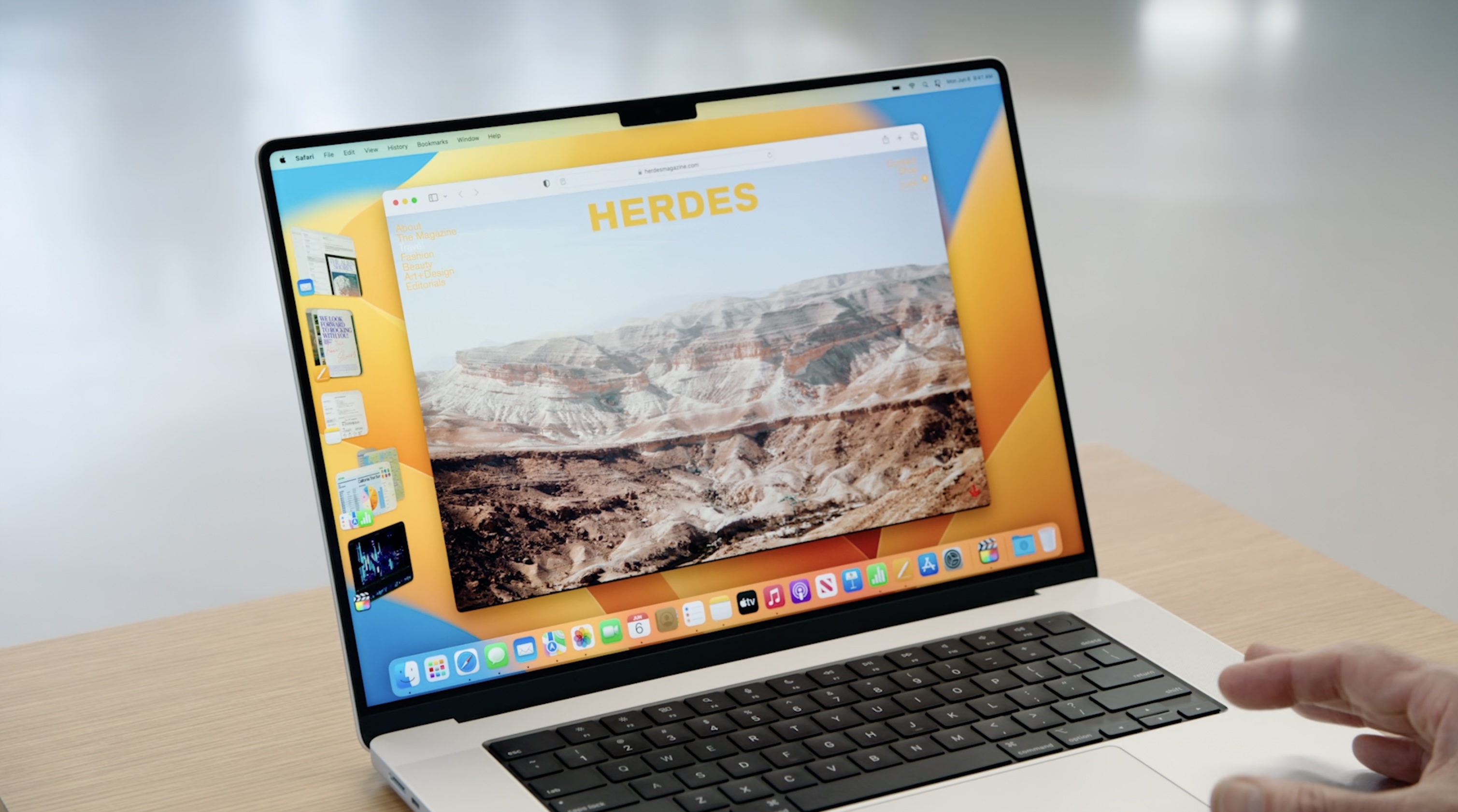
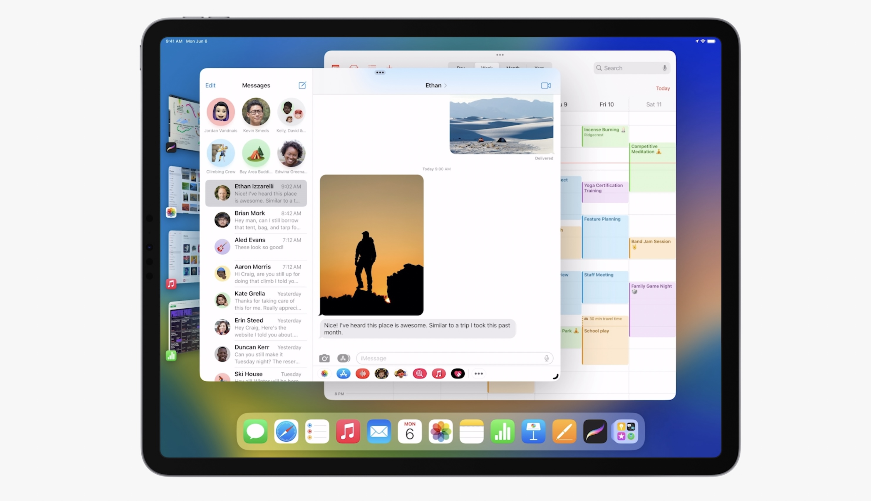
Stage Manager is the centerpiece of this year’s enhancements to multitasking on iPad. The feature presents sets of up to 4 apps per group in a system-managed tile formation. The groups are arrayed to the left, allowing you to quickly tap between these workspaces. It’s essentially a much more visible and persistent version of Spaces – the Mac feature that allows for multiple desktops to hover off to the sides of your screen on macOS. If you didn’t even know Spaces existed, you’d be forgiven, because it’s fairly obscure and does not have many, if any, visual cues to anyone who has never visited the Mission Control screen.
“iPad has a unique proposition, a unique set of expectations around interaction and we wanted to build from that place, not just drag things over from, you know, decades past or another system that was built on a different set of foundational principles. And so Stage Manager is, I think, an important step on that evolutionary arc,” says Federighi.
The idea of allowing a single window to take focus on the screen has deep roots at Apple, says Federighi. First was the single application mode in the early days of Mac OS X beta. And years later an internal prototype of an experience that felt like Stage Manager.
“On the Mac, there are so many different ways to work. Some people use spaces, some people are in and out of Mission Control. Some people are command tab people, some people like to create a mess, some people clean up their messes and some people use minimization. I mean, there’s no wrong answer here, there are a lot of valid ways to work on the Mac.”
This approach to workspace management does appear to be very obviously iPad-centric. But Federighi says that two independent teams at Apple, one working from the iPad side and one working from the macOS side to try to make multiple workspaces more obvious and friendly, arrived at a similar concept and met in the middle. This means, he says, that both perspectives are represented in this approach.
“There were many of us who use the Mac every day who really wanted this kind of focused experience that gave us that balance. So we were on the Mac side, picking this idea up and saying we think that’s in reach, we want to make this happen. And separately on the iPad side we were thinking about [it]. And believe it or not two independent teams who are brainstorming and designing converge on almost the identical idea.”
He acknowledges that there will likely be a group of people that have 40 years of Mac history behind their expectations. That there will be people who will expect the feature to act a certain way and that it’s wildly different. And, by nature, this won’t be a tool immediately used by many Mac loyalists.
“It takes people some time to adapt their muscle memory and their expectations, and then optimize their flow for a new set of tools. I mean, this is for iPad users. And on the Mac, it’s for the subset of users who find they want to work that way.”
“If 20% of the users on the Mac end up saying that this is another great tool in the quiver for them,” Federighi says, ”that’s fantastic.”
Why now, and why M1?
One constant with every Apple product introduction is the desire for it to have appeared earlier. The word finally has become something of an in-joke semi-troll amongst Apple observers. The truth behind most launches is that these things are often far more complex to pull off than they seem. Especially at the level of quality and usability that will satisfy billions of users. Apple has not always hit the mark on the first try, and the edge cases and therefore the rough ends of the software have increased as they’ve grown to serve more and more uses. But the overall consistency of its software teams is still considered a benchmark for anyone building platform-level software.
But the timing question is still one worth asking, so I asked. Federighi says that there were a bunch of things Apple had to do in order to line up the necessary rails to get Stage Manager and the other recent enhancements to multitasking for iPad out to users. So, even though it was obvious people were ready for more capability – especially on iPad Pro – some groundwork needed doing.
Split View, Slide Over and now Stage Manager all required that developers support full app resizing in Apple’s own frameworks. Apple needed to build infrastructure support to mediate multiple apps running at the same time on the screen as well. And there were hardware needs too.
“Building to M1 was critical as well,” says Federighi. “From the start, the iPad has always maintained this extremely high standard for responsiveness and interactivity. That directness of interaction in that every app can respond to every touch instantaneously, as if you are touching the real thing underneath the screen. And I think it’s hard sometimes for people to appreciate the technical constraints involved in achieving that.
“And as you add multiple apps into play, and large amounts of screen real estate, you have to make sure that any one of those apps can respond instantaneously to touch in a way that you don’t have that expectation with a desktop app. Indirect manipulation gives you some slack there, so it’s a different set of constraints.”
Stage Manager takes advantage of the more powerful GPU, faster I/O in virtual memory, faster storage and more RAM that the M1 chips brought to the table. That all had to come together to keep the experience fluid and this year, they did, says Federighi.
This builds to some chatter that people have had around why Stage Manager requires Apple’s M1 processor in order to function. I asked for some clarity here given that there were a variety of theories around which components required the new hardware and which were a matter of choice.
Federighi says that the extremely high bar Apple has for interactive responsiveness was at the core of the issue. On iPad, he notes, there is this tremendously high bar for interactive responsiveness and the experience where every app you can touch needs to be able to respond essentially instantaneously. This meant that, historically, whatever apps were immediately accessible to the user needed to be entirely resident in RAM. Something that has not been true of apps on macOS, which made heavy use of virtual memory.
In order to reach that level of responsiveness, several factors needed to collide. First, a combination of a lot of RAM and “extremely fast IO virtual memory” were needed to host multiple apps in the active bucket.
“It’s only the M1 iPads that combined the high DRAM capacity with very high capacity, high performance NAND that allows our virtual memory swap to be super fast,” Federighi says. “Now that we’re letting you have up to four apps on a panel plus another four – up to eight apps to be instantaneously responsive and have plenty of memory, we just don’t have that ability on the other systems.”
It was not purely the availability of memory that led Apple to limit Stage Manager to M1 iPads though.
“We also view stage manager as a total experience that involves external display conductivity. And the IO on the M1 supports connectivity that our previous iPads don’t, it can drive 4k, 5k, 6k displays, it can drive them at scaled resolutions. We can’t do that on other iPads.”
Graphics performance, too, was a limiter.
“We really designed Stage Manager to take full advantage [of the M1]. If you look at the way the apps tilt and shadow and how they animate in and out. To do that at super high frame rates, across very large displays and multiple displays, requires the peak of graphics performance that no one else can deliver.
“When you put all this together, we can’t deliver the full stage manager experience on any lesser system,” Federighi says. “I mean, we would love to make it available everywhere we can. But this is what it requires. This is the experience we’re going to carry into the future. We didn’t want to constrain our design to something lesser, we’re setting the benchmark for the future.”
Why this way?
Stage Manager is an interesting avatar for the Apple Way (my phrase,  , etc) of design. The main tenets, highlighted especially on iPad, focus on providing the user a way to navigate through presence rather than memory. The nature of the information appliance approach is that the iPad should embody the task at hand and minimize distractions. When that rule is broken, the supporting pillars of the philosophy – direct interaction, show not tell and clear navigation breadcrumbs – step in to keep the user from getting lost.
Though ostensibly a window manager, the approach here is absolutely not a free for all. Apple is making some very specific choices for the user in order to keep things feeling directly actionable. The windows snap to predefined sizes, you cannot ever hide one app by placing another one directly over it.
“As a user, you appreciate that you’re not constantly accumulating clutter, you’re not cleaning things up, you’re not managing where things are, you just do what you want to do. And it’s there. And it’s, it’s all managed for you,” says Federighi on their approach to Stage Manager’s design. “It’s clean and focused. Traditional windowing environments are the opposite. They are mess making by default, everything you open contributes to clutter. Everything involves you having to kind of manage where things are and how things might cover each other up and so forth. And then you’re responsible for sort of cleaning up after yourself the whole time.”
“But even the way that those things are arranged, we make sure that windows are always accessible and not covering each other up. So you don’t have to manage it. And then when you move on to the next app, though, you’re back to a clean, single window experience. And we’re keeping everything still accessible to you. So you have your recent apps, it’s not out of sight out of mind, they’re there for rapid multitasking. But they’re not in the way and cluttering everything up.
“This was a design that we feel really preserved the essence of what we love about iPad, while giving you that flexibility and fluidity of the multitasking experience that some people who were wanting to stretch iPad further were really looking for.”
In my early impressions, this approach is really well handled. Though there will be that superset of users who wants infinitely adjustable windows, the ability to allow one window to obscure another and the freedom to be as messy as possible – that’s simply not the iPad base and it shouldn’t be catered to here, in my opinion.
I think that if Stage Manager continues to get tweaked and polished it could easily replace the relatively obscure Spaces, Mission Control and other multi-app views on iPad. Improvements in how you get one app to snap to full screen and then back would be great, for instance. It needs to be a single tap or pinch gesture, I feel – currently it’s two taps away behind an obscure icon. But snapping to ‘full screen’ to allow the iPad to be the app and then back to facilitate inter-app communication should be part of the main flow, not a side branch.
Still, the feature has an elastic enough framework to take on beefier tasks and more apps held in memory and an immediacy that feels briskly functional and powerful. As someone who has been primarily driving on iPad for years now and has gotten used to swimming against the single-app approach when it came to multi-app workflows, it’s been a really nice surprise.
Building from beta
Federighi says that Apple will continue to work on Stage Manager throughout the summer. Even though the beta versions of Apple’s software get a lot more scrutiny these days, he says, their primary job is still about getting developers to adopt their new SDK and ready their apps.
After that, they want the foundation of the experience in place so that they can ensure that the feedback they’re getting is actually useful. But they’re still working on the feature and Federighi says that they have a few things “in flight” that they know are refinements or tweaks that they can drop in on subsequent beta releases.
“We already had a number of them planned as it relates to stage manager both on Mac and iPad,” says Federighi. “And some of the feedback we’ve received are things where we’re like ‘yeah I mean that that’s coming in seed two or seed three!’ We already have those things identified, either that or bugs or just incomplete elements or tweaks to behavior.
“There hasn’t been anything we’ve seen, that has us thinking like, whoa, that is that is unexpected news. Many of them are either the reaction we expect from people who haven’t sort of adapted to the system or in areas where we have refinements in flight. So yeah, we’re certainly going to continue to do that.”







 English (US) ·