Yesterday, fintech startup Lydia unveiled a brand new design for its financial super app. And it’s an opinionated take on mobile payments — not just a fresh coat of paint. I sat down with the company’s founders to discuss the thinking and vision for the future of Lydia.
In many ways, Lydia isn’t standing still and keeps reinventing itself. The company originally started as a peer-to-peer payment app for the French market. For the first time, people could send and receive money instantly from their smartphones.
The app has evolved drastically over the past few years. The company recently reached unicorn status and the team has been iterating with more services and features.
In particular, you can now use your Lydia account as an alternative to a regular bank account. Users can order a debit card, send and receive money through a unique IBAN. Users can also trade cryptocurrencies, stocks, precious metals and ETFs.
With this new design, the company is streamlining its app with a clear separation between your activity, your accounts, your cards and your trading activity. More importantly, the company is positioning its mobile app as a social product — not a fintech product.
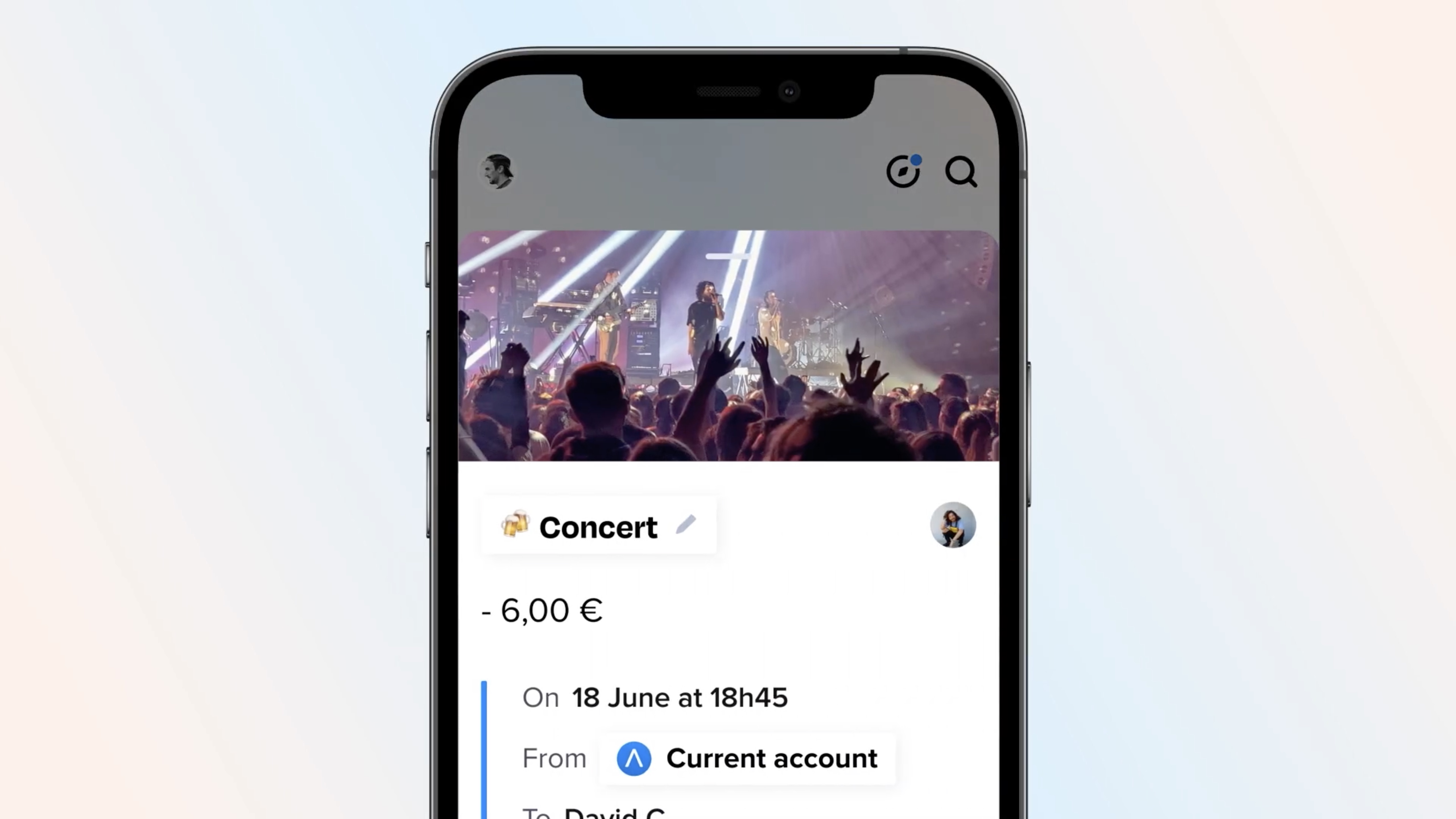
Image Credits: Lydia
Building the foundation for the next 10 years
When I met with Lydia’s co-founders Cyril Chiche and Antoine Porte, they both had read my recent article on Zenly, another popular social app designed in Paris. And they found some similarities between the new Lydia and the new Zenly.
“We just sent a newsletter to our user base that unveils a new chapter for Lydia, laying down the plan for the next 10 years — just like Zenly,” co-founder and Chief Product Officer Antoine Porte told me.
This isn’t a random milestone. Lydia launched the first version of its app nine years ago. “If you count the gestation period, it’s been 10 years,” Porte said.
The company has managed to attract 5.5 million users. And a fraction of them have now decided to use Lydia as their primary account.
“The more we progress in financial and banking services, the more we try to intellectualize the reason why people dislike their bank,” co-founder and CEO Cyril Chiche told me.
“When digging further, you realize how banks have been using technology. They built a beautiful system for interbank activities. You can move money from one end of the globe to the other. It works but it has never been designed for humans,” he added.
This sums up Lydia’s design language pretty well. The team wants to build an app that is “designed for humans”. For instance, someone who has never used a bank app before shouldn’t have to learn about SEPA transfers and IBANs before sending money to a family member.
When you open the updated version of Lydia, the main tab has been drastically cleaned up. It is now an activity feed with your latest transactions. There are two buttons at the top of the screen — receive and pay.
At the bottom of the screen, there’s a new tab bar with buttons that are clearly labeled. You no longer have to guess which button does what.
The second tab shows your accounts — your main Lydia account, your sub-accounts and your bank accounts that you have aggregated in the app. Personal accounts and shared accounts are now separated into two sections.
The third tab lets you access your cards and control them from there. Trading now gets its own tab, separated from the rest of the app. If you rarely open Lydia, it is now much easier to understand where you should tap to access what you want to access.
What is money?
As French entrepreneurs who overthink everything a bit too much, Lydia’s founders keep going back to the definition of the terms they use. “We have forgotten the very reason why money exists because we view money as an accounting tool,” Porte said.
“Money has a meaning. It is either a project or a memory,” Chiche added later in the conversation.
And yet, when people open their bank app, it feels like opening up an Excel spreadsheet. Worse, it often fosters a lot of negative thoughts.
“Your account has only been credited once and everything else is negative operations. When you look at your account statement, you feel like you messed up,” Chiche said.
According to the founders, there’s too much guilt involved with banking. That’s why you no longer see your account balance when you open Lydia. You have to tap on the second tab to view it. That’s also why you don’t see the ‘€’ sign next to every transaction. The company doesn’t want to emphasize the accounting aspect of your transactions.
“The worst thing is neobanks that show you a chart of your balance over time,” Chiche said.
“We need a new definition for money. Money is no longer coins, bills or physical things. That could be the opportunity to go back to the origin — money is what you do with it,” Porte said.
A fintech app or a social app
Each transaction in Lydia could be considered as an event. You can open the transaction card, change the name and add emojis so that it means something to you. For instance, you may want to put your baby’s name on the nursery bill.
Today, the company is going one step further. Users can add a photo to each transaction. That seems a bit odd at first, but Lydia truly believes it has a shot at building the best social journaling app.
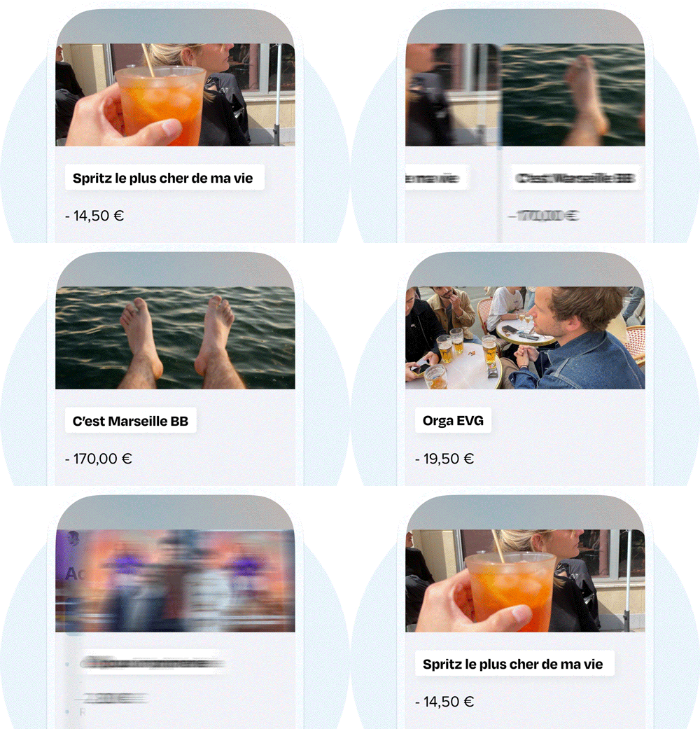
Image Credits: Lydia
You may think that journaling is a thing of the past. But a generation of smartphone users have been journaling every day without even realizing it.
The journal itself has evolved. Instead of buying a fancy notebook and spending 15 minutes every day writing about the current day, people take photos with their phones. The camera roll has become a sort of ubiquitous, effortless journal.
Lydia plans to take advantage of that by augmenting the camera roll. First, your past financial transactions represent a structure. Second, adding a photo makes a transaction much more personal. “If you don’t know what photo you should use, it probably means that it was an unnecessary expense,” Porte said.
Third, it turns each transaction into a potential social post. You can swipe through your transactions just like you would swipe through photos in a photo album. If it’s a shared expense, other users will see the photo. It also creates a virality factor as people could start asking why you’re taking a photo. You could imagine a feature that lets you share a transaction in other apps as well.
More importantly, it opens up a lot of possibilities. A card transaction also happens at a specific place and at a specific time. Lydia could populate the transaction screen with more data about the place you visited. As soon as Foursquare invented checkins, people started talking about checkin fatigue. Maybe the most powerful checkins are your card payments.
It brings us to the main question. Is Lydia a fintech app or a social app?
“Lydia is so simple and fast that it has always been considered as a utility app. But it has always been a social app,” Porte told me.
I don’t think it’s as simple as that. Some users will still use Lydia a few times a month to send and receive money. But a small, highly engaged portion of the user base might see the social potential of Lydia.
We don’t need to come up with a definitive answer right now as the redesign is a clear improvement over the previous version of the app. “People tell us our competitors are Revolut, but they are bankers,” Porte said.
“We want to create the WhatsApp of money instead,” he added.









 English (US) ·