I, of all people, got a fresh new user interface in Instagram the other day. Although the company has not rolled it out to all users yet, the changes seem in line with its intention to move away from its original model of photo sharing among friends, to the one pioneered by TikTok: showing as much algorithmically targeted video content as possible and juicing engagement wherever practical.
The new UI is plainly inspired by TikTok, the way Instagram has routinely been “inspired” by its more innovative rivals, like when they clone-stamped Stories out of Snapchat. In this case they took the opportunity to bring in a few bad habits and troubling choices, all pretty clearly intended to juice their metrics and force users to interact with content on the app’s terms. I asked Instagram about whether and when the new UI would come to everyone and haven’t heard back, but will update if I do.
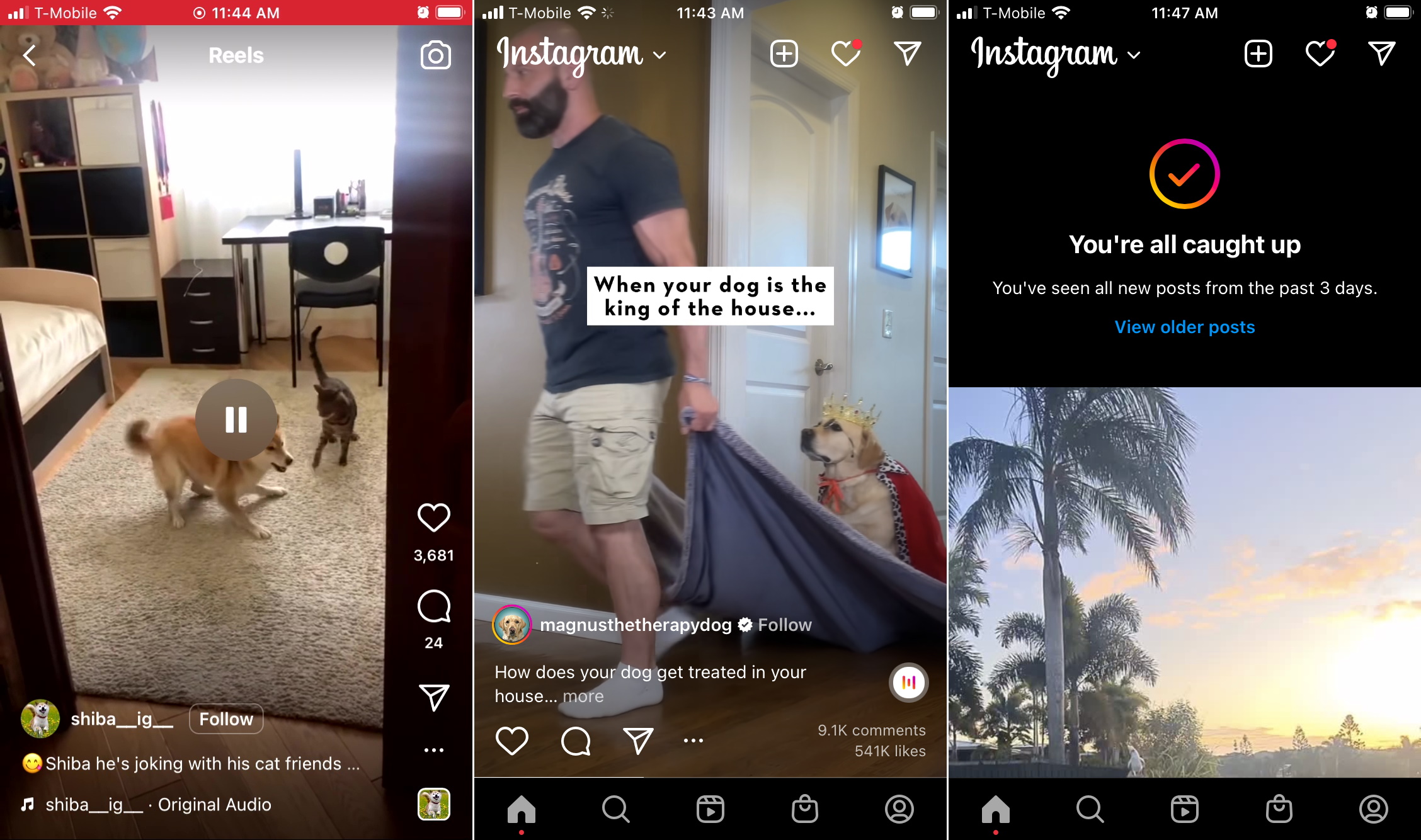
The first thing I noticed was that I could no longer mute or unmute videos — sorry, Reels — by tapping on them. This has always been a user-friendly feature, because millions check their feeds in public places where the raucous cheers or music blitz of a random sponsored video would be an unpleasant surprise for everyone within 20 feet. The safe assumption was that the sound was off until you tapped it.
Now tapping something just pauses or unpauses it. Okay, it still makes it quiet — why is that a problem? Because what they’ve done is added friction to consuming the content in the way you choose. If you want Instagram to be silent, you have to set your entire phone to silent.

Just imagine it’s making noise. You can see at least that I’ve trained my search page well. Image Credits: Devin Coldewey/TechCrunch
I don’t know about you, but my phone is set to vibrate all the time, but that’s not “silent.” I literally have no idea what volume my phone is set to at any given time, because some apps have their own volume levels, others take over the system one, and so on. Sometimes my music comes on all quiet because I turned it down for some game (or, now, for Instagram). How many clicks of the volume down button will it take for me to make this aspiring viral video, probably a TikTok screencap, shut up? Impossible to say. That’s why I appreciated defaulting to silent or at least the knowledge that a single tap would quiet the app without affecting the rest of the phone.
Dark patterns are often less about deception than direction. Here Instagram wants you to be inconvenienced by the process of silencing a video so that you’ll engage more fully with it, maybe Remix the Reel
 by tapping the little round soundtrack button — another Instagram original! Instead of leaving the choice to you, they weight that choice heavily on the side they would like to see more of. It’s all out of the standard Meta playbook for user behavior manipulation.
The other big UI change is a switch from the classic infinite scroll to an item-by-item flipping style, also highly reminiscent of TikTok. Obviously this has been successful in that app, and if you’re focusing on video content, it makes a certain amount of sense: when a video is playing, you want to show the whole frame so you don’t miss the beginning. With images it doesn’t matter nearly as much, you can take your time scrolling by.
Why is this a dark pattern? Well, again, it’s about controlling how you experience the content. In an infinite scroll feed, there is the feeling of it being a timeline of sorts, a long stream that you’re going back through. You could let posts zip by and stop it with your finger when you saw something interesting, or a post by a friend rather than a meme account.
With post-by-post scrolling, you are forced to engage with each image or video completely, if only for a fraction of a second, before moving on. Again, it’s not that you can’t move on quickly but that Instagram is putting its finger on the scale: every piece of content gets a new minimum quantum of engagement now, a level they chose rather than the user. It’s not deceptive — it just makes a choice for you to stop at every item, with no alternative.

Screenshots of UI changes in the Instagram app. I don’t follow any of these accounts, though I like the look of Magnus.
This has especial significance when it comes to ads, which in my new UI reliably appear as every 4th item starting with the second. Posts 2, 6, 10, 14, 18, etc are all ads for me (I’ve asked if this will be universal), and that’s before suggested posts, which I’ll get to in a second. Now consider the previous feature and you’ll find that you can no longer simply zoom past an ad — it literally isn’t possible in the app! Whereas before you might have scrolled by in a hurry, the ad zipping past your view too quick to register, now the ad will, 100 percent of the time, take up your full display until you touch the screen to dismiss it.
Think about that. The change is akin to going from banner to popup — neither one stops you from getting to the content, but one requires you to do something to get past it. Once again, you still can get quickly through your feed, but what used to take one flick of the finger might now take 5 or 6. (Stories already had this, but at least you were just tapping.)
What Instagram is banking on here is that by the time you apply some attention to figuring out what the post is, ad or not, the hook is already set, and you’ve viewed the content long enough to inflate some arcane eyeball metric. And that’s doubly true for “suggested” posts now, which have no indicator except for a “follow” button next to the account name.
Before, it would say “Suggested for you” or something at the top so you knew from the get go that this wasn’t your friend’s dog, it was some doggregator (there are so many!) trying to build an audience. Now you see the content first, then the little indicator that you have never met this account in your life. Fortunately you can still go in the dot menu to “snooze” suggested posts for 30 days at a time — I’m just waiting for them to nerf that too.
One last little thing Instagram does is, when you reach the end of your organic content, the bottom half of the screen is the top half of an algo post. I can’t remember when this started, but it kind of gives the lie to this idea that they want you to take a break when you’re “all caught up.” They plainly want you to continue, which is why “view older posts” is tiny and the default action is “watch algorithmically generated content.” It doesn’t say “want to watch some recommended videos?” it just makes that choice prominent.
All of this pushes Instagram much closer to TikTok on one hand and generally tighter control over the user experience on the other. I understand that the Instagram product team thinks mimicking whatever app is more popular than them at the moment is the way to survive, but the patterns they’ve adopted here are detrimental to the Instagram experience that users know and enjoy. I’m not saying never change, but… maybe don’t change in such an obviously shitty way, you know?


 English (US) ·