Carl Pei seemed practically giddy when he spotted a pretender on the MWC show floor. He posed for a picture status with the phone and fired off a series a tweets. Imitation is the sincerest form of flattery, after all — though most in the industry don’t handle it in such stride. For Pei, on the other hand, it signaled that Nothing was on to something.
Whatever hang-ups one might potentially have with the company’s approach, there’s one thing you can’t really argue: Its entry into the space was a nice jolt to the arm. As someone who has been covering the industry for longer than I care to mention, I’ll be the first to admit that things got a bit boring. Manufacturers painted themselves into a corner, and sales have slowed accordingly.
I won’t go so far as to say the quality of the device was beside the point — the Phone (1) still had to be good to sell units — but Nothing did an excellent job getting people excited, and design was a big piece. Much of the initial buzz around the company was the mystery of what Pei had left OnePlus to create. He’d built up goodwill with a brand that established itself as a solid alternative to bigger players.
However, that brand has since navigated its own growing pains after being absorbed into Oppo. It was the perfect time to embrace scrappy origins and rekindle the direct line to consumers that helped propel OnePlus to success in its earliest days. But Nothing has faced the same existential question that plagues any new entry into a mature category: Why?
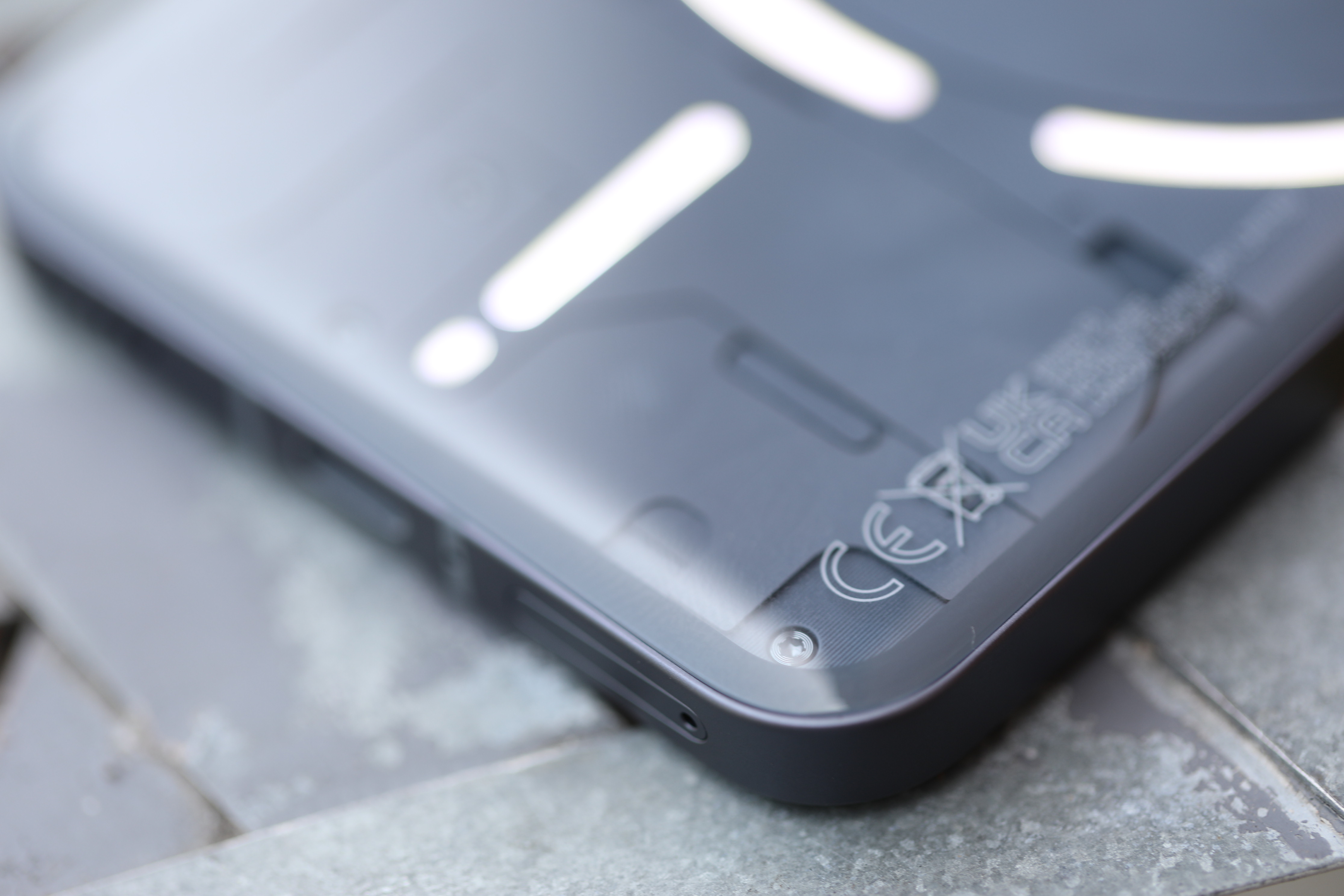
Image Credits: Brian Heater
Aesthetics were — and continue to be — a big part of the answer. The Ear (1) set the stage for the design language that has permeated all products since: transparency, coupled with monochromatic flourish (and the occasional pop of red) and text stylized to look like circuit board etches. It’s industrial, but not cold.
Much of Nothing’s marketing strategy has relied on elements from the fashion and sneaker worlds. Product releases have been celebrated with limited-edition drops, both in pop-ups and the company’s first retail store in London. In fact, as I write this, the Phone (2) is exclusively available in limited quantities at that store and a spot in Manhattan.
The Phone (1) did what it needed to do. It established Nothing in the smartphone category with a solid product. Somewhat ironically, the illuminating glyph design on the rear was the one truly flashy thing about the product. Spec-wise, it was a midtier device, running the Qualcomm Snapdragon 778G+ chip. Nothing wrong with midtier devices, of course, but the product attempted to also serve as a kind of status symbol, like some limited-edition piece of streetwear.
While the Phone (1) was tasked with the difficult job of making a first impression, the Phone (2)’s role may be even harder. Without the same level of novelty to propel it forward, it’s tasked with demonstrating that Nothing isn’t just a one-trick pony. Smartphones are iterative products — supply chains and hardware manufacturing don’t allow for radical reinventions ever year. The Phone (2) needs to broaden the line’s appeal by offering something more than sheer novelty.
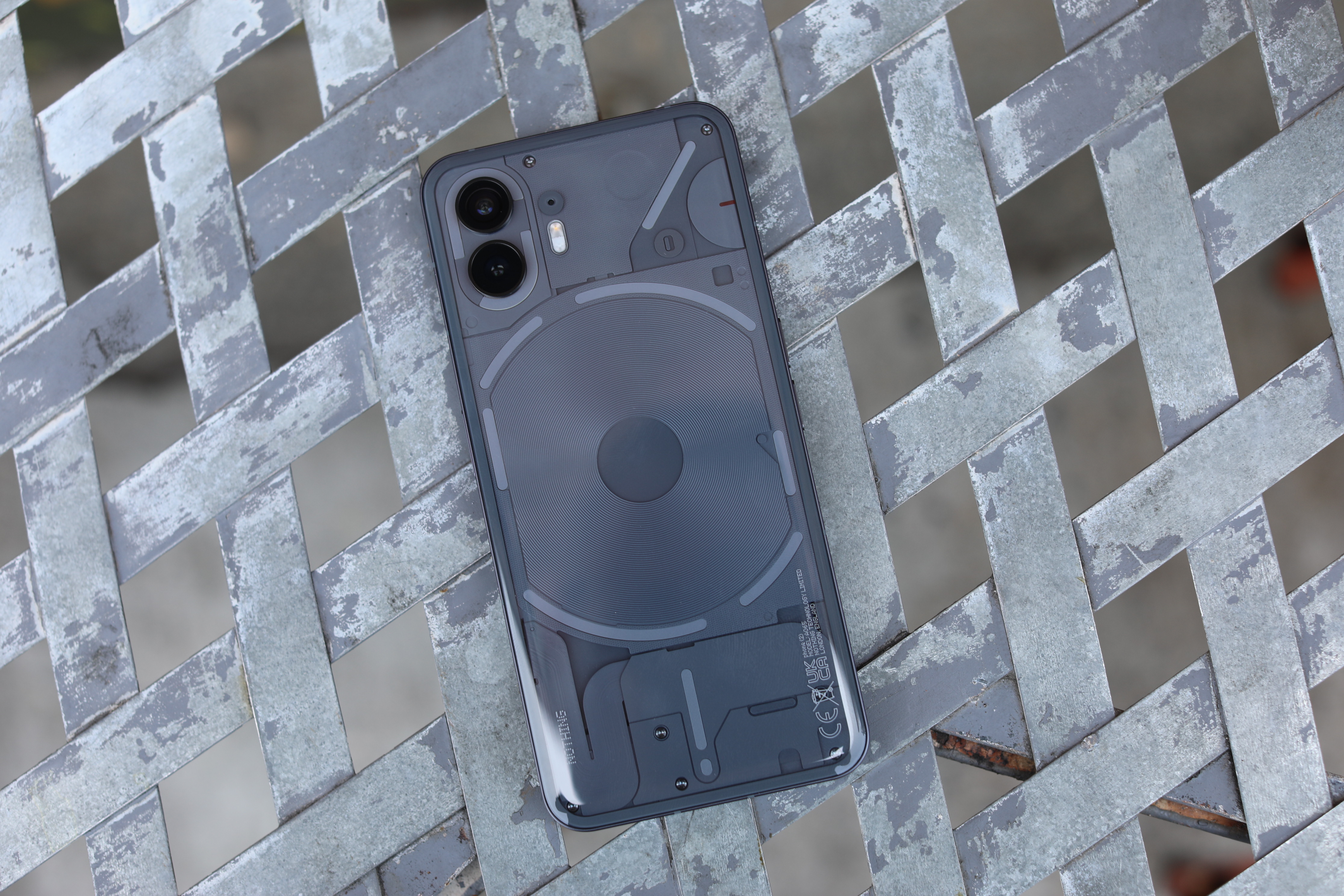
Image Credits: Brian Heater
It’s clear the company internalized feedback around the initial chipset. The truth is that even a midtier modern Qualcomm chip will give you a fine experience. There are certain elements you lose out on, including high-end image processing and AI capabilities, but as a daily driver, it’s perfectly serviceable. I suspect that the Nothing team built the Phone (1) thinking most potential buyers would be unfazed and opted for a more budget-friendly chip in the name of keeping the price accessible.
But the people who pay close enough attention to the industry to track a company like Nothing are often the same people who are concerned with owning the latest and greatest processor. As it stands, Nothing isn’t a large enough company with a big enough reach to make it onto the radar of more casual consumers. That comes with time, money, scale, carrier deals and having a larger retail footprint. Currently most people who encounter the device are the people who go looking.
Back in February, Pei told TechCrunch that the Phone (2) will sport Qualcomm’s flagship 8 series chip. Nothing kept its promise, though it’s still not quite the top of the line. The on-board Snapdragon 8+ Gen 1 was unveiled last May. In November, the chipmaker announced the Snapdragon 8 Gen 2, and Qualcomm is now seemingly overdue for its six-month refresh. It seems likely that the decision was once again due — in part — to pricing concerns.
Opting for an older version of a flagship chip helps a manufacturer avoid hitting flagship prices, which routinely put phones over the $1,000 threshold. The Phone (2) starts at $599. This was OnePlus’ approach for some time, allowing it to produce a very good phone without hitting the sort of exorbitant price points that have helped throttle smartphone sales. Notably, the OnePlus 11 launched in February with the Series 8 Gen 2, priced at $699 — presumably having a manufacturing giant like Oppo in your corner helps.
As scale increases, the pricing will presumably drop along with it, but as it stands, the Phone (2) isn’t priced to truly take on the budget category, if that’s what the ultimate goal is here. But by U.S. phone buying standards, the price point is a reasonable one.
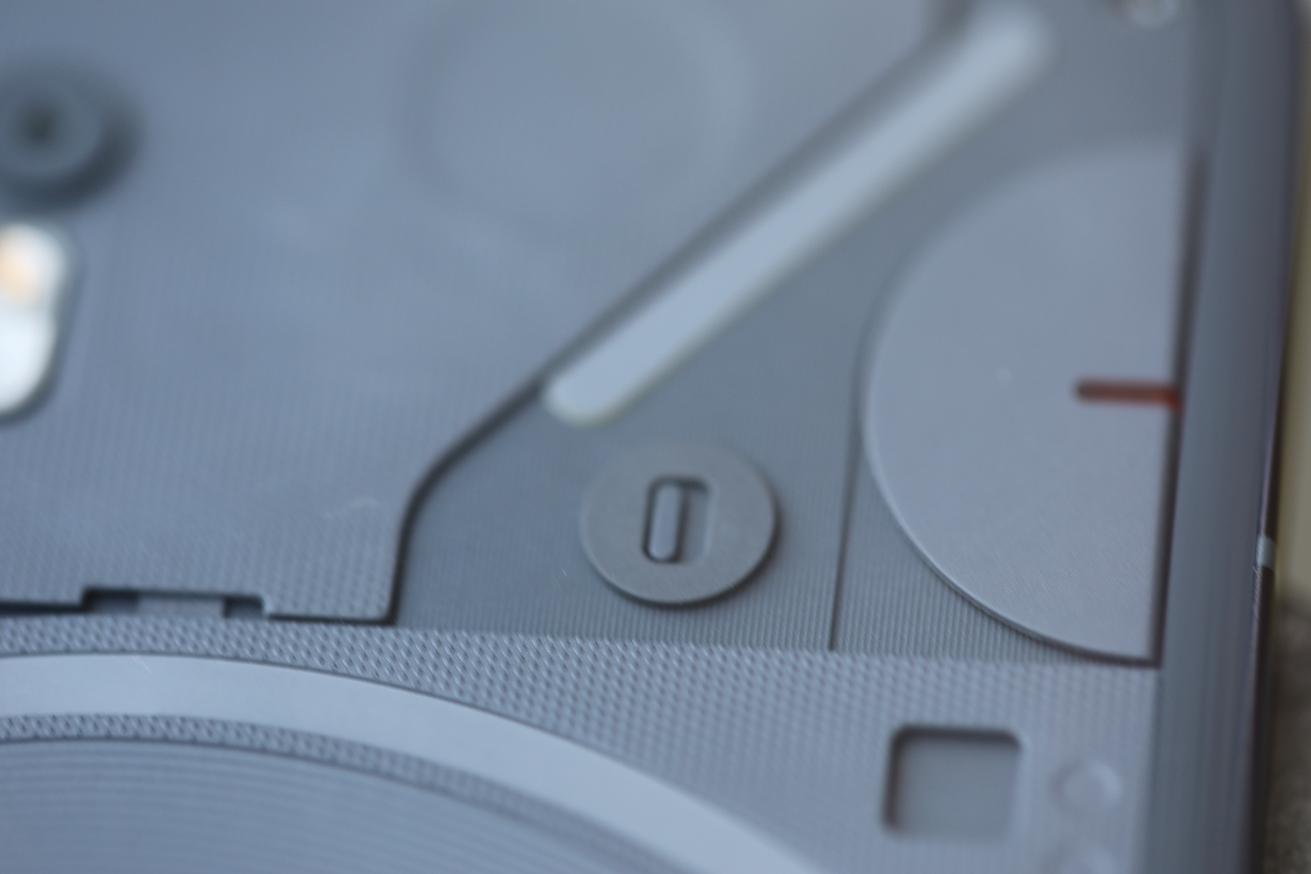
Image Credits: Brian Heater
The other key component upgrade here is the move from a 4,500 mAh to a 4,700 mAh battery. That’s not a huge upgrade, but a slightly larger size, coupled with the more advanced process will squeeze more life out of the system. The phone itself is slightly larger on all sides, moving from 159.2 x 75.8 x 8.3 mm to 162.1 x 76.4 x 8.6 mm, which presumably left a little more room for battery.
In turn, the bigger footprint is almost certainly a direct result of the slightly larger screen, bumping from 6.55 to 6.7 inches. More screen real estate also means a bit higher resolution here at 2,412 x 1080 vs. 2,400 x 1,080. None of this is what you would call a major upgrade, of course.
Very little has changed about the industrial design here. True story: I thought I’d lost the Phone (2) for half a day. Turns out it was sitting on my desk, and I’d mistaken it for an iPhone. Should I have admitted that? Probably not, but we’re already 1,000 words into this thing, so what the hell? Pei has made clear his admiration for Apple and the iPhone, and that’s very much on display with the Phones (1) and (2). Of course, around back is where things get more interesting.

Image Credits: Nothing
The Glyph interface was the one thing everyone talked about on the original model, and fittingly, it’s received some of the biggest hardware upgrades here. The illuminating back jumps from 12 to 33 LED “zones,” which affords the system significantly more customizability. Such customization goes a way toward transforming the feature into something beyond mere gimmick.
Using the phone for the past few days, I was reminded of something Pei told me during an interview at MWC:
I personally think foldables are supply chain–driven innovation and not consumer insights. Somebody invents OLED, and they can make a lot of money, because it’s a great technology. Then after a few years, a lot more companies make that, so they need to lower their prices. So they need to figure out what else they can sell at a higher margin. They develop flexible OLEDs, which they can sell at a higher price.
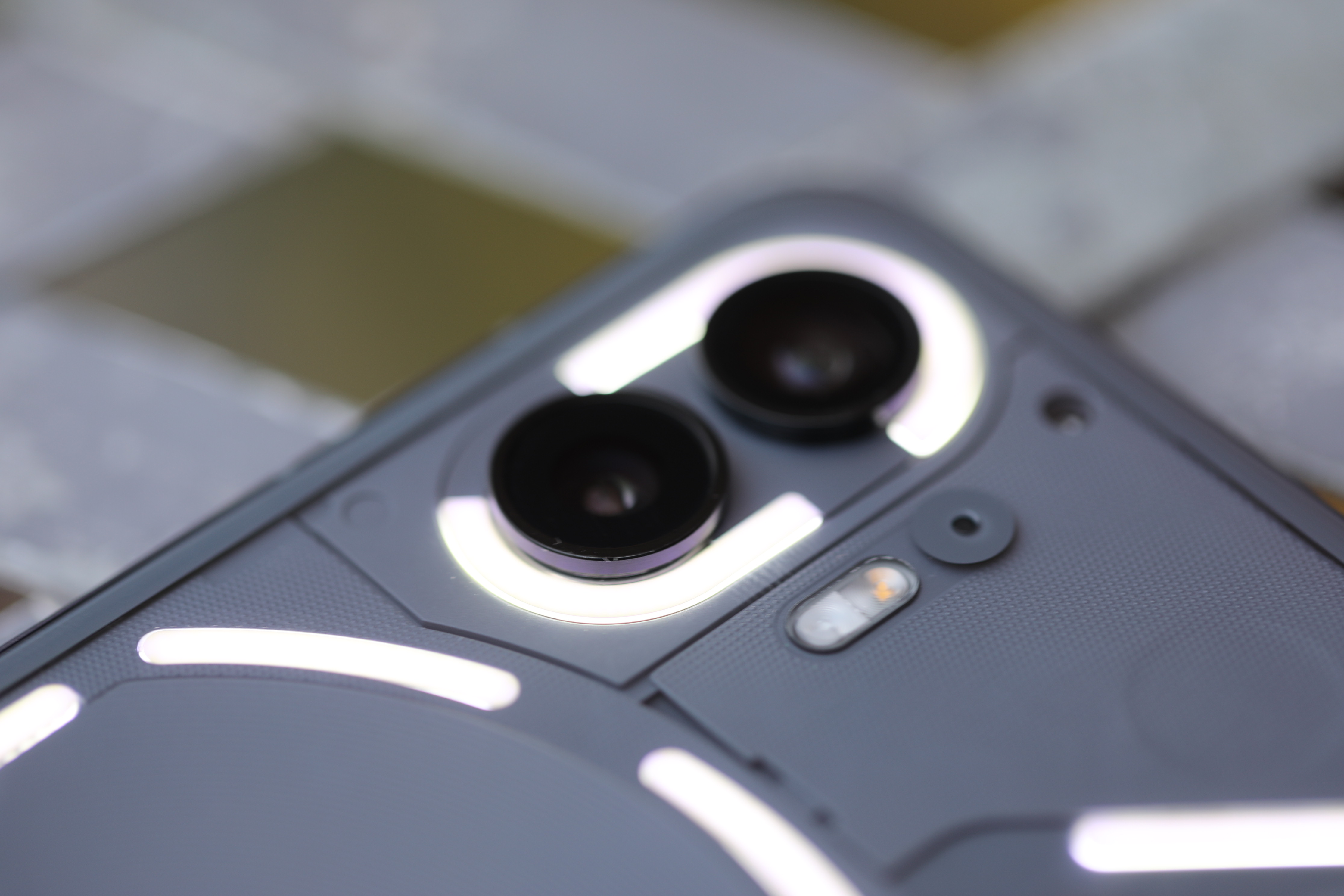
Image Credits: Brian Heater
So where does that leave Glyph? Nothing isn’t a manufacturer, so we’re not talking about a supply chain driver here — but is a back panel that lights up a response to consumer insight or a fun trick to drive interest? Put differently, is it form or function? From my perspective, it’s a feature that began life as form in search of function and managed to find some genuinely useful use cases along the way.
When the phone is flipped facedown, you can silence notification sounds and simply rely on the lights. In addition to notifications, the light patterns can be used as a volume and battery meter and countdown clock. The lights remain all white, but for a small sliver on the right side that turns red when recording video — a nice courtesy for everyone else around.
Are any of these features game changers? Obviously not. But it’s nice seeing the design grow into something more. Nothing has also opened the API up to developers, noting, “The new Glyph Interface also behaves as a progress tracker for your favorite ride or delivery services. Watch the lights countdown to keep an eye on the arrival of your driver or your food order. All without having to be on your screen.”

Image Credits: Brian Heater
Even with nearly three times the LED zones as its predecessors, it’s hard to see the interface adding truly killer applications, but it’s also fun to see what developers come up with. The nicest design change here is one of the subtlest. Moving from a completely flush rear to curved and rounded glass adds a premium design element that does a lot with a little. It just feels nicer.
The other big element the company is pushing here is Nothing OS 2.0. It’s effectively a skinned version of Android 13 that maintains the company’s signature aesthetic. It’s monochromatic, with the occasional red pop that utilizes the circuit board etching style for text, numbers and even some graphics for apps like weather. Think of it as Android’s Material You customization, but specifically for the Nothing brand.
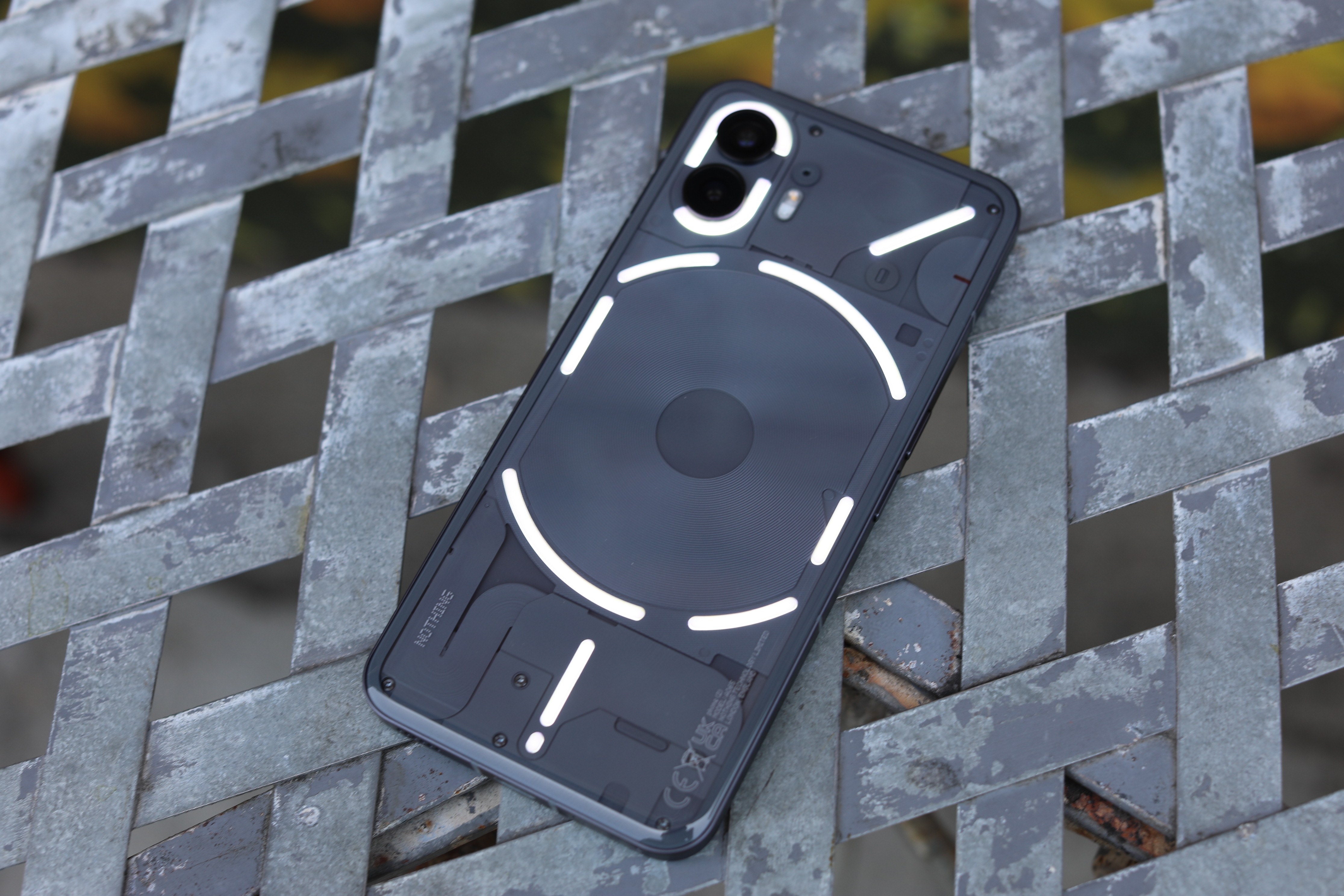
Image Credits: Brian Heater
Many of the bigger apps have matching black and white icons. By default, Slack, Reddit, LinkedIn, Discord and DoorDash all matched, though some bigger apps like Facebook, Instagram and Zoom didn’t. It’s one of those things you really want to be all or nothing, as it were. All in all, it’s some nice design that’s easy on the eyes. If you want something more traditional, you can always opt for the normal icons, but I appreciate the company’s commitment to design consistency here.
Along with the chip conversation, Nothing has also been talking up imaging hardware. It retains a pair of rear-facing 50 megapixel cameras, though the main sensor has been bumped up from the Sony IMX766 to the IMX890. You don’t hear companies name-check their camera sensor that often, but Nothing wants to make it clear that it’s not skimping on components here.
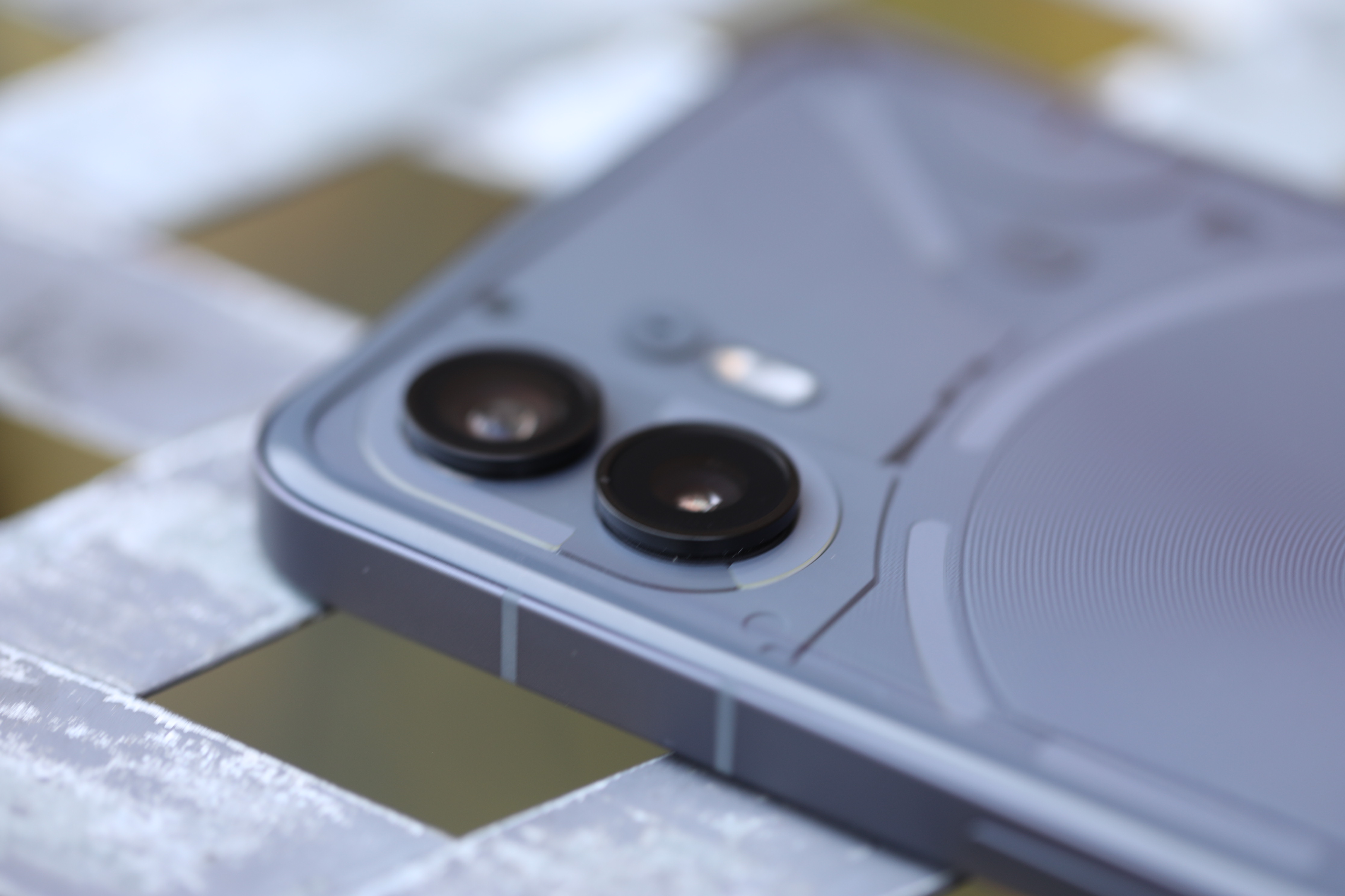
Image Credits: Brian Heater
That’s the same sensor you’ll find on the OnePlus 11 and various other phones from Oppo and fellow Chinese handset maker Realme. The front-facing camera, meanwhile, has been upgraded from 16 to 32 megapixels. Honestly, though, the biggest camera hardware upgrade is the new silicon. Computational photography is such an important element, and the resulting images are better balanced and more vibrant for it.
I was mostly satisfied with the shots. They not exceptional, but they definitely get the job done. In the rough price point ballpark, however, the $499 Pixel 7 wins out. Google has such a massive head start that it’s hard to imagine Nothing truly competing there any time soon. And if imaging is the be-all and end-all of your phone experience, it’s still worth looking into investing in a flagship like the Pixel 7 Pro or various Samsung devices.
[gallery ids="2567479,2567478,2567477,2567476,2567475,2567473,2567472,2567471,2567469,2567468,2567467,2567466,2567465,2567464"]
There’s a saying in the music industry: You have your whole life to write your first record, and 18 months to write your second. Phone (1) established the company in the space, and Phone (2) is about improving the experience, through hardware improvements and an overall refinement to things like software.
All told, the Phone (2) is a solid midtier device. It’s not a flagship killer, and Google’s going to continue to be hard to best at that price point. It’s pricier than its predecessor (£399 — about $460 — at launch), owing to some key hardware upgrades. If you leapt in and bought the Phone (1), don’t worry, there’s not enough here to justify spending another $500 a year later.
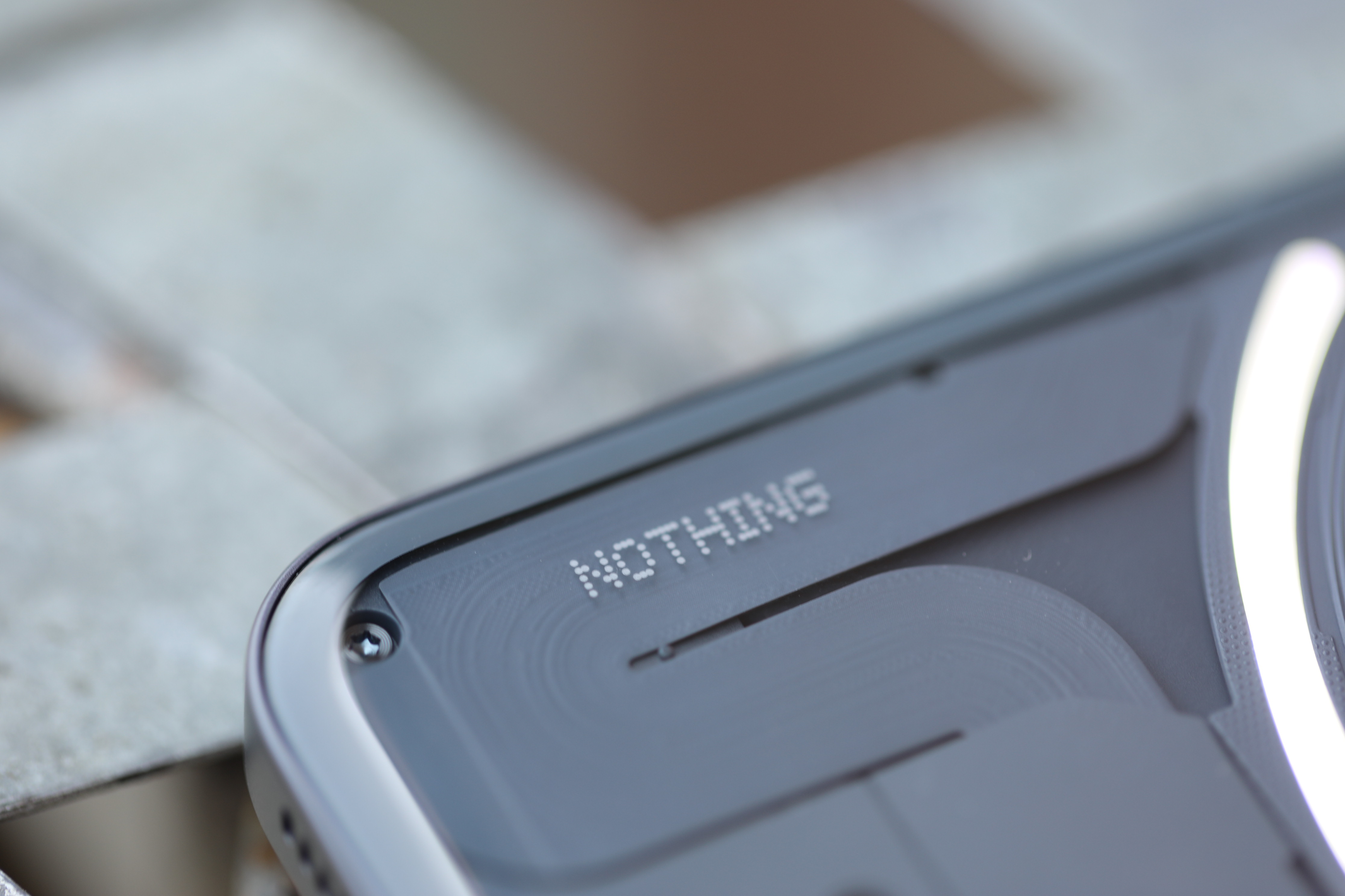
Image Credits: Brian Heater
While there’s nothing earth-shattering here, there’s also nothing wrong with delivering a solid midtier device — especially when doing so with style.
Nothing Phone (2) review by Brian Heater originally published on TechCrunch








 English (US) ·