 3 years ago
433
3 years ago
433
I’m an absolute sucker for a well-designed pitch deck, and as an animal lover, it’s hard not to immediately fall in love with that adorable dog on the cover slide.
Call me ludicrously biased, but first impressions count, and so I picked this deck in part so I would have an excuse to look at totes adorbz animals for a few hours.
Today’s pitch deck teardown is the deck tele-veterinarian company Dutch used to raise its $20 million Series A that Aisha reported on earlier this year.
If you love these pitch deck teardowns and you want to submit your own, here are the details for how to do that!
Slides in this deck
- 1 – Cover slide
- 2 – Founder slide (marked as “The Product”)
- 3 – Market slide (marked as “The Problem” at the top of the slide)
- 4 – Problem slide (also marked as “The Problem”)
- 5 – Market opportunity slide (also marked as “The Problem”)
- 6 – Market slide (comparing pet health to human health)
- 7 – Product slide
- 8 – Competition slide (marked as “The Opportunity”)
- 9 – Product road map slide (marked as “The Opportunity”)
- 10 – Problem slide
- 11 – Competition slide (marked as “The Problem”)
- 12 – Competition (marked as “The Differentiator”)
- 13 – Traction slide (marked as “The Team”)
- 14 – Traction slide (marked as “The Opportunity”)
- 15 – Why Now slide (marked as “The Opportunity”)
- 16 – Market Validation slide (marked as “The Opportunityv)
- 17 – The Ask, showing that Dutch was trying to raise $15 million (marked as “Future Ambitions”)
I’m pleased to report that I counted 14 photos of adorable animals. See, how could one not love this job? I literally get paid for counting pictures of animals. Thank you, TechCrunch.
3 things to love
This deck was designed to raise $15 million (as per slide 17), and as we reported, the company went on to raise $20 million. It’s easy to see why; the deck tells a coherent and extremely compelling story for why the company needs to exist and identifies an enormous opportunity in a colossal market that’s beyond ripe for disruption. Awesome visual storytelling combined with great traction metrics and a purr-fect set of photos; there’s a lot to love here.
Extraordinary storytelling
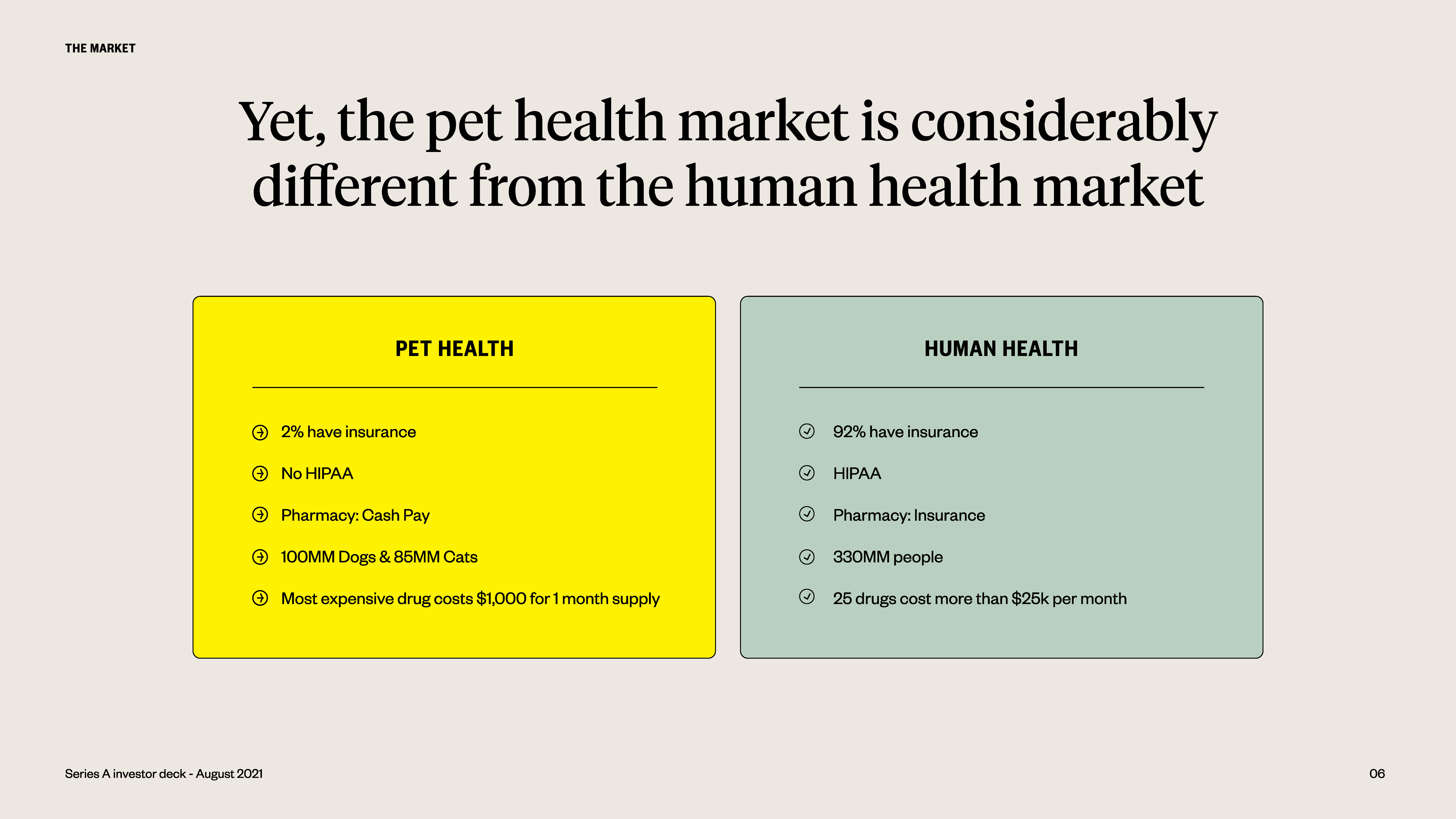
[Slide 6] Dutch makes a number of compelling points about why this is a market worth taking a closer look at. This is a particularly powerful one. Image Credits: Dutch
Slide 6 (above) is particularly powerful; in a world where not everyone has good visibility on how animal health is treated, the company draws an elegant parallel between human and animal health care. I haven’t seen the pitch, so I’m not sure why HIPAA is mentioned here (though I suspect it’s to note that pet care won’t face the privacy and regulatory hurdles that a human-centered product would). I’m also not unsure why the company makes the comparison between human and animal drugs, but as an overall storytelling element, this slide is genius: Draw a parallel between something literally every person in the U.S. has experience with and an emotional connection with, and explain the differences.
Big now, huge in the future
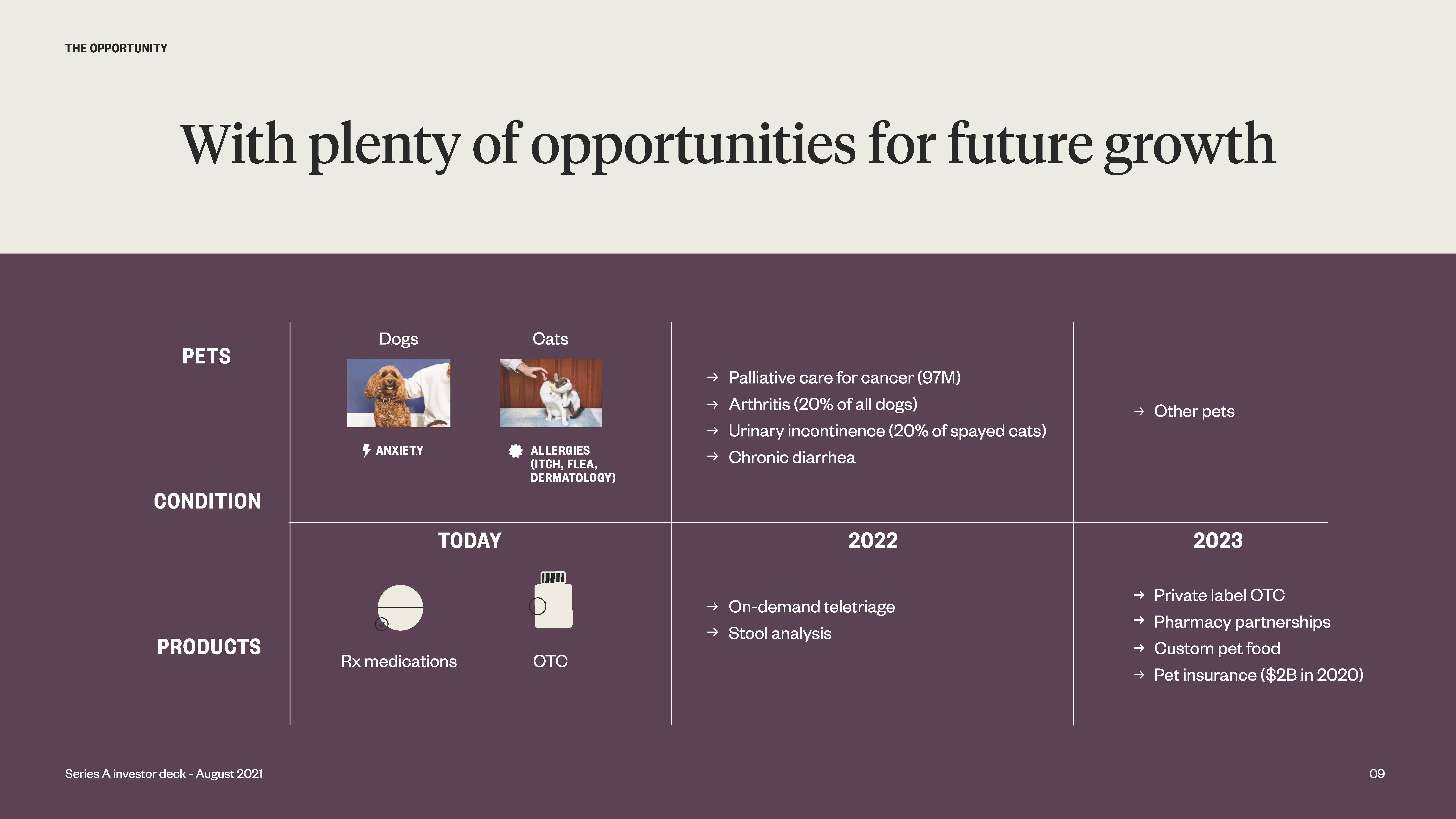
[Slide 9] A great story about a growing market. Image Credits: Dutch
It’s a nice touch to see that the company has a steady growth plan, too. In markets like these, it will perennially be tempting to get lured in by new opportunities. By having a clear and focused road map, the company instills confidence that it knows to grow in a more predictable way, without getting distracted by every squirrel that crosses its path.
Traction galore
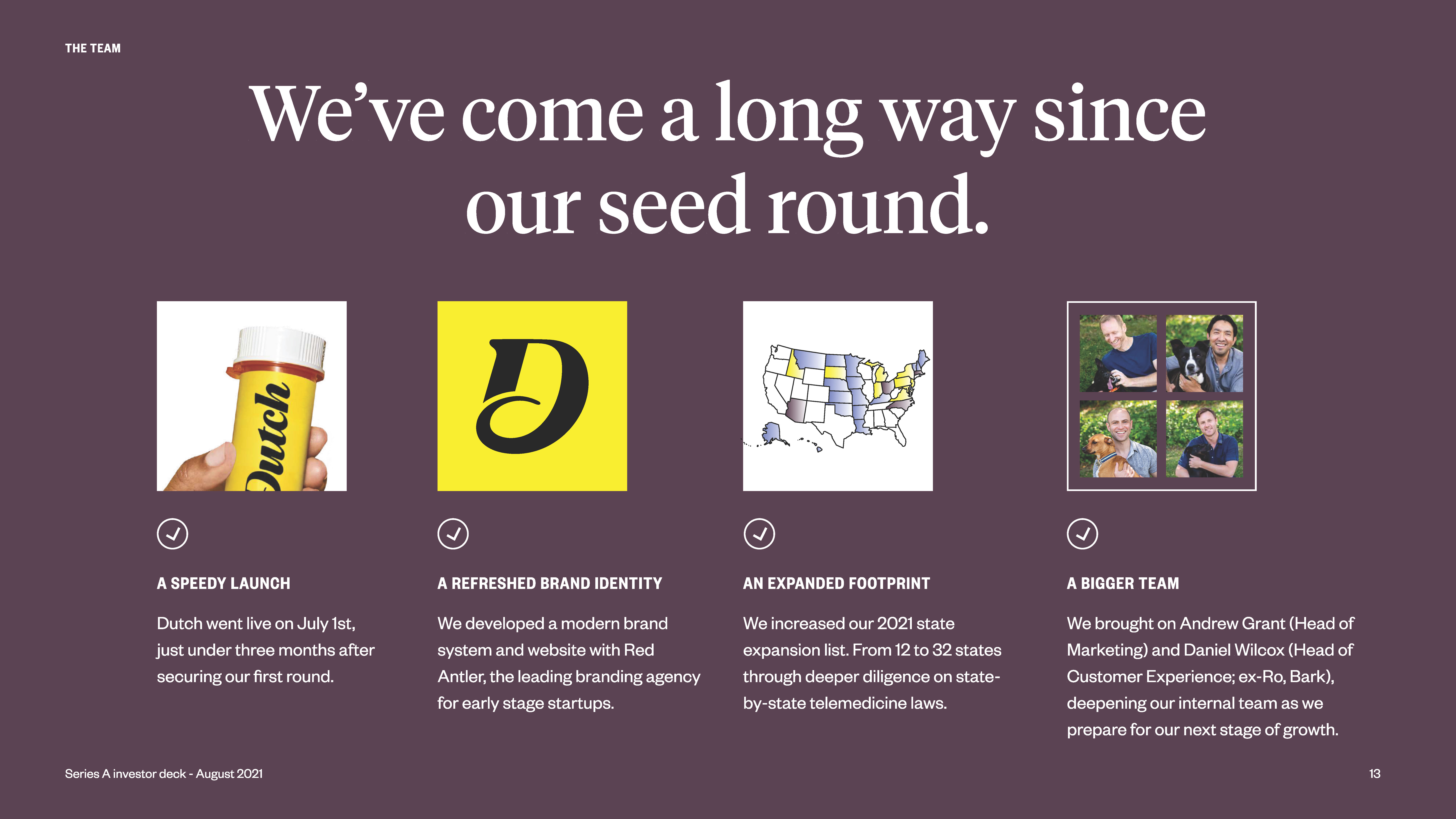
[Slide 13] Dutch has a number of traction metrics that shows what it has done to date. Showing major milestones is helpful. Image Credits: Dutch
I imagine the founders can use this slide to tell a number of stories about the inception and growth of the company. The speed to launch is unusual, and a great thing to brag about. Working with leading agency Red Antler is inside baseball, but it signals that the company really knows how to spend money on building an extraordinary direct-to-consumer brand.
Dutch.com can’t have been a cheap domain, but the whole brand is absolutely on point. As an investor, I’d be worried for all of 10 seconds whether the company invested too heavily into its visual identity, then put it out of my mind when I see how distinctive and tight the brand is. This is how you build a DTC brand with oomph — and it shows in the story, in the visual language, and in all the other content the brand is putting out there. Extraordinary.
In the rest of this teardown, we’ll take a look at three things Dutch could have improved or done differently, along with its full pitch deck!


 English (US) ·