I get a lot of pitch deck submissions for this TechCrunch Pitch Deck Teardown series from people who are raising friend and family rounds, and I mostly pass on them. Often, these decks aren’t very good, but it’s important to remember that they don’t have to be.
For a small round (say $200,000 or below), most well-connected entrepreneurs will be able to find a group of people who believe in them and are willing to invest in them. It’s not about the product (there typically isn’t one), and it’s not about the solution (the company is still iterating).
Such investors are usually betting on two things:
- Is this market big enough, and is the problem worth solving big or pertinent enough to give this company a possibility of success?
- Are the founders the right people to solve this problem? Do they have the connections, skills or experience that gives them an unfair advantage?
Here’s the truth: When considering very early stage companies, if you can’t say “Yes” to both of those questions with 100% certainty, you shouldn’t invest. If the market isn’t big enough, don’t invest. If the founders are smart, friendly and amazing, but they don’t have something special that gives them a head start, don’t invest.
It was against that backdrop that I received the pitch deck for Palau Project. Its founder, Jerome Cloetens, is a professional kite surfer (!) with an economics degree and an MBA, and he’s taking on climate change.
Let’s take a closer look at how all those pieces come together in a pitch deck.
We’re looking for more unique pitch decks to tear down, so if you want to submit your own, here’s how you can do that.
Slides in this deck
This pre-seed deck has 22 slides, but it could probably have been 10 slides or so. That said, it looks good, and although it jumps from topic to topic a little, I can see how the presentation would take shape. Cloetens notes that the slide deck has been slightly updated since the fundraise, and he mentioned it’s “not precisely as Pitched; some of the design and small content changes (Such as our traction metrics) have been updated.”
- Cover slide
- Problem impact slide
- Problem slide
- Solution slide
- Product slide
- Product slide
- Product slide
- Challenge slide
- Value Proposition slide
- Business model slide
- Market size slide
- Market slide
- Traction slide
- Metrics slide
- Milestones slide
- Team slide
- Founders slide
- “Seed round” Interstitial slide
- Mission slide
- The Ask slide
- Milestones slide
- “Equity for thrifthers” closing slide
Three things to love
As I mentioned in the intro, this is a pre-seed deck. As per slide #20, the founders were trying to raise $500,000, and they closed on about $125,000. That isn’t entirely uncommon at early stages. Slightly later on, your plan needs to match the funds, which needs to match the milestones you’re trying to hit.
At this stage, “I just need some money to prove what we are trying to do” will work, and if the angel investors think it makes sense, you’ll raise money.
Simple product, testable now
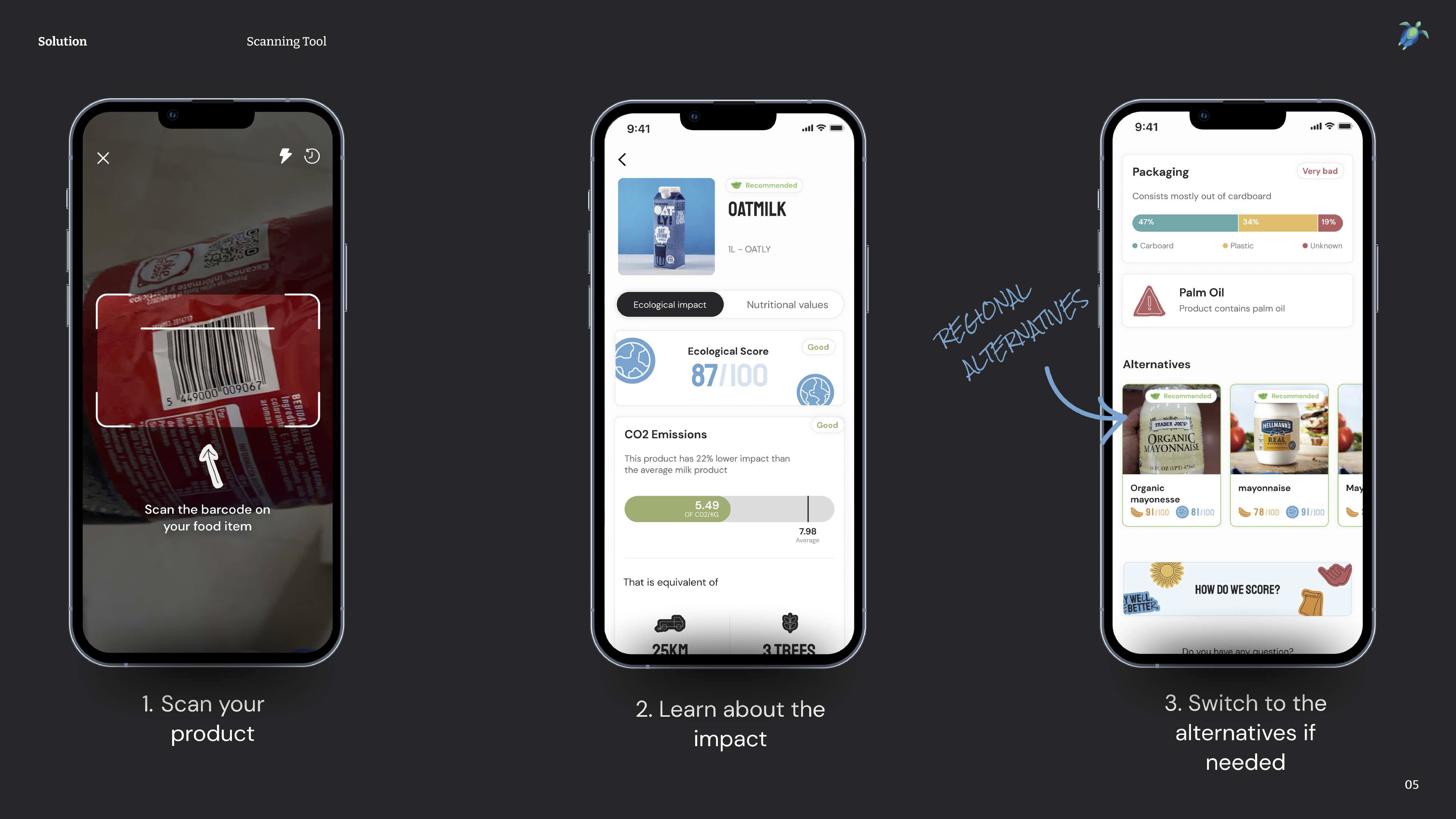
[Slide 5] Palau Project’s product is super simple, but the power will be in the data. Image Credits: Palau Project
I mentioned earlier that all that matters is the market size and team, and I’ll get to that in just a moment. For now, I was really impressed at how simple the idea is, and how easy it is to imagine this in use. Scan a barcode, get information about a product and get nudged towards products that have less impact on the climate.
As an investor, I would immediately have three questions:
- How good is the database and how many products are captured there?
- Will people actually use this when they are walking around, shopping?
- This use case appears to be in-person, but the business model refers to a commission. How would the manufacturers know that a user has changed their behavior as a result of using an app?
You can learn two things from this slide: Make your product demos this simple if you can — it’s easy to understand, visual and impactful. The second step is to tie it to your value propositions: What’s in it for the consumer? What’s in it for the product manufacturers? What’s in it for your company (i.e. how does this help you gain or retain customers, and how does it help you generate value)?
Traction!

[Slide 13] A product this early with traction is beautiful. Image Credits: Palau Project
Again, the slide raises questions for me:
- Scans are great, but I want to know what percentage of those scans were successful (i.e. had products in the database). If users scanned 10,000 items and ended up with 600 hits, and 9,400 “We don’t know this product,” that will make a lot of users turn away immediately.
- 25-30 new users per day is impressive, but show us a graph and the total number of sign-ups.
- TikTok videos are cool, but that’s a vanity metric that means nothing unless it moves the needle on the business side. Did the video result in downloads? More scans? More inquiries?
What you can learn from this slide as a startup is to think about the story you are telling with your metrics, because you could be telling the wrong story, or it could raise more questions than it answers.
Pretend to be a VC for a moment, and ask yourself: If a company told me these numbers, what caused the numbers to happen, and what do they tell me about where the company is going?
Elegant value proposition
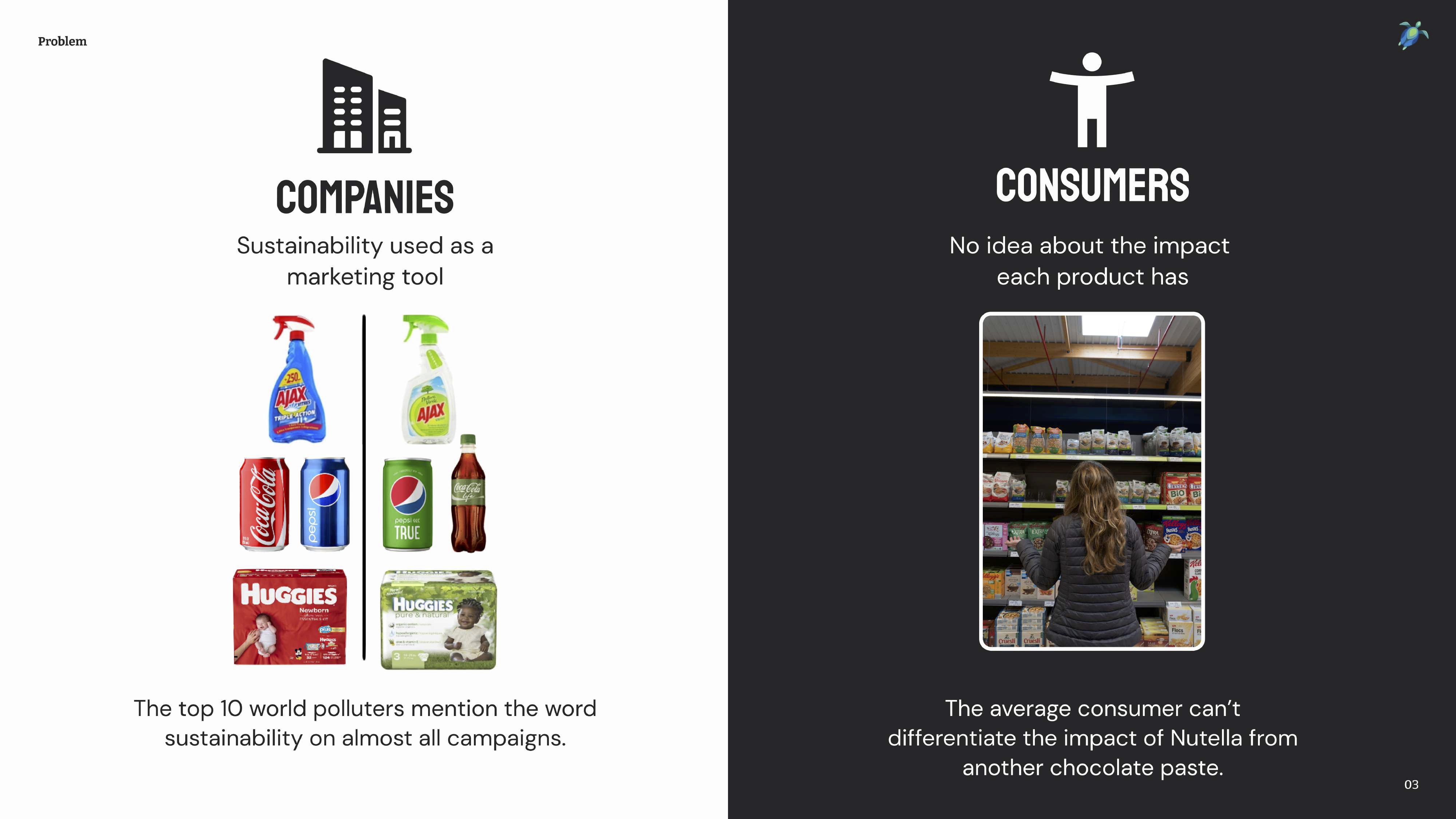
[Slide 3] It’s hard to be a consumer who cares. Image Credits: Palau Project
So what is a poor consumer to do? Palau Project’s take on this is a masterful set-up to a pitch and a wonderful way of opening the door to a story.
This slide is a great example of a good opener that can help drive the conversation forward. Having a clear value proposition or painting a picture for your raison d’etre is a great way to engage your listeners.
Remember when I said “team” and “market” are the two most important parts of a pre-seed slide deck? You’ll notice the absence of either in this “things I loved” section. There’s a reason for that, so let’s take a closer look at what could be improved in Palau Project’s pitch.
Pitch Deck Teardown: Palau Project’s $125k pre-seed deck by Haje Jan Kamps originally published on TechCrunch












 English (US) ·