Hardware startups have a serious disadvantage over SaaS companies: Once you ship, it’s somewhere in the hard-to-impossible range to make changes to the product. That means you’d best get it right. But knowing what to ship can be challenging. Prelaunch.com first caught my eye at CES in Las Vegas this year, where the company had a “wall of flops”: products that were manufactured but didn’t find commercial success.
Earlier this year, the company raised a $1.5 million seed round, and I already talked with the company’s founder about what it takes to de-risk hardware products. As part of that interview, I managed to talk the team into letting me take a closer look at the pitch deck it used to raise the $1.5 million.
We’re looking for more unique pitch decks to tear down, so if you want to submit your own, here’s how you can do that.
Slides in this deck
- Cover slide
- Summary slide
- Market context slide
- Problem slide
- Solution slide
- Problem with the existing solution slide
- Product slide 1
- Results slide
- Product slide 2
- Product slide 3
- Product slide 4
- Vision slide
- Value prop slide
- Traction and metrics slide
- Business model and pricing slide
- Market trends slide
- Why now slide
- Team slide
- The Ask slide
- Contact us slide
Three things to love
Prelaunch obviously has a very clear idea of where it wants to go, and it presents that beautifully in its slide deck. At the same time, the company makes some pretty elementary mistakes, and the deck is missing some important information. Still, there’s a lot to love here, so let’s dive in and take a look.
Share the win
On Slide 8, the company shows the measured efficacy of what it does, essentially suggesting that it has developed a crystal ball of sorts.
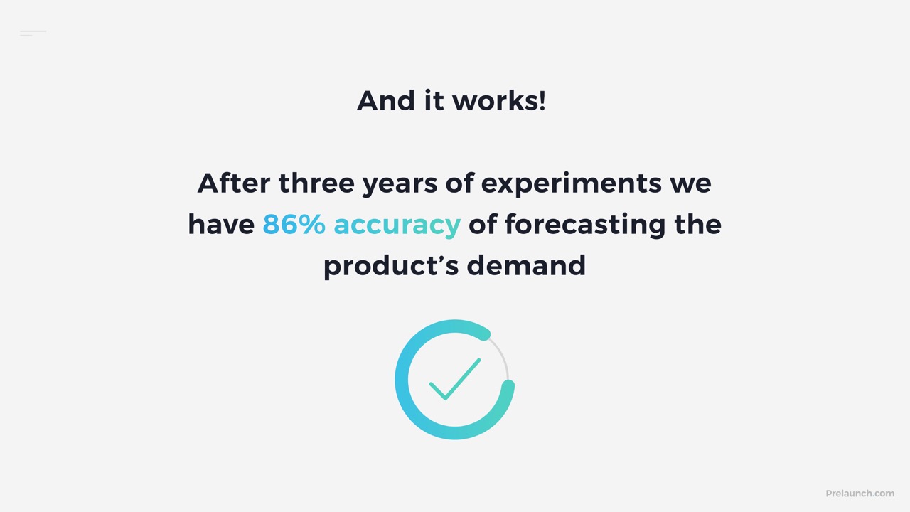
[Slide 8] Being able to predict how much demand there will be for a product with more than 85% accuracy is a hell of a feat. Image Credits: Prelaunch
In Slides 1-7, Prelaunch sets up its problem space and the challenges it is addressing in the hardware ecosystem. On this slide, it brings it full circle, claiming that what it is doing works extremely well. To hardware manufacturers and the people who know how they work, an 86% accuracy of product demand forecasting is as good as it gets; it may as well be a crystal ball. This is an incredibly powerful claim that goes a long way toward confirming that the company is building something that may well be an indispensable tool for hardware manufacturers.
When you are putting together your own slide deck, think about whether you have a similar metric you can refer to, one that illustrates how much better your customers’ lives will be if they use your product. It’s a great storytelling tool — if it stands up to scrutiny.
A bold vision
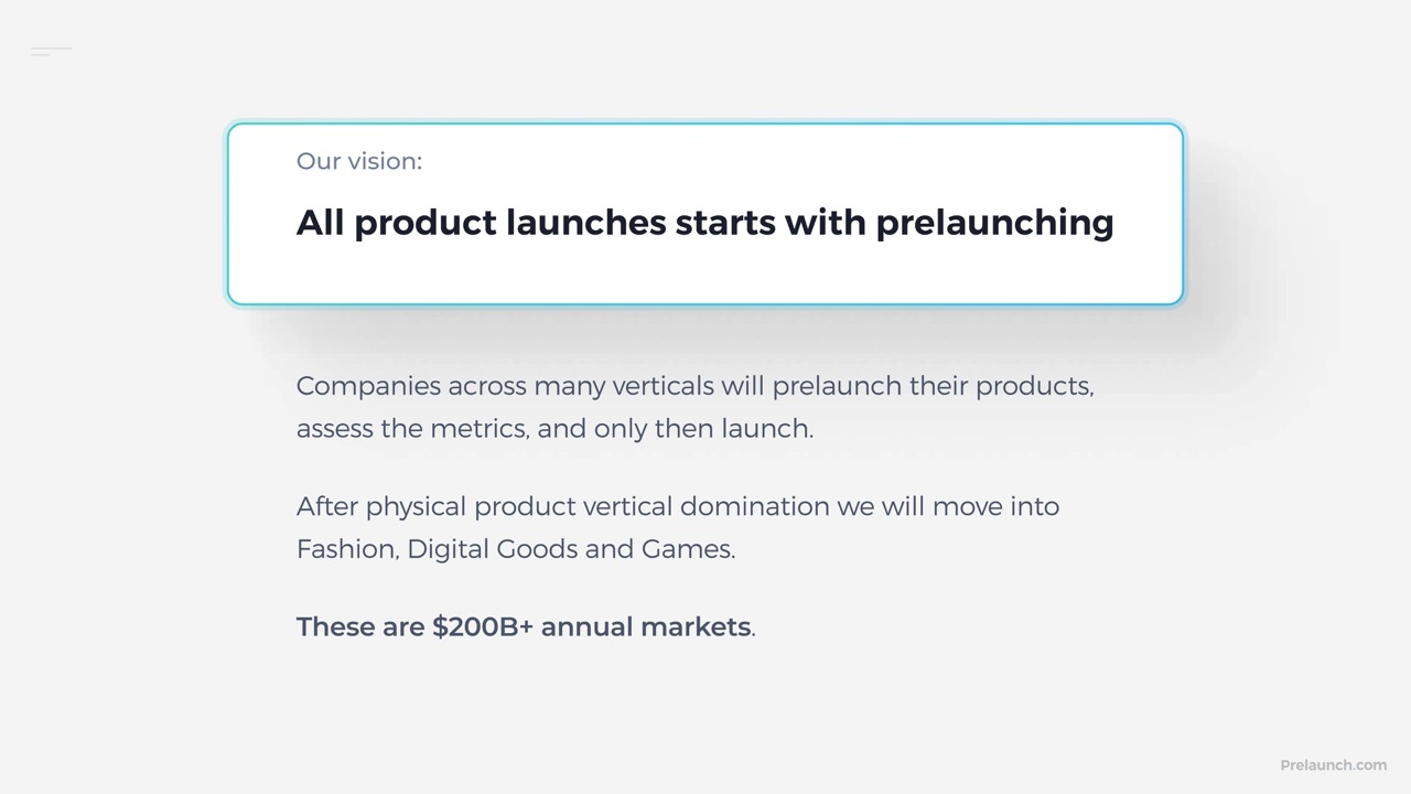
[Slide 12] Plenty of space to grow. Image Credits: Prelaunch
Show, don’t tell

[Slide 11] Showing what the tool does is helps explain why it’s useful. Image Credits: Prelaunch
This part of the story is very show-don’t-tell, and it describes a couple of important things about the company and its product: It’s able to create complex dashboards that convey large amounts of information simply, and it’s able to build a product that’s intuitive and actionable.
Traction galore!
I usually only add three things I like, but I had to include this slide as well …
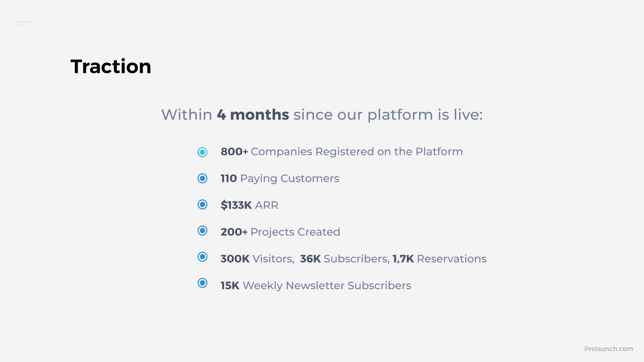
[Slide 14] In the four months since launch, Prelaunch has seen incredible growth. Image Credits: Prelaunch
Pitch Deck Teardown: Prelaunch.com’s $1.5M seed deck by Haje Jan Kamps originally published on TechCrunch










 English (US) ·