Back in August, our own Ron Miller covered the $6 million seed round of Spinach, a company that’s building out its meeting tool designed specifically for engineers using agile methodology to run stand-up meetings online.
It caught my eye at the time: There is no shortage of meeting tools, and I was curious about what made the company stand out. Today, our itch gets scratched: Spinach shared its pitch deck with TechCrunch for a closer look.
We’re looking for more unique pitch decks to tear down, so if you want to submit your own, here’s how you can do that.
Slides in this deck
Spinach raised its round with a tight 10-slide deck that’s missing some important information (we’ll get back to that in the “Three things that could be improved” section), but the included info is extraordinarily well laid out and organized. The team says it submitted the deck exactly as it was used in its investor pitches.
- Cover slide
- Team slide
- Problem slide
- Mission slide
- Product slide
- Traction slide
- Customers slide
- Investors slide
- 18-month plan slide
- Thank you slide
Three things to love
I love the 10-slide deck’s brevity; I think they could have raised money with just two or three slides, so let’s start with the strongest one:
Traction, traction, traction
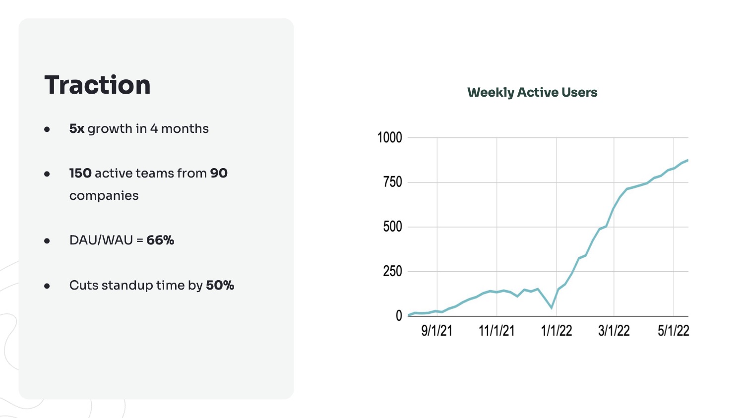
[Slide 6] The Spinach traction slide is a beast. Image Credits: Spinach.io
Now, the growth is impressive, but it isn’t exponential. Beginning in early March 2022, it flattened out a little, and as an investor, I would want to dig into why that might be.
The other potential gotcha here is that the company is graphing weekly active users. That’s an important graph, of course, but the company fails to tell the story of its business model. In other words, from the deck alone, it isn’t clear whether active user numbers are directly tied to revenue (checking out the company’s pricing page, however, it seems that it is, which makes me wonder why it doesn’t just graph revenue here).
Still, traction is traction, and if the revenue growth is in the same general ballpark as the daily and weekly active users, I’m unsurprised to see the company raised money.
The thing you can learn from this slide as a startup is to really lean into your metrics. If you’ve got ’em, flaunt ’em.
Great mission and solution
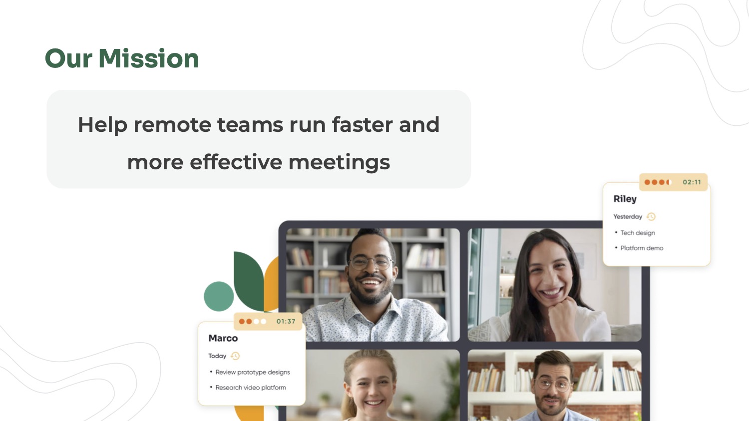
[Slide 4] That’s how you set a mission. Image Credits: Spinach.io
Spinach’s mission slide is basically its “solution” slide as well, and it very clearly states the reason for the company’s existence: helping “remote teams run faster and more effective meetings.”
I’d nitpick a little here, because the product (for now) is focused on integrated design and development teams running the scrum process — there are many other teams that work remotely for whom this product may be a less perfect fit — but I love the clarity of this.
As an investor, I’d be curious as to what the company is planning: Will it be broadening its focus to serve all remote meetings, or will it further narrow its goals to be an even better tool for scrum teams? What I wouldn’t have given to have a tool like this when I became a certified scrum master back in 2007.
This slide shows that it’s OK to simplify. Yes, it might be a little vague, but that might be necessary to make the story flow more easily and to help potential investors understand the direction you’re going.
Interesting take on the product slide

[Slide 5] Spinach embedded a video in its presentation rather than doing a live demo. Image Credits: Spinach.io
If you’re going to raise $6 million, you should spend the extra few hours to cut a video that speaks directly to the investors. It’s a small but important thing.
Finally, there’s a red flag built into the core of the company. It is essentially an extension for Zoom, which is an inherent risk. Now, it’s unlikely that Zoom will build Spinach’s features into its core platform, but it’s not hard to imagine that Zoom might make changes to its platform that puts Spinach’s business model at risk. Not a huge risk for Spinach specifically, but my general advice stands: Build a company, not a feature.
In the rest of this teardown, we’ll take a look at three things Spinach could have improved or done differently, along with its full pitch deck.
Pitch Deck Teardown: Spinach.io’s $6M seed deck by Haje Jan Kamps originally published on TechCrunch










 English (US) ·