Large supermarket chains have their own purchasing and logistics functions, but there are thousands of small, independent grocery stores and chains. They typically don’t have the benefit of the specialized software and tech to help make everything run smoother, but that’s where Vori saw an opportunity.
The company agreed to share the pitch deck it used to raise a $10 million Series A so I can take a closer look. (It also wrote a bit more about the fundraise on its own blog.)
For this pitch deck teardown, it’s helpful if you have a bit of context for why Vori makes sense as a business, and it’s pretty awesome to see its founder outline how the company works — and how he thinks about building a piece of B2B software that “is as fun to use as Candy Crush.” Below is a five-minute video that tells the story beautifully. I only watched it after I did the pitch deck teardown so as to not let my critique be affected by the video, but it’s good enough to watch before or after should you want to dip a little bit deeper into this particular industry.
We’re looking for more unique pitch decks to tear down, so if you want to submit your own, here’s how you can do that.
Slides in this deck
Vori shared 13 slides, redacting a little bit of information.
“We removed some in-the-weeds data about growth loop conversion metrics,” the team told me, “along with sales cycle/revenue traction.”
- Cover slide
- Mission statement slide
- Vori-at-a-glance — (KPI slide, lightly redacted)
- “We understand grocery” — interstitial slide
- “Our market: Independent Grocery Chains” — market slide
- “Grocery stores still run on pencil and paper” — problem slide
- “How these stores operate today” — problem slide
- “Suddenly, COVID changed everything in grocery” — “Why now” slide
- “Meet Vori, the all-in-one grocery back office” — solution slide
- “What retailers are saying” — market validation slide
- “The largest undigitized retail segment on earth” — market size/TAM/SAM/SOM slide
- “Competing against legacy systems” — competition slide (redacted)
- “Our team was born for this” — team slide
Three things to love
When I recently talked to the DocSend team about what the most important slides are in a deck, they shared that the summary slide is starting to be more and more important. At the time, I was curious about finding a good example, and lo and behold — Vori comes along with a great one:
A tight mission

[Slide 2] Straight out of the gate with oodles of clarity. Image Credits: Vori
I love a good summary slide. A lot of people put it on the cover slide, but Vori takes a different approach — the first two slides set the stage for what the company is doing. The cover slide is at the top of this post and just reads “The OS for Grocery” with a few keywords, designed as tags (“order management,” “inventory management” and “analytics”). The second slide further rounds out the level-setting for what the company does: “Vori is a vertical SaaS solution for local and regional supermarket chains.”
In only a handful of words and a photo, the company makes it very easy for investors to get a high-level overview and some decent context for what they’re about to look at. That has several benefits: If investors are scared by groceries, inventory management, SaaS or regionally focused businesses, they can walk away after seeing just two slides.
The only thing I would have added to one of these two slides is a hint at the progress and size of the round. Something like “We have X customers and are raising a Series A” or even just the words “Series A” help give an indication of the order of magnitude.
Clear market size
One of the most important things you have to show VC investors is whether the company is “venture scale.” In other words, is it possible for an investor to make a half-decent return on investment? (“Half-decent” in this context is a lot more than you might think. Angel investors have very different expectations than VCs do). One of the big drivers for that is how big the market is.
Pitching a wrong-sized company to a VC shows that you don’t understand how the asset class works. Vori elegantly sidesteps that problem by getting straight to the meat of the question: Slide 4 is an interstitial (and a really sweet one at that; check it out in the full slide deck below), but Slide 5 goes bold:
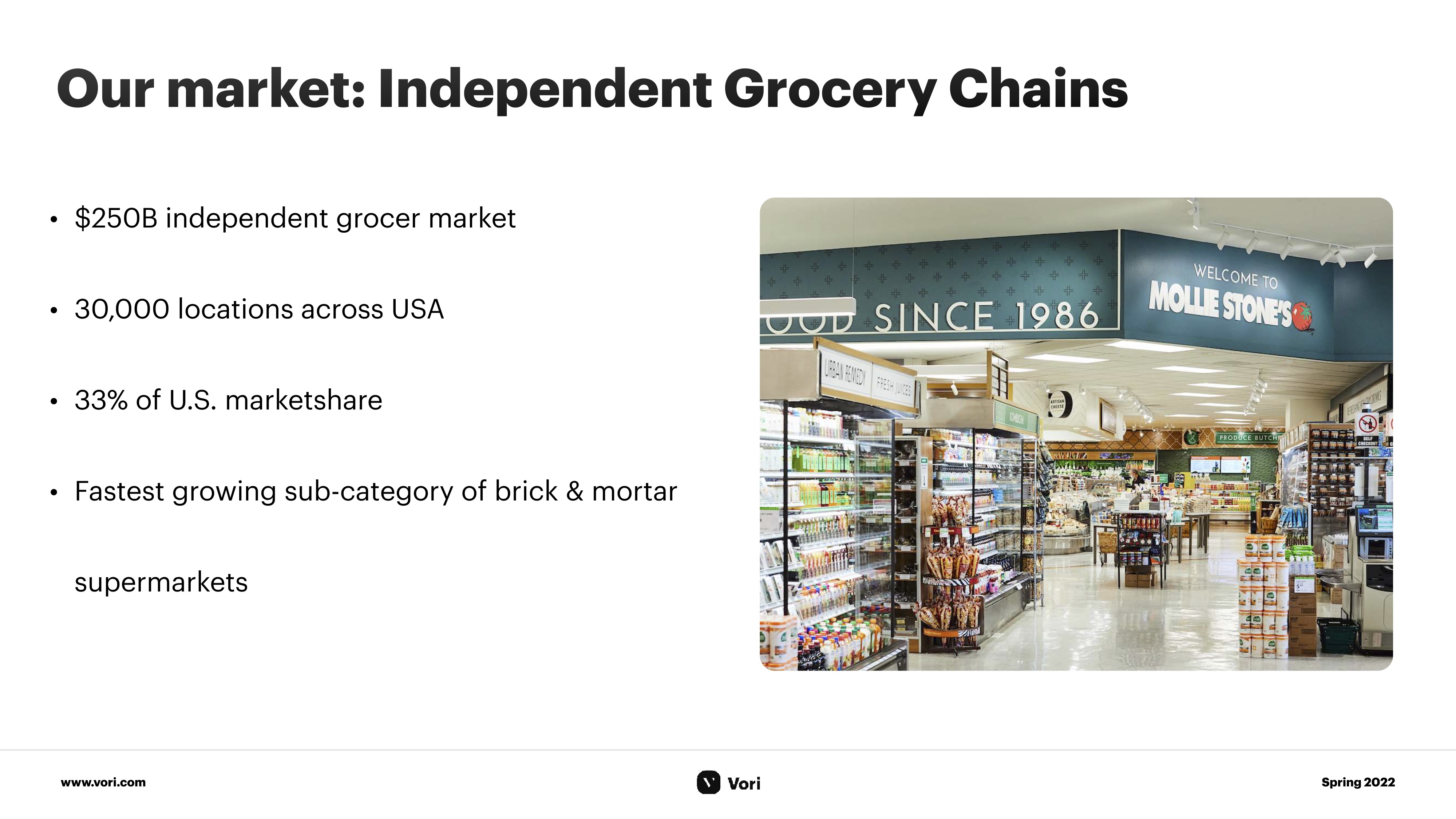
[Slide 5] So, is this market big enough to care about? Image Credits: Vori
Nonetheless, the size and penetration of independent supermarkets are more significant than I thought, which would indicate that perhaps this is a market paying closer attention to, after all.
This slide makes it easy for the investor to grok what the size of the market is, as well as how they can think about the size and growth of the market you are about to enter.
The alternative is god-awful
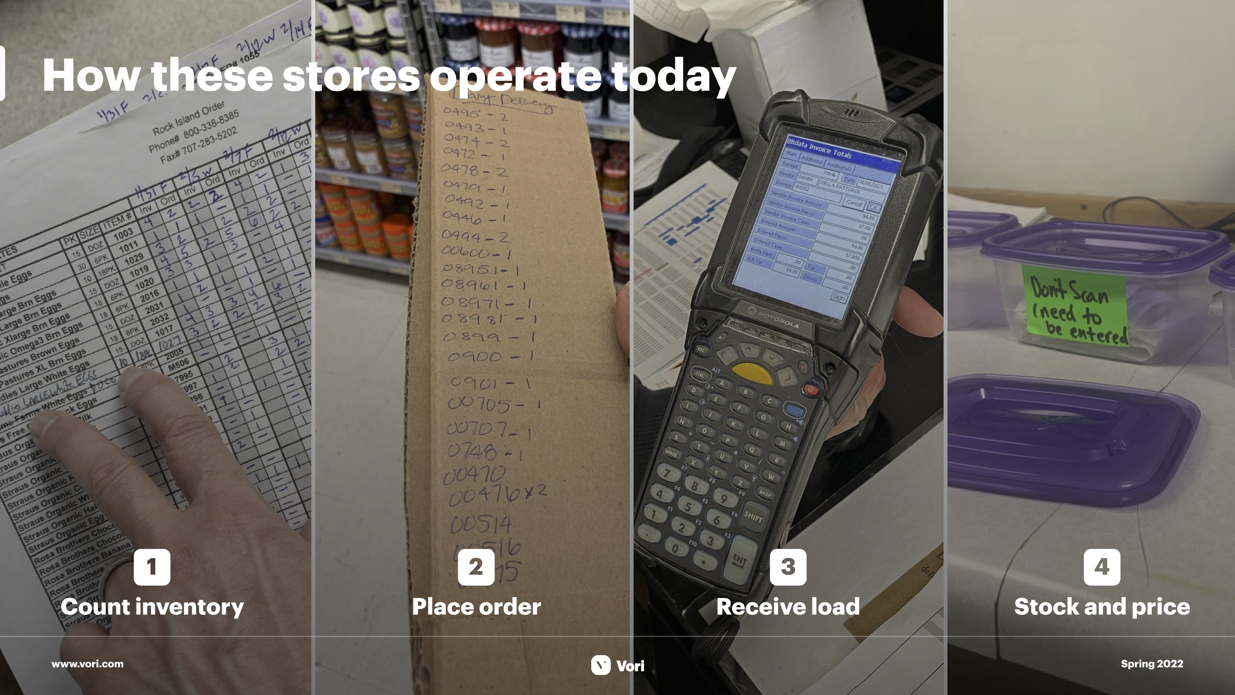
[Slide 7] Clear problem and value prop. Image Credits: Vori
I don’t know exactly how Vori does the voice-over for this slide, but if it were me, I’d explain the additional costs, the missed opportunities and the problems that are inherent in relying on old systems. This goes a long way toward explaining the value proposition. Vori doesn’t connect the dots on this slide, but I imagine the company has metrics here that can connect the use of its product to a significant increase in productivity, profitability and a reduction of mistakes. It’s a short path from there to concluding that the product pays for itself in saved time.
This slide showcases how to think empathetically with your customers and use the value prop to really ram home the point that your product is a crucial part of your customers’ lives.
In the rest of this teardown, we’ll take a look at three things Vori could have improved or done differently, along with its full pitch deck!
Pitch Deck Teardown: Vori’s $10M Series A deck by Haje Jan Kamps originally published on TechCrunch







 English (US) ·