Reddit today is launching the first major change to its mobile app in over two years with the addition of a new Discover Tab, offering personalized recommendations, as well as a revamped navigation system that includes new Community and Profile menus where users can quickly access and reorganize their subscriptions or access their profile settings.
The company said it heard from users that they wanted a better way to explore their interests, which prompted the decision to introduce the Discover Tab.
Reddit today has over 100,000 active communities, but many of them are still under-exposed, it notes.
“The big thing we’re really trying to solve for here is that it can be hard to find subreddits and communities that you want to develop a deep connection to,” explains Jason Costa, Reddit’s Director of Product for Content and Communities. “Maybe something pops up in Reddit Search or Google Search…but it can take work. It’s not always the easiest thing to do. We acknowledge that — so we wanted to craft a new surface area to make it easier to discover lesser-known communities,” he said.
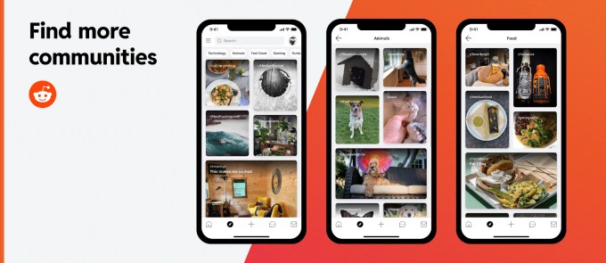
The new Discover Tab will now sit to the immediate right of the home button on Reddit’s mobile app for iOS and Android. In this section, you’ll be presented with a visually engaging, vertical feed of subreddit (community) recommendations, either based on popularity, if you’re a brand-new Reddit user, or based on your engagement patterns, if you’re an existing user.
Specifically, Reddit will take into consideration things like which subscriptions you already have and where you spend the most time, to make its recommendations. For example, if you subscribe to a lot of baseball subreddits and spend time in several football subreddits, the app may recommend other sports communities. If you’re a new user, Reddit will make suggestions of popular communities until it gains a little more signal about your interests.
What Reddit won’t do, however, is leverage any sort of understanding of user demographics — like age, location, or gender — for its recommendations.
As you scroll down the Discover Tab, you’ll see photos, GIFs and videos in small rectangular or square boxes overlaid with the name of the community they represent. This choice to use rich multimedia is meant to bring more “sight, sound, and motion” to the often text-heavy Reddit app, Costa says. The new feature will also allow you to refine your suggestions as you go by long-pressing on a tile then selecting options like show me more of this content, show me less of that content, and hide that content.
Across the top of the new section are high-level categories — like Technology, Animals, Sports, History, Hobbies, and many more — so you can explore areas beyond your current interests directly.
Not all communities will be showcased on the Discover page, we understand.
Costa tells TechCrunch the company won’t recommend any community that’s NSFW, based on its community content tags rating system. It also won’t suggest any community that’s been banned or quarantined at any point, as that’s a signal it may not be appropriate for such broad recommendation.
This decision would prevent Reddit’s more controversial communities from gaining further traction, even if they don’t reach the point of requiring a ban — like the bans enacted on the Trump-supporting communities The Donald and r/donaldtrump in previous years.
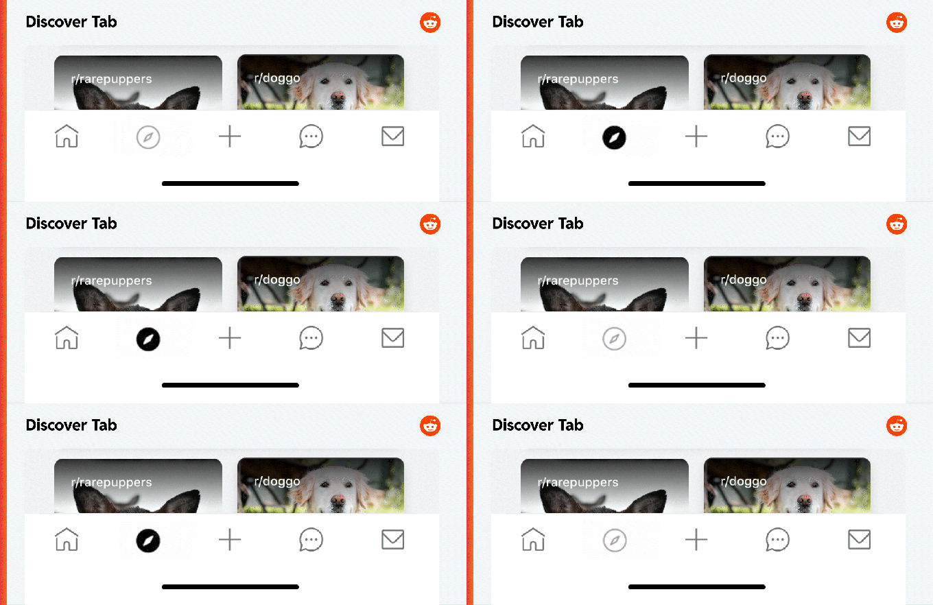
Image Credits: Reddit
Ultimately, Reddit hopes the new Discover Tab will help users find more communities to subscribe to, which would lead them to launch the Reddit app more often and engage with more content. This, in turn, could help boost Reddit’s bottom line. During tests over the previous month with a small subset of users, Reddit found that one in five people joined at least one new community after using the Discover Tab.
The new tab isn’t available on the web at this point, as Reddit will instead focus on the 70% of its user base who engage with its service via the mobile app (55% iOS/45% Android) or mobile web, versus the 30% who use Reddit on the desktop.
The addition also necessitated Reddit to rethink its navigation, as the tab is replacing the subscription tab that had previously been found on the bottom navigation bar. Now, subscriptions are tucked into the new Community menu on the left, where they can be sorted and customized. This Community Drawer will now include four sections: Moderating entry points; “Your Communities,” for your subscriptions; “Following” for the users you follow; and the “r/all” entry point.
On the right side, a new Profile Drawer will allow users to access and customize their profile.
The new features are rolling out now to Reddit’s global user base of 54 million daily active users across iOS and Android.








 English (US) ·