Comparisons will inevitably be drawn between the Tesla Model 3’s sparse interior and that of the new Volvo EX30. But Volvo’s electric crossover goes big on the minimalist, space-maximizing Scandinavian charm you’d find in an IKEA store, not just ruthless cost-cutting for its own sake. Make no mistake, however: there’s plenty of that too.
The EX30 represents one of the smartest examples of rethinking car interior design that can be found on the market today — and not just because it’s a master class in how to add Scandinavian minimalism without making it feel too sparse. There is an end to the means: a $34,950 starting price.
Lisa Reeves, head of interior design at Volvo, emphasized that the lower price goal didn’t come at the cost of skimping on functionality or quirkiness.
For example, each EX30 comes with a small rubber trash bin that slides out from behind the center console that’s ideal for kids’ candy wrappers and other waste, she told TechCrunch in a recent interview. It’s washable–and dishwasher-safe–and etched with a cartoon drawing of a moose in a forest they took to calling “Morton.”
“This car has so much personality, and that’s what I really love about it,” Reeves said.
Bye, bye buttons
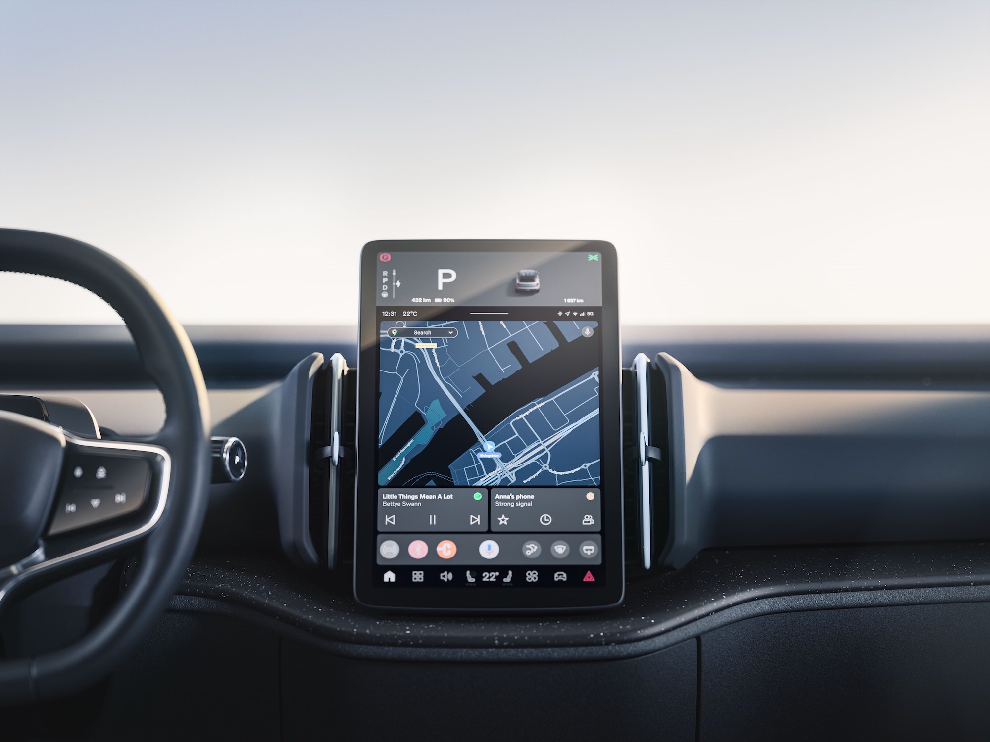
Plenty of EVs like the Ford Mustang Mach-E, the BMW iX and the Mercedes-Benz EQE have eschewed buttons and switches for controls on a giant tablet screen, both to nail the “high-tech” feel these cars aim for and for aggressive cost savings. And Volvo’s been one of the more “screen-forward” of the traditional carmakers since the last decade.
But the EX30 takes things to new heights. Getting to the EX30’s sub-$35,000 price–a kind of “sweet spot” for many EV-skeptical buyers concerned with cost–required the same “re-think everything” approach to interior design that Tesla famously used on the Model 3 and Model Y.
Here, it feels like you’re getting the results of the same playbook written by IKEA designers.
“We’re looking at it very holistically, and from the interior perspective, how to design using fewer components in a way where the components you do have are really multipurpose,” Reeves said.
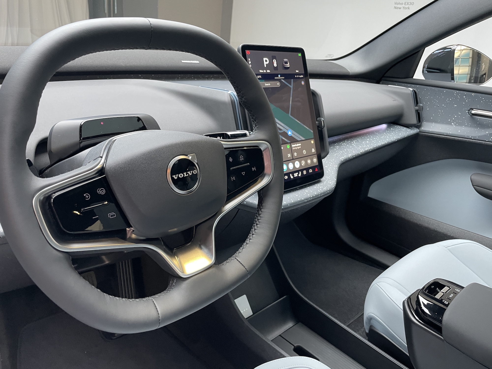
There is no instrument cluster, digital or otherwise, facing the driver; just a small infrared sensor on the steering column that tracks eye and head movement to make sure attention doesn’t wander. The gear selector is a tiny toggle hanging off the steering wheel. Nearly all controls are relegated to the 12.3-inch tablet-style center touchscreen. A “contextual bar” with key functions stays fixed to the bottom of the screen no matter what menu you’re on for easy navigation, Reeves said.
That may be the biggest UX hurdle to clear. While modern Volvos keep buttons and switches to a minimum, the EX30 tosses even those out the window. This, despite repeated reports and surveys that indicate buyers are increasingly fed up with controls built into screens, and that physical interfaces like buttons are generally considered safer and less distracting. That will be an interesting line to walk for Volvo, an automaker that built its reputation on safety.
But Reeves said their team strove for a balance there: “I think you will really value the controls that we have on the steering wheel,” she said, which include driver functions on the left and media on the right. “I think that is something we will continue to sort of evaluate to get you know the best balance.”
The few controls that aren’t screen-based, like door locks and window controls, are found on a small section of the center armrest (which also contains a slide-out set of cupholders, and Morton and his trash bin behind it.) A center-mounted glovebox pops out from underneath that screen. There’s also a hidden storage area built into the floor, located directly under that armrest.
Scandinavian principles
There are no speakers in the EX30’s doors, which is how nearly every car is built. Instead, occupants are treated to a soundbar stretched across the dashboard. “That’s a little bit less wiring than you need, and all of these little choices add up to bigger cost savings we’re able to pass it along to the consumer,” Volvo spokesperson Thomas McIntyre Schultz said.
But Reeves says these choices were more than just about cost-savings.
“We figured from the beginning, how do we design our smallest car to also get a very spacious and light feeling in a cabin? Because it’s really important for our Scandinavian principles,” she said.
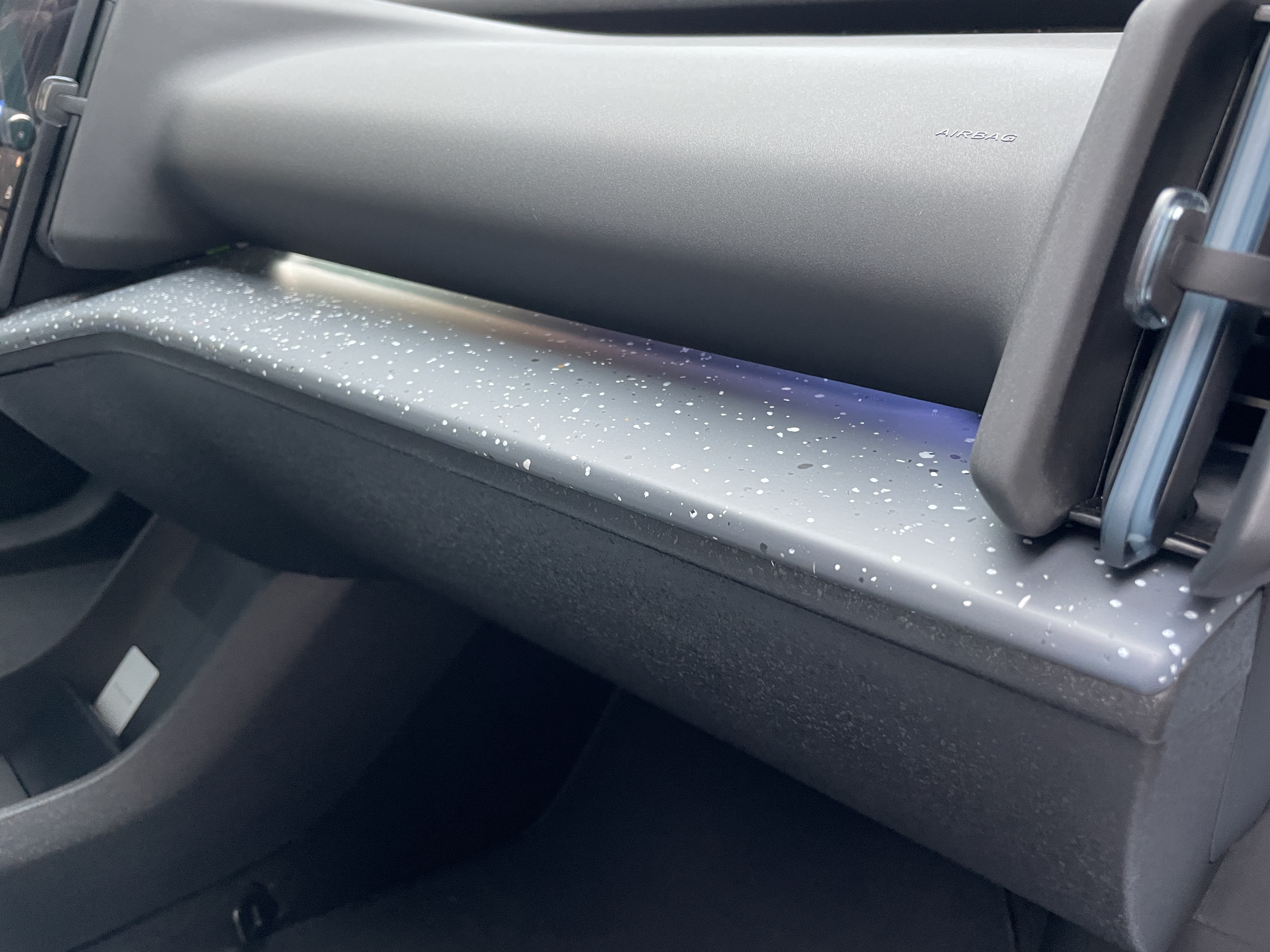
Keeping with the furniture-store vibes, an EX30’s interior can be had in one of four “rooms”–Breeze, Mist, Pine and Indigo, all said to be inspired by nature. The first one was on display at Volvo’s New York debut event this week, and it featured the signature speckled “particle” trim on the dashboard and doors.
That’s actually made of recycled plastic waste from window frames, Reeves said, adding that the seats are made in part from recycled PET bottles. She said the EX30 has the highest percentage of recycled aluminum, steel and plastic in any Volvo to date.
As heavy as it is on reused materials and despite that price tag, the EX30’s interior doesn’t feel cheap–and Reeves believes it’s plenty tough, too. “We have really strict levels on the robustness of the materials,” she said. “The ultimate goal is to keep the car in life for as long as possible with the highest value.”
Volvo is already taking $500 deposits for the EX30 in the U.S. and company officials say its popularity is exceeding expectations. Prospective buyers may want to get up close and personal with the sparseness of the controls here before they pull the trigger, even if the car on the whole doesn’t skimp on Scandinavian charm.
But as more and more automakers seek ways to get their EV prices down to reasonable levels, this approach may end up becoming more the norm than we’re used to even now.


 English (US) ·