Twitter is developing an updated version of its audio chat rooms product known as Spaces, TechCrunch learned and Twitter confirmed. The company said it’s currently working a new experiment for the Twitter Spaces tab in its app, but declined to discuss the specifics of that change. However, screenshots of one of the earlier versions of this test include what appear to be thematic audio stations as well as a personalized audio digest.
The test shows a revamped look-and-feel for Spaces that organizes the audio rooms into topics, like Music or Sports, for instance. These are represented with colorful cards and imagery from the programs. (Oddly, the images appear to represent traditional podcasts in some cases.) There’s also a feature dubbed “Your daily digest” which includes a selection of programs that can be played with a click of a button. The tab also shows you who’s listening, much as it does now.
The company said an official announcement would be further down the road after concepts are finalized, but didn’t offer a time frame.
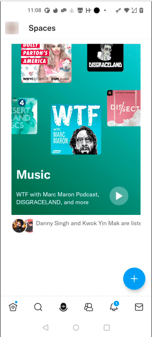
Image Credits: Twitter screenshot via Watchful
Twitter also stressed these images — which hail from competitive intelligence firm Watchful — are inaccurate and outdated. We’re told they represent only “an initial version” of the new experience it has in the works. (The company asked us to withhold publication for that reason, but we declined. TechCrunch often covers new products in their early stages — and it’s interesting to see what sort of direction Twitter may be taking with Spaces in the future, even if the final product looks remarkably different when it goes to launch. We think our readers agree.)

Image Credits: Twitter screenshot via Watchful
From our best guesses, the updated version of Spaces appears to be building upon Spaces’ support for Topics, launched last year. This allowed creators to tag their audio programs with up to three topics from a general list. This spring, Twitter also made it easier for users to see more about the Spaces when they tapped into the Space tab by placing a Space bar at the top of the screen that displayed who’s hosting, the Topics, and other information. Now, it could be experimenting with using Topics to better group different Spaces together.
In any event, it’s clear that the company is thinking about how to better introduce Spaces of interest to listeners — and one way to do this could be through a better organizational system and user interface improvements.
Today, the Spaces tab makes discovery difficult as it offers a couple of suggestions at the top, followed by Spaces from people you follow, then other live Spaces that are happening now, and below that, a selection of trending Spaces. The programs themselves often now have long, unwieldy titles as creators stuff searchable keywords, hashtags and Twitter usernames into the show’s name. At any time, the selection of popular and active Spaces is overrun with those focused on investing and crypto, as web3 adopters are highly engaged on Twitter. This also complicates discovery as you have to scroll quite a bit to find the shows outside this genre.
Plus, the layout today only makes sense for people who are regular Spaces users. When more casual users have time to kill, they may want to locate Spaces based on what’s being discussed, rather than their connections to the hosts on the social network or what’s “hot” right now. Having a digest could also make the product more compelling for those who want to keep up with Spaces but don’t have time to continually tune in.
We’ll update if Twitter chooses to share more about the product changes.








 English (US) ·