Wikipedia, one of the world’s top 10 most visited websites, and a resource used by billions every month, is getting its first makeover on the desktop in over a decade. The Wikimedia Foundation, which runs the Wikipedia project, announced today the launch of an updated interface aimed at making the site more accessible and easier to use with additions like improved search, a more prominently located tool for switching between languages, an updated header offering access to commonly used links, an updated table of contents section for Wikipedia articles, and other design changes for a better reading experience.
The interface has already been launched on hundreds of language versions of Wikipedia in recent weeks, but is now rolling out to English Wikipedia, it said.
The changes being introduced are not very dramatic — in fact, they may not even be immediately noticed by some users. The organization, however, says the update was necessary in order to meet the needs of the next generation of Internet users, including those who are more newly coming online and may have less familiarity with the Internet.
To develop the new interface, the foundation engaged with over 30 different volunteer groups from around the world, with users in places like India, Indonesia, Ghana, and Argentina, among others, all helping to test the update and provide insights into the product development. The goal for the update was to make Wikipedia more of a modern web platform, it said, and to remove clutter, while also making it easier for users to contribute. It additionally aimed to make the desktop web version more consistent with Wikipedia’s mobile counterpart.
Among the changes is a newly improved search box that now uses both images and descriptions in its autocomplete suggestions that appear as you type to help direct users to the article you need. This change, like many being introduced, is relatively small but offers a visual clue that could speed up searches and make them more helpful. The Wikimedia Foundation said this update led to a 30% increase in user searches when it was tested — a reminder that even minor changes can have larger impacts on a product’s real-world use.
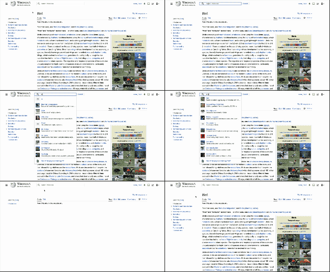
Image Credits: Wikipedia
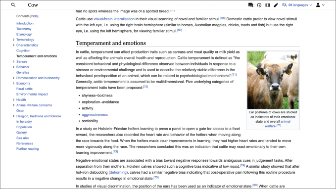
Another change involves an updated sticky header, where you’ll find commonly used links like Search, the Page name, and Sections that moves with you as you scroll down, staying pinned to the top of the page. That means you’ll no longer have to scroll back up to the top to find what you’re looking for, allowing users to stay focused on reading or editing the content instead.
Again, this seems like a smaller tweak but one that decreased scroll rates by more than 15% during tests — something that may be helpful to those who spend a lot of time on Wikipedia navigating between pages and sections, though it largely addresses an annoyance with the site, more so than any real problem. The tests also found that edits people started using the edit button in the sticky header were reversed less often than those initiated through other edit buttons on the page.
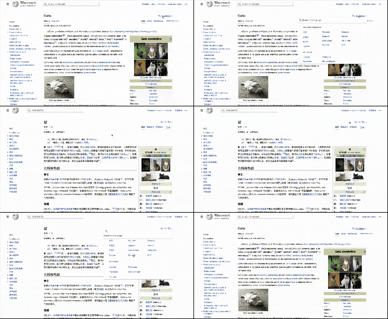
Language-switching tools were previously available but are now bumped up to a new, more prominent position at the top right, allowing readers and editors to switch between over 300 supported languages. This could be helpful in emerging markets where multi-lingual users want to access pages from other languages, at times.
The new table of contents section on the left side of articles, which helps people navigate through longer content, will now remain visible as you scroll down the page and helps you to see which section you’re currently reading. This makes it easier to jump around, moving in between various parts of the article as you further investigate a topic. Again, helpful but not world-changing.
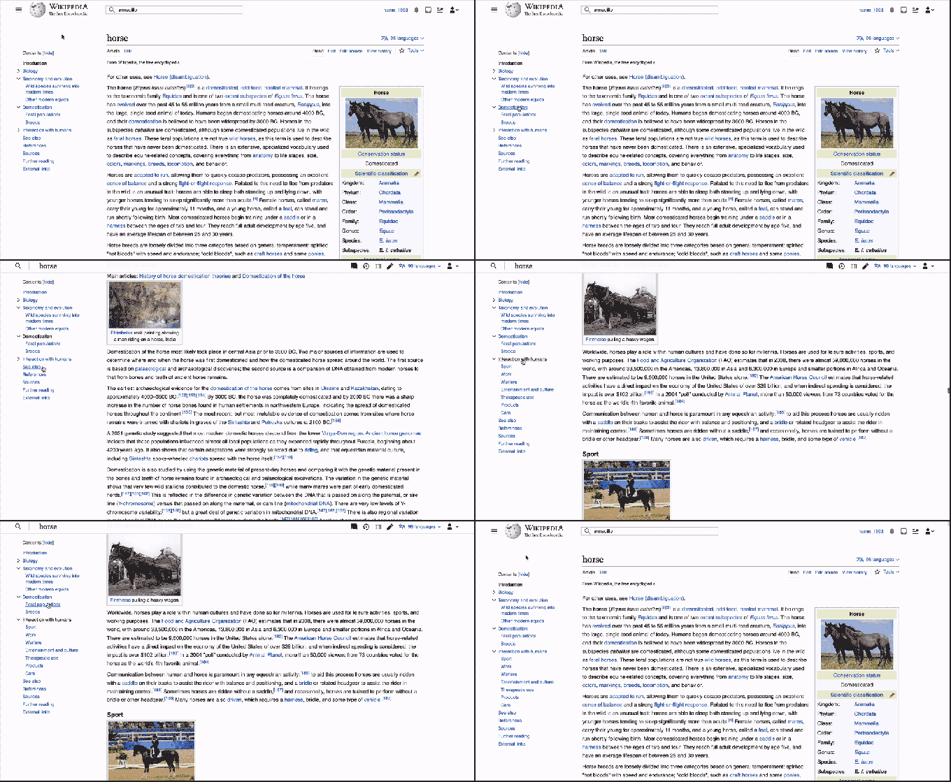
Image Credits: Wikipedia
Other changes to the site include the addition of a collapsible sidebar for a more distraction-free reading experience and a change to the maximum line width. The foundation explained that limiting the width of long-form text makes for a more comfortable reading experience and improves retention of the content. However, a toggle is available for logged-in and logged-out users on every page if the monitor is 1600 pixels or wider, allowing users to increase the width of the page. Logged-in users can also set a width in their preferences page.
The default font size was also increased for better reading comfort.
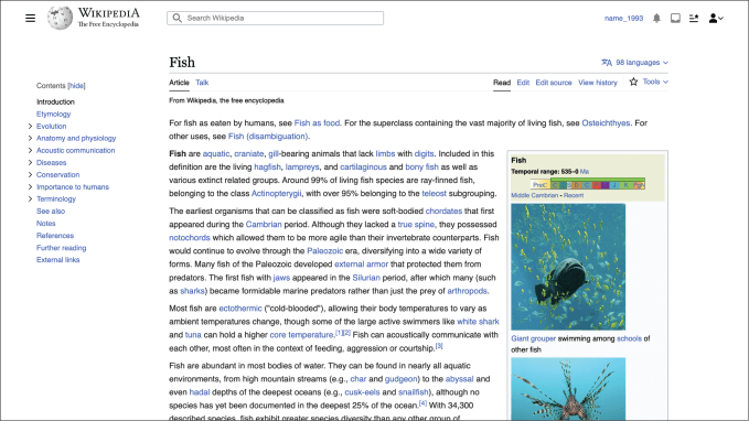
Image Credits: Wikipedia
Given the size of Wikipedia’s readership, it’s clear the organization was careful not to make disruptive changes. Today, Wikipedia offers over 58 million articles across more than 300 languages, which are viewed nearly 16 billion times every month, it said. The announcement also noted that no existing functionality was removed as a part of these changes — instead, the focus of the update was on usability improvements and modernizing the site.
The makeover, which is also known as “Vector 2022” — a reference to the name of the default Wikipedia skin (Vector — and yes, there are others!) — had been in the works for three years and had been slowly rolled out across the Wikipedia platform ahead of today. As of December 2022, Vector 2022 was the default skin for around 300 Wikipedias globally, and became the default on Arabic and Greek Wikipedias.
Today, the update is live on 94% of the 318 active language versions of Wikipedia for all desktop users and is rolling out to English Wikipedia on the desktop.
Wikipedia gets its first makeover in over a decade…and it’s fairly subtle by Sarah Perez originally published on TechCrunch







 English (US) ·