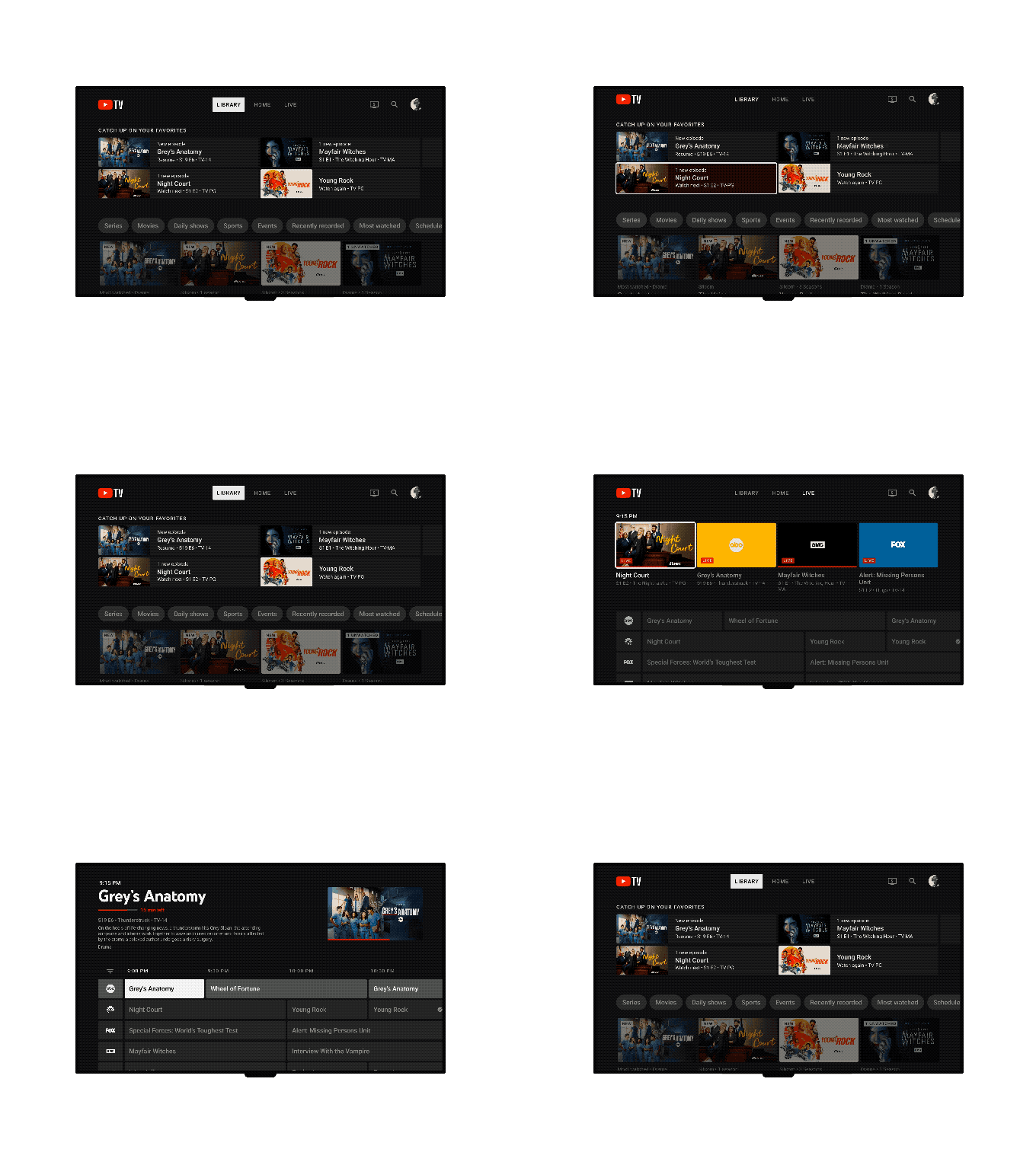
YouTube TV announced today that it’s rolling out updates to its Live Guide and Library. The updated Live Guide, which offers a more traditional grid showing what’s on now and what’s upcoming, has already reached some users, offering both a new design and recommendations of what to watch. Meanwhile, updates to the Library will roll out starting today and will continue over the next few months.
The updated Live Guide now includes a row of curated recommendations at the top, a condensed grid that displays more channels and programming on the screen and an overall simpler design. Users also get more information about each live show or movie from the new guide.
The condensed grid was mainly done so viewers could scroll less and take in information more quickly, Esther Ahn, Head of Design for YouTube TV and Primetime Channels, wrote in today’s blog post.
Ahn also claims that it’s easier to record content from the new guide since it requires fewer steps. The Live Guide makes it more obvious to users if a show or movie is already saved to the DVR or not, the post noted.
Meanwhile, the updated Library now lets users manage their content better thanks to improved filters and organizational tools. YouTube TV removed the side navigation, and instead, there’s a row of filters for more specific content categories, such as daily shows. There’s also a new “Catch up on your favorites” shelf, so users can easily find the content that they enjoy the most.
Ahn noted that users with large libraries were frustrated with how difficult it was to find a title they wanted to watch. “Members have built up their libraries over time, but programs they were interested in several years ago might no longer be relevant to them,” Ahn said. “The more their libraries grew, the less usable they became due to the lack of tools to organize their shows, movies and sports.”
YouTube TV wanted to focus on upgrading its Live Guide and Library since they are the most used pages by YouTube TV watchers, the company said. For both features, YouTube designed new side panels with shortcuts, like “Add to Library.” A “Set Reminder” shortcut is in the works as well.
These changes aim to give YouTube users more control over how they explore and find content.
“Decision fatigue is real when you turn on your TV with even more apps and channels than ever before. Viewers are looking for easier ways to find the content most relevant to them, whether it’s jumping into a live game or seeing what’s trending right now,” Ahn wrote.
While overall, these are minor design tweaks and changes, making the product simpler to use is a competitive advantage when it comes to attracting new cord-cutters to the YouTube TV service over rivals, like Hulu with Live TV or Sling TV.
The company said more changes were on the way including those that would bring more flexibility and interactivity during live playback and make it easier to switch between user profiles, but did not offer an ETA as to when those features would launch.
YouTube TV upgrades its live TV guide and library to give users more control by Lauren Forristal originally published on TechCrunch









 English (US) ·